
Selecting a custom poster is one of the most effective ways to personalise a space, bridging the gap between raw architectural structure and curated comfort. However, a common pitfall when ordering custom poster printing is focusing solely on the artwork itself, without considering how the design style, paper material, and framing will interact with the existing interior design theme. To create a cohesive and visually striking environment, the chosen custom poster design must harmonise with the room’s established layout, lighting, and materials.
Achieving this balance requires evaluating several key design principles, including color coordination, visual weight, and structural framing. By understanding how different poster styles complement specific interior aesthetics—from the clean lines of Scandinavian minimalism to the raw textures of industrial lofts—you can make informed decisions before placing your custom order. This guide outlines the essential design matches, material considerations for tropical climates, and technical checks to ensure your custom prints look professional and endure over time.
How to Match Custom Poster Designs to Your Space
Integrating a custom poster into a room requires a thoughtful assessment of the existing decor to ensure the new addition feels intentional rather than accidental. The first dimension to evaluate is color palette coordination. You can approach this through either harmonious matching or strategic contrast. Harmonious matching involves selecting artwork that shares the dominant or secondary colors already present in your furniture, walls, or textiles, which reinforces a sense of calm and unity. Alternatively, you can use a high-contrast poster to establish a clear focal point. By choosing a print that features a bold accent color—one that sits opposite your room’s primary tones on the color wheel—you can draw the eye directly to a specific wall, injecting energy into an otherwise neutral space.
Products mentioned in this guide
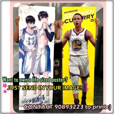
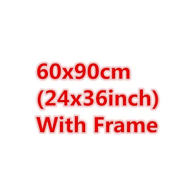
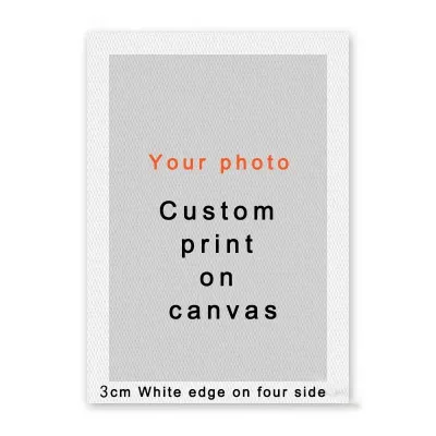
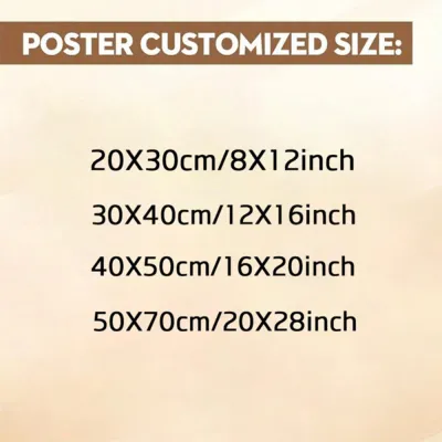
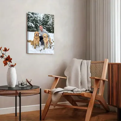
Prices are valid at publication and may change. Please refer to the product page for the latest price.
Visual weight and balance represent the second critical dimension of art selection. The complexity of your poster design should contrast with the complexity of its immediate surroundings. If your room features busy patterns, textured wallpaper, or intricate furniture designs, a clean and minimal poster design provides a necessary visual resting point. Conversely, if your space is characterized by flat surfaces, solid colors, and simple furniture, a highly detailed, complex poster can introduce much-needed texture and depth. Balancing these elements prevents the room from feeling either chaotic or sterile.
Additionally, the choice between typography-driven and imagery-driven designs significantly influences the spatial mood. Typography-driven custom posters—featuring graphic quotes, minimalist monograms, or architectural coordinates—introduce a structured, intellectual, and modern atmosphere. They work exceptionally well in study rooms, home offices, or transitional spaces like hallways. On the other hand, imagery-driven designs, such as abstract paintings, landscapes, or portrait photography, evoke emotional depth and sensory responses, making them ideal for spaces dedicated to relaxation, such as living rooms and bedrooms.
While these design frameworks offer reliable guidance, personal preference and emotional resonance should remain the ultimate deciding factors. Art is inherently subjective, and a technically perfect match will fail to elevate a space if it does not evoke a positive personal connection. Use design rules to narrow down your options, but let your intuitive response to the artwork guide your final selection.
Recommended Custom Poster Styles by Interior Theme
Different interior design themes rely on specific visual vocabularies. To ensure your custom poster enhances your home’s aesthetic, match the design style of the print to the core philosophy of your interior theme.

Minimalist and Scandinavian Interiors
Minimalist and Scandinavian spaces prioritise simplicity, functionality, and a deep connection to natural elements. For these light, airy, and uncluttered environments, the most effective custom poster styles include continuous line art, minimalist typography, and soft, muted abstract shapes. Designs that feature organic curves or simple geometric forms in earth tones, beige, sage, or terracotta maintain the serene atmosphere of the style.
To preserve the light-filled quality of Scandinavian design, select artwork that incorporates ample white space (or negative space) within the composition. This design choice prevents the wall from feeling heavy and allows the room to breathe. When printing, opt for a premium matte paper finish. Matte paper diffuses light rather than reflecting it, eliminating the harsh glare that glossy prints often produce in highly illuminated, naturally lit rooms.
Industrial and Urban Loft Spaces
Industrial design celebrates raw materials, structural elements, and utilitarian functions. To complement exposed brick, concrete screed, and visible ductwork, choose custom posters that reflect this rugged, textured aesthetic. Excellent options include vintage patent drawings, black-and-white architectural photography, and graphic designs featuring distressed, grainy, or concrete-like textures.
Color palettes for industrial posters should lean toward monochromatic black-and-white, deep charcoal, or sepia tones. These muted, structural colors sit naturally against the warm tones of exposed brick and the cool grey of concrete. To complete the look, pair these prints with dark wood frames, matte black aluminum frames, or industrial metal borders, which anchor the artwork and match the metallic accents typical of urban loft decor.
Bohemian and Eclectic Rooms
Bohemian and eclectic interiors are defined by their warmth, layered textures, and highly personalised, globetrotting character. For these vibrant spaces, look for detailed botanical illustrations, warm-toned abstract art, and vintage-style travel photography. The artwork should feel curated over time, reflecting personal journeys, nature, and cultural appreciation.
Because eclectic design thrives on variety, you are not restricted to a single framing style. Mixing different frame materials—such as warm bamboo, carved natural timber, and distressed gold gilt—adds tactile depth to the wall. Printing your custom designs on textured canvas or heavy cotton rag paper further enhances this tactile quality. Additionally, bohemian spaces are highly suited for gallery walls, where posters of varying sizes and orientations are grouped together to create a rich, narrative-driven focal point.
Modern Contemporary and Luxury Settings
Modern contemporary and luxury interiors focus on sleek lines, sophisticated finishes, and high-contrast visual drama. To match this polished aesthetic, select bold geometric patterns, high-contrast fashion photography, dramatic cityscapes, or highly structured minimalist layouts. These styles provide a clean, decisive visual statement that complements high-end architectural details.
To anchor a contemporary room, utilise deep, rich colors—such as emerald green, navy blue, or deep burgundy—or opt for stark, high-contrast black-and-white photography. The framing and mounting of the poster are just as critical as the art itself in luxury settings. Consider frameless acrylic mounts, which present the print behind a thick sheet of polished acrylic for a glossy, three-dimensional effect, or choose ultra-thin, sleek metal frames in brushed brass, chrome, or satin black to maintain a refined, gallery-grade finish.
Choosing the Right Paper and Framing for Singapore Homes
In Singapore, environmental factors and housing characteristics play a decisive role in the longevity and safety of your custom wall art. The primary environmental challenge is Singapore’s high relative humidity, which frequently exceeds 80%. Standard paper stocks easily absorb atmospheric moisture, leading to warping, cockling (the wavy distortion of the paper), and eventual mold growth behind the glass. To prevent this, specify moisture-resistant paper stocks, such as synthetic polypropylene paper, or high-grade, acid-free cotton rag archival papers that resist moisture absorption. Additionally, ensure your framing provider seals the back of the frame completely with professional moisture-resistant backing boards and high-quality framing tape to block humid air.
Another critical factor is tropical sunlight. Rooms with large, floor-to-ceiling windows receive intense UV radiation, which rapidly degrades standard printing inks, causing colors to fade and paper to yellow within a few years. When framing custom posters for bright rooms, select UV-protective glazing. Acrylic or glass treated with UV-filtering properties can block up to 99% of harmful UV rays, preserving the original color saturation of your print. Acrylic glazing is also highly recommended over standard glass because it is lightweight and shatterproof, making it safer for high-traffic areas.
Wall construction in Singapore also dictates how you should mount your framed posters. Most Housing & Development Board (HDB) flats and condominiums feature structural concrete walls or precast internal concrete panels. These walls are exceptionally sturdy but require an impact drill and plastic wall plugs (anchors) to secure heavy frames. Conversely, partition drywalls, which are common in newer condo bedrooms or renovated layouts, cannot support heavy loads without specialised drywall anchors, such as toggle bolts. Always check the manufacturer’s instructions for your mounting hardware to verify its weight capacity, and ensure the anchor matches your specific wall type. If you are planning to hang exceptionally large, heavy, or glass-fronted frames at height, consult a qualified professional handyman to ensure a secure installation.
Finally, to prevent moisture from becoming trapped between the back of the frame and the wall—which can lead to unsightly mold patches on your paintwork—always maintain proper airflow. You can achieve this easily by applying small, self-adhesive silicone or rubber bumper pads to the bottom corners of the frame’s backing board. These bumpers create a consistent 2mm to 3mm air gap between the frame and the wall, allowing air to circulate freely and reducing the risk of condensation buildup.
Quick Match Guide: Interior Theme to Poster Style
Use this reference table to quickly identify the ideal design elements, frame styles, and color palettes for your specific interior design theme.
| Interior Theme | Recommended Poster Styles | Best Frame Materials | Ideal Color Palettes |
|---|---|---|---|
| Minimalist & Scandinavian | Continuous line art, minimalist typography, soft organic abstract shapes | Light oak, natural ash wood, or thin white wood | Beige, cream, soft terracotta, sage green, and muted pastels |
| Industrial & Urban Loft | Vintage patent drawings, black-and-white architectural photography, distressed textures | Matte black aluminum, dark distressed timber, or raw steel | Monochromatic black and white, charcoal grey, sepia, and rust |
| Bohemian & Eclectic | Detailed botanical illustrations, vintage travel posters, colorful abstract art | Mixed frames (bamboo, carved wood, distressed gold, ornate brass) | Ochre, mustard yellow, burnt orange, deep olive, and warm terracotta |
| Modern Contemporary & Luxury | Bold geometric patterns, high-contrast fashion photography, structured layouts | Frameless acrylic mounts, thin brushed brass, or satin black metal | Stark black and white, deep emerald, rich navy, and metallic accents |
Essential Checks Before Placing Your Custom Poster Order
Before finalizing your custom poster order and sending your files to print, perform these essential technical and spatial checks to ensure the physical product matches your expectations.
First, verify the image resolution and dots per inch (DPI). Printing a low-resolution image on a large poster results in highly visible pixelation, soft edges, and a cheap appearance. As a general rule, the digital file should have a resolution of 300 DPI at the final print size for high-density, close-up viewing (such as a poster placed next to a desk or in a narrow hallway). For very large posters (such as A1 or A0 sizes) that will be viewed from a distance of two meters or more, a resolution of 150 DPI to 200 DPI is acceptable. To check this, divide the pixel dimensions of your image by the desired print dimensions in inches; if the resulting number is below these thresholds, seek a higher-resolution source file.
Second, pay close attention to aspect ratio cropping. Digital images come in various aspect ratios (such as 4:3, 3:2, or 16:9), which may not match standard international paper sizes (such as A4, A2, or A1, which use a 1:√2 ratio) or standard frame dimensions (such as 50×70 cm). When you upload an image for custom printing, the printing software will often automatically crop or stretch the image to fit the selected print size. Always review the digital print preview carefully to ensure that vital details, artistic elements, or text near the edges of your design are not cut off or awkwardly cropped.
Third, ensure you have the appropriate copyright and usage rights for the image you intend to print. While downloading images from search engines is easy, printing copyrighted artwork without permission violates intellectual property rights. To print safely and legally, source your images from reputable public domain archives, purchase high-resolution files directly from independent artists, or use stock photography platforms that explicitly include personal printing licenses in their terms of use.
Finally, measure your physical wall space and compare it to the scale of the furniture below it. A common design mistake is choosing a poster that is too small for the wall, which makes the artwork look lost, or selecting a print so large that it overwhelms the room. To achieve a balanced look, apply the two-thirds rule: the total width of your framed poster (or group of posters) should span approximately 60% to 75% of the total width of the furniture directly below it, such as a sofa, sideboard, or bedhead. Use masking tape to outline the proposed frame dimensions on your wall before ordering, allowing you to step back and visually assess the scale and proportion of the layout in real life.
Community discussion
Share your experience or ask a question. Comments are reviewed before publication.