
Selecting the perfect wall decor involves far more than simply choosing an image that catches your eye. A canvas painting serves as a visual anchor, bridging the gap between your furniture, architectural features, and overall design aesthetic. In Singapore’s diverse housing landscape, from cozy HDB flats to expansive condominiums, the right artwork can visually expand a room, establish a clear mood, and tie disparate design elements into a unified narrative. Understanding how different artistic styles interact with specific interior design themes ensures your walls enhance, rather than disrupt, your living space.
To achieve a harmonious look, you must evaluate how a painting’s color, scale, and presentation format align with your room’s existing elements. By treating art as an active component of your interior design rather than an afterthought, you can transform your home into a cohesive, curated environment that reflects your personal taste.
How to Choose the Right Canvas Art: Core Matching Principles
To select a canvas painting that truly harmonizes with your room, start with color extraction. This process involves identifying the dominant, secondary, and accent colors already present in your space—such as in your upholstery, rugs, curtains, or a feature wall—and finding artwork that mirrors those tones. A useful approach is the 60-30-10 design rule, where 60% of the room is a dominant neutral color, 30% is a secondary color, and 10% is an accent. Your canvas art should ideally pull from the 30% and 10% color brackets. For example, in a living room with cream walls (60%) and a navy blue sofa (30%), a canvas featuring deep blue brushstrokes and subtle gold accents (10%) creates an instant, intentional connection.
Products mentioned in this guide
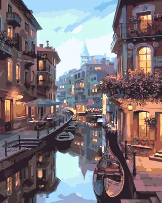
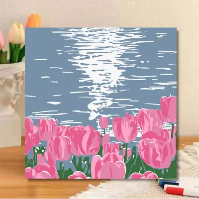


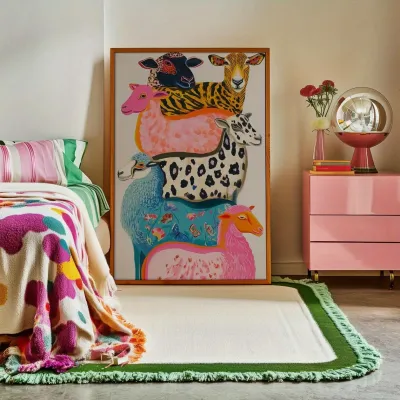
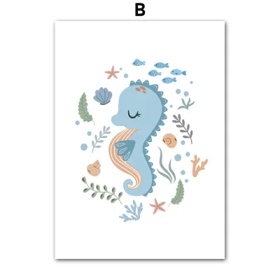
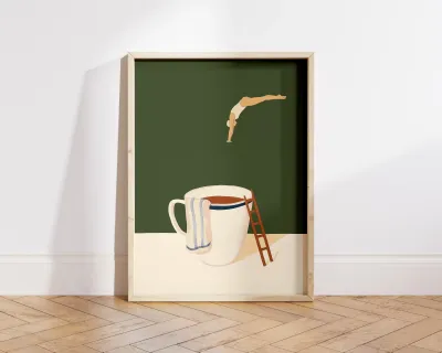
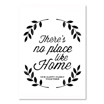
Prices are valid at publication and may change. Please refer to the product page for the latest price.
Scale and proportion are equally critical, especially when navigating the layout constraints of Singaporean apartments. Hanging a tiny canvas on a large living room wall makes the art look lost, while an oversized piece can overwhelm a compact dining nook. As a general guideline, a canvas or a set of canvases should occupy between 60% and 75% of the available wall space that is not covered by furniture or architectural trim. When hanging art above a specific piece of furniture, such as a sofa or console table, the artwork’s total width should be approximately two-thirds to three-quarters the width of the furniture below it to maintain a balanced visual weight.
The choice between a framed canvas and a gallery wrap also significantly influences the room’s formal tone. A gallery wrap, where the canvas is stretched over wooden bars and secured at the back, allows the image to wrap around the sides of the frame. This frameless style offers a clean, contemporary look that blends seamlessly with the wall, making it ideal for modern, minimalist, or casual spaces. Conversely, a framed canvas—particularly one utilizing a floating frame where a thin gap separates the canvas edge from the frame—adds structural definition, elegance, and a polished, gallery-like finish that suits transitional, industrial, and traditional interiors.
Modern and Minimalist Interiors: Best Canvas Styles and Pairings
Abstract and Geometric Canvas Art
Modern and minimalist spaces prioritize clean lines, functional furniture, and a lack of unnecessary ornamentation. In these environments, abstract and geometric canvas art serves as a powerful focal point without introducing visual clutter. Bold geometric shapes—such as intersecting circles, sharp angles, or clean linear grids—introduce structure and architectural interest to a plain wall, acting as a visual anchor that complements the clean-lined furniture below it.

When selecting abstract pieces for a minimalist room, focus on color blocks that complement a neutral or monochromatic palette. A canvas featuring large fields of soft beige, charcoal, and cream can add depth and texture to a white-walled room while maintaining a calm, serene atmosphere. The key is simplicity; look for compositions that rely on balance, form, and negative space rather than intricate, busy details.
However, there are distinct limitations to keep in mind when choosing abstract art for minimalist spaces. Avoid overly busy, chaotic abstract compositions with splattered paint or high-contrast, multi-colored patterns. These busy styles can easily disrupt the quiet, restorative atmosphere that minimalist design aims to cultivate. Stick to pieces with a clear, restrained composition and a limited color palette to preserve the room’s clean aesthetic.
Line Art and Monochromatic Prints
For those favoring Scandinavian or Japandi (Japanese-Scandinavian fusion) aesthetics, continuous line art and monochromatic prints offer an ideal balance of elegance and restraint. Continuous line art, which depicts figures, faces, or abstract organic shapes using a single, unbroken line, provides a delicate visual element that does not overpower the room’s quiet design language.
These styles rely heavily on negative space—the empty area surrounding the main subject. In a Japandi-themed home, where the concept of ‘ma’ (the appreciation of negative space and emptiness) is highly valued, a canvas with ample blank space keeps the room feeling airy, light, and uncluttered. It allows the wall color to breathe and prevents the visual weight of the room from shifting too heavily toward one corner.
To elevate these minimalist prints, pair them with slim, structured frames. Matte black metal frames offer a sharp, contemporary contrast against light-colored walls, while light oak or natural wood frames enhance the organic warmth inherent in Japandi and Scandinavian designs. Ensure the frame profile remains thin (around 1 to 1.5 cm) to preserve the delicate, understated nature of the artwork.
Industrial and Urban Themes: Canvas Styles That Add Edge
Urban Photography and Architectural Prints
Industrial design celebrates raw materials, exposed brick, concrete walls, and dark metal finishes. To complement this rugged, urban aesthetic, high-contrast black-and-white photography and architectural prints are highly effective. Images of cityscapes, structural steel bridges, or close-up architectural details mirror the structural honesty of industrial interiors.
When placing these prints, size is critical to achieving the desired impact. An oversized canvas positioned above a distressed leather sofa or a reclaimed wood dining table serves as a dramatic anchor for the entire room. Large-format prints (such as 90×120 cm or larger) match the bold scale of industrial furniture and prevent the raw wall textures from overpowering the art.
Additionally, pay close attention to the canvas finish. Opt for a matte or satin finish rather than a high-gloss coating. Glossy surfaces reflect light easily, which can cause distracting glare in rooms with large windows or exposed, bright industrial-style track lighting. A matte finish preserves the depth of dark charcoal and black tones, ensuring the image remains clearly visible from various angles in the room.
Vintage Maps and Typographic Canvas
Industrial spaces often benefit from elements that introduce historical character and warmth to balance cold concrete or brick surfaces. Vintage maps printed on canvas are excellent for this purpose. The warm sepia tones, aged parchment yellows, and intricate cartographic details of historical maps soften the starkness of an industrial room while adding a sense of global adventure.
Typographic canvas art—such as vintage patent blueprints, schematic drawings, or bold, weathered lettering—also fits seamlessly into an urban loft aesthetic. These pieces evoke the feel of an old workshop or creative studio, aligning perfectly with the utilitarian roots of industrial design.
When purchasing large-format typographic or schematic prints, always verify the print resolution with the manufacturer. Because these designs rely on fine lines and small text, low-resolution prints can appear blurry or pixelated when scaled up to fit a large canvas. Look for high-definition digital prints with crisp, sharp edges to ensure a professional, high-quality look on your wall.
Bohemian and Eclectic Spaces: Canvas Art for a Relaxed Vibe
Botanical Illustrations and Nature Landscapes
Bohemian and eclectic interiors are defined by their layered, free-spirited, and organic nature. To enhance this relaxed vibe, botanical illustrations and nature landscapes are natural choices. Canvas paintings featuring lush tropical monstera leaves, delicate ferns, or sun-drenched desert landscapes bring the outdoors inside, reinforcing the organic feel of the space.
These botanical themes pair beautifully with the natural textures commonly found in boho decor, such as rattan furniture, woven jute rugs, and cotton macramé wall hangings. You can choose muted, earthy tones (like terracotta, olive green, and warm ochre) for a grounded, desert-boho look, or vibrant, saturated greens and teals for a lively, tropical-boho atmosphere.
To display these pieces, consider creating a salon-style gallery wall. Unlike modern spaces that favor symmetrical grids, an eclectic gallery wall thrives on variety. Mix different canvas sizes, orientations, and organic themes. Avoid rigid, perfectly aligned arrangements; instead, arrange them in a loose, asymmetrical cluster that feels as though it has collected naturally over time.
Textured and Mixed Media Canvas
Texture is a cornerstone of bohemian design, and this tactile quality can extend directly onto your walls. Textured canvas paintings—such as those created using thick impasto paint strokes, plaster overlays, or integrated woven fibers—add a three-dimensional depth that flat prints cannot replicate.
The physical texture on these canvases interacts beautifully with natural light throughout the day and takes on a cozy, inviting glow under warm ambient lighting in the evening. As the light hits the raised surfaces of the paint or mixed media, it casts subtle shadows, creating a dynamic visual experience that changes depending on the time of day and your room’s lighting setup.
Maintaining these unique, textured surfaces requires careful handling. Because dust can easily settle into the crevices of impasto paint or plaster, regular gentle maintenance is necessary. Always consult the artwork’s specific care instructions before cleaning. Generally, a soft, dry makeup brush or a delicate anti-static feather duster should be used to gently sweep away dust. Avoid using damp cloths, chemical cleaners, or firm brushes, which can chip the paint or degrade the mixed media elements.
Traditional and Classic Decor: Timeless Canvas Recommendations
Classic Oil-Style Reproductions and Portraits
Traditional and classic interiors rely on symmetry, refined elegance, and historical references. To complement this formal aesthetic, canvas prints that replicate classic oil-style paintings or historic portraits are highly effective. These pieces bring a sense of heritage, depth, and sophistication to formal dining rooms, studies, or elegant living areas.
For an authentic look, seek out high-quality canvas reproductions that capture the rich texture, visible brushstrokes, and deep color saturation of original oil-on-canvas works. The subject matter should align with the room’s formal tone; classic portraits, historical scenes, or classical mythological themes work beautifully to establish a stately atmosphere.
The framing of these traditional canvases is just as important as the artwork itself. Unlike modern styles that favor frameless gallery wraps, classic art demands substantial, ornamental framing. Select heavy, dark wood frames or ornate metallic frames with gold or bronze leaf finishes. These elaborate frames act as a bridge between the artwork and other traditional furniture pieces, such as mahogany sideboards or tufted leather armchairs.
Floral Still Life and Vintage Landscapes
Floral still life paintings and vintage-toned landscapes offer a softer, more romantic approach to traditional decor. A canvas depicting a lush arrangement of roses, peonies, or hydrangeas in deep, rich tones can beautifully echo the floral patterns found in traditional upholstery fabrics, drapery, or classic wallpapers.
Vintage-toned landscapes—featuring rolling hills, quiet forests, or serene rivers in muted greens, soft ambers, and dusty blues—add a sense of quiet history and warmth. These pieces are particularly suited for dining rooms or above fireplaces, where they encourage relaxation and conversation.
However, traditional oil-style canvases often feature dark, heavy color palettes that can absorb a significant amount of light. To prevent these artworks from making your room feel gloomy or closed-in, balance them with thoughtful room lighting. Ensure the space has adequate ambient light, and consider dedicated accent lighting to bring out the subtle details hidden within the deeper tones of the painting.
Sizing, Placement, and Lighting: A Practical Buying Checklist
To ensure your chosen canvas painting looks professional and integrated into your home, follow this practical checklist for sizing, hanging, and illuminating your art:
- Apply the Two-Thirds Rule: When hanging a canvas above a key furniture piece—such as a living room sofa, a bed headboard, or an entryway console table—ensure the width of the canvas (or the total width of a multi-panel set) is approximately two-thirds to three-quarters the width of the furniture below it. This ratio prevents the artwork from looking dwarfed by the furniture or top-heavy.
- Position at Eye Level: A common mistake is hanging art too high. For optimal viewing, position the vertical center of the canvas at average eye level, which is approximately 145 cm to 150 cm from the floor. If you have exceptionally high ceilings, you can adjust this slightly upward, but ensure the artwork remains visually connected to the furniture below it rather than floating in isolation.
- Integrate Dedicated Lighting: To truly showcase the colors and textures of your canvas, integrate dedicated lighting. Picture lights mounted directly above the frame offer a classic, gallery-like look, while adjustable track lighting or directional ceiling-mounted wall sconces provide a modern, flexible solution.
- Observe Electrical Safety: For any lighting installation involving fixed electrical wiring, such as installing new wall sconces or ceiling track lights, safety is paramount. Always isolate the mains power supply at the distribution board before starting any electrical work. In Singapore, fixed electrical wiring installations must be carried out by a qualified, licensed professional (an EMA-licensed electrician) to ensure compliance with local electrical safety standards and building codes. Always follow the manufacturer's installation instructions and verify that the lighting fixtures carry appropriate safety certifications.
- Match Color Temperature to Art Style: The color temperature of your light source significantly affects how colors appear. Use warm light (2700K to 3000K) to enhance the rich, golden tones of traditional oil reproductions, vintage landscapes, and warm bohemian art. For modern abstract art, monochromatic prints, or high-contrast photography, opt for neutral light (3500K to 4000K) to keep whites crisp and colors true to their original cool tones.
- Perform Pre-Purchase Structural Checks: Before buying a heavy, large-format canvas or a substantial framed piece, verify your wall type and structural support. For drywalls, use a stud finder to locate wall studs for secure mounting, or use appropriate heavy-duty hollow-wall anchors. For concrete walls common in Singaporean HDB flats, ensure you have a rotary hammer drill and appropriate masonry wall plugs. Additionally, check the thickness of the canvas stretcher bars; standard bars are about 2 cm thick, while gallery-wrapped canvases designed to hang without a frame are typically 3.5 cm to 4 cm thick, requiring deeper hanging hooks.
Frequently Asked Questions (FAQ)
Can I mix different canvas painting styles in one room?
Yes, you can successfully mix different canvas painting styles in a single room by establishing a clear unifying element. To prevent the space from looking chaotic, tie the diverse artworks together using a consistent color palette (for example, ensuring every piece contains a touch of navy blue) or by using identical frames across different styles. Additionally, balance the visual weight of the room by placing bolder, high-contrast pieces on one wall and balancing them with lighter, more delicate works on the opposite wall, ensuring no single area feels visually overwhelmed.
How do I protect canvas paintings from high humidity?
In humid climates like Singapore, protecting canvas art from moisture is essential to prevent mold growth and fabric sagging. Avoid hanging canvases in high-moisture zones, such as directly inside bathrooms or immediately above kitchen stoves where steam accumulates. To ensure adequate air circulation behind the artwork, attach small adhesive rubber bumpers or foam spacers to the bottom corners of the canvas stretcher bars, keeping the frame slightly off the wall. When purchasing canvas prints, check for UV-protective and moisture-resistant protective coatings applied during manufacturing to ensure long-term durability.
Community discussion
Share your experience or ask a question. Comments are reviewed before publication.