
Framed painting styles that suit modern minimalist homes in Singapore embrace negative space, clean lines, and restrained color palettes. These include abstract geometric compositions, fluid line art, and desaturated botanical or landscape studies. Selecting a painting with frame for a minimalist interior requires balancing the artwork’s visual weight with the clean architectural lines and abundant natural light characteristic of contemporary Singaporean apartments.
Singapore’s urban apartments, such as modern HDB flats and condominiums, often feature open-plan layouts, neutral walls, and large windows. In these spaces, wall art is not merely decorative; it acts as a visual anchor that defines functional zones without introducing clutter. Choosing the right frame and artwork style ensures that your walls feel curated rather than crowded, maintaining the serene, airy atmosphere that defines minimalist design.
Core Principles of Minimalist Wall Art
Minimalist wall art is defined by its restraint and intentionality. Before selecting specific pieces, it is essential to understand how art interacts with a minimalist environment. The goal is to enhance the room’s existing design elements rather than compete with them for attention.
Products mentioned in this guide
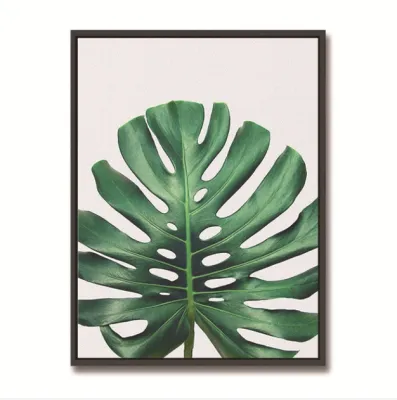
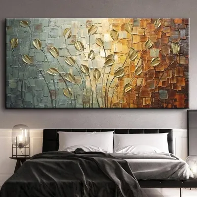
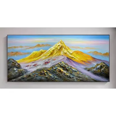
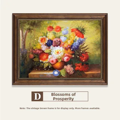
Prices are valid at publication and may change. Please refer to the product page for the latest price.
Evaluating the color palette is the first step in this process. A minimalist home typically features a neutral base of whites, creams, greys, or soft beiges. Your artwork should either harmonize with these tones or introduce a single, deliberate accent color. Negative space—the empty area surrounding the main subject of the painting—is equally important. This empty space gives the eyes a place to rest, preventing the room from feeling visually overwhelming.
Visual weight and texture also play crucial roles in uncluttered spaces. In a room with minimal furniture, every object carries significant visual presence. A heavy, dark painting can easily overpower a light-filled living room, while an overly faint print might disappear entirely. To add depth without introducing visual noise, look for subtle textures within the artwork itself, such as the natural grain of watercolor paper, matte canvas finishes, or delicate brushstrokes.
Finally, align the mood of the artwork with your home’s architectural lines and lighting. Singaporean homes often feature clean, linear architecture, built-in cabinetry, and recessed lighting. Your framed art should complement these structural elements. For instance, vertical frames can accentuate high ceilings, while horizontal pieces can make a narrow dining area feel wider. Consider how natural light from balconies or large windows interacts with the art throughout the day, as well as how artificial spotlights highlight the frame’s texture and color.
Framed Painting Styles That Complement Minimalist Decor
Minimalism does not mean sterile or devoid of personality. It is about choosing styles that align with your personal taste while respecting the spatial flow of your home. By exploring open-ended style categories, you can identify the aesthetic direction that best complements your existing furniture and decor.

Abstract and Geometric Compositions
Abstract and geometric art uses simplified shapes, lines, and color fields to evoke emotion and structure. In a minimalist setting, color-blocked pieces with clean divisions or soft, overlapping shapes create a sense of order and calm. These compositions add visual interest to plain walls without introducing the chaotic details of traditional representational art.
When evaluating geometric patterns, focus on structural balance. Look for designs that balance bold forms with ample breathing room, ensuring the shapes do not compete with the clean lines of your furniture. The interaction of simple shapes can create a dynamic focal point that grounds the entire room.
Scale is critical when dealing with geometric patterns. Large-scale geometric art works beautifully as a single focal point, drawing the eye and defining a space. Conversely, small, repetitive geometric patterns can quickly become visually busy, mimicking the clutter we want to avoid. Opt for larger, simpler shapes that make a quiet statement rather than intricate, complex patterns that demand too much cognitive attention.
Line Art and Continuous Line Drawings
Line art, particularly continuous line drawings of figures, faces, or abstract forms, is a staple of modern minimalist decor. The beauty of this style lies in its simplicity. By using a single, unbroken line to represent a subject, these drawings capture the essence of a form with maximum restraint.
When selecting line art, pay close attention to the stroke weight. Thin, delicate lines offer a subtle, elegant look that blends seamlessly into the background. Thicker, bolder strokes create a stronger graphic impact, making the artwork a more pronounced focal point. Ensure there is sufficient contrast between the line color—often black, charcoal, or deep brown—and the background paper or matting to make the artwork pop without feeling harsh.
Thematic simplicity is essential to ensure the artwork aligns with the room’s overall restraint. Simple silhouettes, botanical outlines, or abstract curves work best. This simplicity allows the artwork to remain engaging when viewed up close, yet unobtrusive when you are relaxing in the space. It respects the minimalist ethos by saying more with less.
Muted Landscapes and Botanical Studies
For those who wish to bring a touch of nature indoors, muted landscapes and botanical studies are excellent choices. Unlike vibrant, highly detailed nature photography, minimalist botanical art often features isolated subjects—such as a single monstera leaf, a delicate fern, or a misty mountain ridge—set against a neutral background.
The color palette of these pieces should be desaturated, utilizing soft greens, earthy terracotta, warm ochres, or misty greys. This tonal harmony ensures the artwork complements your walls rather than clashing with them. The isolation of the subject matter creates a sense of tranquility, bringing the calming effects of nature into your urban home.
These nature-inspired pieces rely on subtle textures to create interest. The gentle grain of a watercolor wash, the soft texture of handmade paper, or the fine details of a leaf vein provide a tactile quality that warms up modern, sometimes cool-toned minimalist interiors. This organic warmth prevents the space from feeling clinical, creating a cozy, inviting sanctuary.
Selecting the Right Frame and Matting
The frame is the bridge between the artwork and your wall. Choosing the right frame materials, colors, and matting proportions is crucial to enhancing the artwork and ensuring it fits the room’s aesthetic.
For a minimalist look, thin gallery frames—typically 1.5 to 2 centimeters wide—are highly recommended. They protect and present the art without drawing attention away from it. More substantial wood borders can also work, provided they feature clean, square edges rather than ornate carvings or traditional bevels.
Natural wood frames, such as light oak, ash, or maple, add organic warmth and pair beautifully with Scandinavian or Japandi minimalist styles. Matte metal frames, particularly in black, white, or brushed aluminum, offer a sleek, industrial edge that suits modern urban apartments. Composite frames provide a lightweight, cost-effective alternative, but ensure they have a high-quality matte finish rather than a cheap, glossy plastic look.
Matting—the cardboard border surrounding the artwork inside the frame—is a powerful tool for creating breathing room. A wide mat, often 5 to 10 centimeters, elevates the artwork, making even a small print look gallery-worthy. It forces the eye to focus on the image and adds a clean, professional border that enhances the minimalist aesthetic. For some abstract or full-bleed prints, a float-mounting technique, where the art appears to hover inside the frame without a mat, can also create a stunning, modern effect.
Glazing protects your art from dust and moisture, which is particularly important in Singapore’s humid climate. Standard glass is cost-effective but can produce significant glare, especially when placed opposite windows. Acrylic glazing is lighter, shatterproof, and often comes with anti-reflective or UV-protective coatings. While acrylic can be more prone to scratching during cleaning, its lightweight nature makes it ideal for larger frames.
Sizing, Placement, and Layout Strategies
Determining the correct scale and arrangement for your specific wall space and furniture layout is essential to maintaining a balanced, uncluttered look.
A common mistake in minimalist design is using artwork that is too small for the wall. A single, large-scale statement piece is often the most effective way to dress a wall while maintaining a clean look. When hanging art above a sofa, console, or bed, the frame should ideally span about two-thirds to three-quarters of the furniture’s width. This creates a balanced, cohesive unit rather than a disconnected floating frame.
If you prefer multiple pieces, keep the layout highly structured. A symmetrical grid, such as a 2×2 or 3×2 arrangement, with identical frames and consistent spacing of 5 to 8 centimeters apart, maintains a clean, orderly feel. If opting for an organic, asymmetrical layout, limit the color palette of both the frames and the artwork to maintain visual cohesion. Keep the spacing tight and deliberate to prevent the arrangement from looking chaotic.
Art should always be hung at eye level, which is generally considered to be around 145 to 150 centimeters from the floor to the center of the artwork. If you are hanging art above furniture, leave a gap of 15 to 25 centimeters between the bottom of the frame and the top of the furniture. In Singaporean homes with standard ceiling heights, keeping these proportions in mind ensures the art feels grounded and integrated into the room’s overall flow.
For heavy frames, suspended loads, or installation on concrete walls, safety is paramount. Ensure you use appropriate wall plugs, heavy-duty anchors, or consult a qualified professional installer to prevent damage or injury.
Sourcing and Evaluating Framed Paintings
Finding the suitable painting with frame involves comparing ready-made options against custom framing services and evaluating the quality of the materials.
Ready-made framed art is convenient and budget-friendly, making it a popular choice for quick styling. However, custom framing services offer flexibility, allowing you to choose the exact frame profile, matting width, and glazing type to suit your space. If you have a unique print or want to ensure a precise fit for a specific wall, investing in custom framing is often worth the extra cost.
When purchasing a framed painting, inspect the quality of the materials upon delivery. Look for giclée prints on acid-free, archival-grade paper, ideally 200 gsm or heavier, to ensure the colors remain vibrant and the paper does not yellow over time. Check the frame joinery at the corners; the seams should be tight, flush, and free of gaps. The backing should be neatly sealed to prevent dust and humidity from entering.
Framed art can be fragile, so it is essential to review the seller’s shipping protections and return policies before purchasing. Ensure the seller uses robust packaging, such as corner protectors and bubble wrap, to prevent damage during transit. In Singapore, ready-made framed prints can range from S$50 for smaller pieces to S$300 or more for large-scale works. Custom framing services typically start around S$100 and can scale up depending on the size, materials, and glazing options chosen.
Frequently Asked Questions (FAQ)
Can I mix different frame colors in a minimalist room?
Yes, you can mix frame colors, but it must be done with intention to avoid visual clutter. To maintain a minimalist aesthetic, limit your selection to two complementary finishes, such as matte black and natural oak, or matte white and light wood. Keep the frame profiles identical in width and depth to create a unifying element. Additionally, ensure the artwork within the frames shares a cohesive color palette or theme, which helps tie the different frame colors together seamlessly.
How do I prevent framed paintings from fading in direct sunlight?
To protect your framed paintings from UV damage and fading, avoid hanging them in spots that receive direct, intense sunlight. When purchasing or custom-framing art, look for glazing options with UV-filter ratings, such as conservation-grade glass or acrylic that blocks up to 99% of UV rays. If your room is exceptionally bright, consider using sheer curtains or UV-blocking window films, which protect both your artwork and your furniture from sun damage while maintaining a bright, airy minimalist atmosphere.

Community discussion
Share your experience or ask a question. Comments are reviewed before publication.