
Selecting the perfect A3 poster frame requires balancing the physical dimensions of your print with the visual language of the artwork itself. A frame does not merely hold a piece of paper against the wall; it acts as a visual bridge between the art and your living space. The right frame style enhances the colors, depth, and mood of your print, while an incorrect choice can distract the eye or even cause physical damage to the paper over time. By understanding how different materials, profiles, and finishes interact with various art aesthetics, you can make an informed decision that elevates your home decor.
Whether you are framing a sleek minimalist line drawing, a textured vintage travel poster, or a high-contrast urban photograph, the framing choices you make will define how the artwork is perceived. This guide walks you through the essential structural verifications, style-matching principles, and material choices to help you select the ideal A3 frame for your space.
Verifying A3 Dimensions and Structural Specifications
Before exploring aesthetic styles, you must verify the exact physical dimensions and structural limits of your framing setup. Standard A3 paper measures precisely 297 mm by 420 mm. However, the actual visible area of your print will be slightly smaller once placed inside a frame due to the “rabbet”—the inner groove that holds the glazing, artwork, and backing in place. The frame’s lip overlap typically covers 5 mm to 7 mm of the print’s outer edges. If your artwork features critical details, signatures, or text near the very edge, you must measure these margins carefully to ensure they are not obscured by the frame’s lip.
Products mentioned in this guide
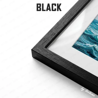
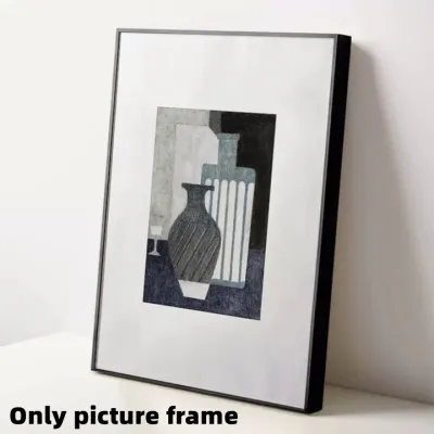
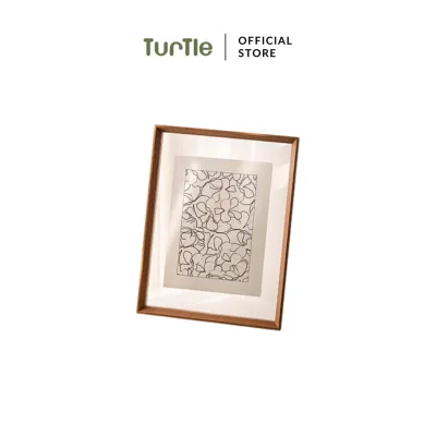



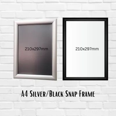
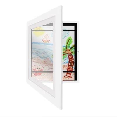
Prices are valid at publication and may change. Please refer to the product page for the latest price.
You must also decide between an exact-fit A3 frame and an oversized frame with a mat board. An exact-fit frame holds the 297 mm x 420 mm print directly against the frame edges, offering a compact and modern look. Conversely, choosing a larger frame size—such as A2 (420 mm x 594 mm)—equipped with a custom-cut mat board creates a wide border around your A3 print. This matting adds visual breathing room, drawing the eye inward and giving the artwork a more prestigious, gallery-like presentation.
Finally, consider the weight and structural integrity of the frame assembly. Glazing materials significantly affect the overall weight; traditional glass is heavy and rigid, whereas acrylic is lightweight but flexible. If you plan to hang a heavy glass-fronted frame, you must verify that the included wall mounting hardware is rated for that specific weight. For homes with concrete or masonry walls, standard plastic wall plugs and screws are necessary, whereas drywall installations require specialized toggle bolts or hollow-wall anchors. For heavy frames or installations at height, securing the frame with robust D-rings and a rated hanging wire is essential to prevent accidental falls.
Matching Frame Profiles and Finishes to Your Art Style
The visual impact of a frame is determined by its profile and surface finish. The profile refers to the physical shape of the frame molding, including its width, depth, and face shape—whether it is flat, beveled, or rounded. A thin, flat profile keeps the focus entirely on the artwork, while a wide, beveled profile adds architectural interest and physical presence to the wall.

Surface finishes alter how light interacts with the frame and how much visual weight it carries. Matte finishes absorb light, creating a soft, modern boundary that blends easily into contemporary interiors. Glossy finishes reflect light, adding a touch of glamour and high-contrast definition, though they can cause distracting reflections in brightly lit rooms. Raw, stained, or distressed wood finishes introduce organic textures and natural warmth, making them highly sensitive to the surrounding decor. Choosing the right combination involves deciding whether to harmonize the frame with the artwork’s dominant tones or create an intentional, high-contrast boundary.
Framing Minimalist and Contemporary Art
Minimalist and contemporary artworks, such as abstract line drawings, geometric prints, and modern typography, thrive on simplicity and open space. To complement these styles without overpowering them, select thin-profile metal frames or smooth, lightly finished wood frames. An ultra-thin aluminum frame in matte black, white, or brushed silver provides a crisp, clean boundary that respects the artwork’s airy composition. Light wood finishes, such as maple, birch, or pale oak, add a touch of organic warmth while maintaining a clean, Scandinavian-inspired aesthetic.
For an exceptionally modern and weightless look, consider frameless acrylic blocks or floating frames. Floating frames suspend the A3 print between two sheets of clear glazing, allowing your wall color to show through around the edges of the paper. This technique creates a beautiful sense of depth and highlights the natural texture of the paper’s deckled edges if present.
You should generally avoid heavy, ornate, or highly textured frames when displaying minimalist art. A thick, baroque-style gold frame or a heavily distressed rustic wood frame will clash with the clean lines of a contemporary print. The visual noise of an overly decorative frame competes with the simplicity of the artwork, disrupting the balanced, calm atmosphere that minimalist pieces are intended to create.
Framing Vintage, Classic, and Typography Prints
Vintage travel posters, classic botanical illustrations, retro movie prints, and traditional typography layouts benefit from frames that evoke history, warmth, and craftsmanship. For these styles, wider wood profiles with visible natural grains and warm stains—such as walnut, cherry, or antique oak—are highly effective. These materials echo the era of the artwork, adding a sense of authenticity and heritage to the display.
Ornate details, step profiles, or classic beveled edges work beautifully with vintage prints. A subtle gold or bronze metallic finish with a light patina can elevate a classic illustration, making it feel like a curated historical artifact. These decorative elements frame the artwork like a window into another time, grounding the print within traditional or transitional interior designs.
When framing vintage prints, pay close attention to color coordination between the frame finish and the paper’s undertone. Vintage papers are rarely stark white; they often feature warm cream, beige, or sepia tones. Framing a warm-toned vintage print in a cold, bright white or a modern chrome frame can make the paper look aged in an unflattering, dirty way. Instead, choose warm wood tones, soft cream matting, or muted metallic finishes that harmonize with the natural aging of the print.
Framing Industrial and High-Contrast Photography
Industrial art, urban landscapes, and high-contrast black-and-white photography require a framing style that matches their bold, graphic energy. Raw metal, dark gunmetal, matte black aluminum, or reclaimed wood with visible knots and weathering are excellent choices. These materials complement the gritty, textured, or mechanical themes often found in industrial and architectural photography.
Thick, substantial frame profiles are particularly effective for grounding bold, high-contrast images. A wide, deep box frame in a matte black finish provides a powerful visual border that contains the intense energy of a high-contrast photograph, turning the print into a dramatic focal point on your wall. The depth of a box frame also adds a professional, gallery-like dimension to the presentation.
However, you must consider the surrounding interior environment before choosing highly industrial frames. A heavy, distressed iron or rough-sawn reclaimed wood frame can look overly harsh or out of place in a room decorated with soft pastels, delicate fabrics, or traditional formal furniture. Ensure that the industrial frame style bridges the gap between the raw energy of the photograph and the existing design elements of your room, maintaining a cohesive visual flow.
Choosing Matting and Glazing for Visual Impact
Matting and glazing are critical components of the framing process that directly affect both the visual presentation and the long-term preservation of your A3 print. A mat board—the cardboard border that surrounds the artwork inside the frame—serves two purposes: it provides visual breathing room and physically separates the paper from the glazing. A single mat in a neutral tone like off-white or light gray is the standard choice for a clean, professional look. A double mat, which layers two boards to reveal a thin sliver of a secondary color, can be used to highlight a specific accent tone within the artwork. For posters where the design extends to the very edge, a “full bleed” configuration with no mat is appropriate, though you must ensure the frame assembly keeps the paper flat without direct, pressurized contact with the glazing.
Glazing options require careful evaluation based on your room’s lighting conditions and window placement. Standard clear glass or acrylic offers excellent clarity but can act like a mirror in rooms with abundant natural light or bright overhead fixtures. If you plan to hang your frame opposite a window, consider non-glare or anti-reflective glazing. Non-glare glazing has a lightly etched surface that diffuses reflections, though it can slightly soften the sharp details of the print. Anti-reflective glazing uses specialized optical coatings to minimize reflections while maintaining pristine clarity and contrast.
Preservation is another vital factor, especially for light-sensitive prints, limited-edition posters, or autographed items. Standard glazing allows ultraviolet (UV) light to pass through, which gradually breaks down paper fibers and fades ink colors over time. To protect your investment, check product specifications for UV-filtering capabilities. High-quality framing glass or acrylic can filter out up to 99% of harmful UV rays, ensuring your artwork remains vibrant and undamaged even when exposed to indirect sunlight.
Building Your Shortlist: Pre-Purchase Verification Checks
To ensure a seamless framing experience and avoid the hassle of returns, compile a concrete checklist to validate your selected frame before finalizing your purchase. First, physically measure your A3 print with a reliable ruler rather than relying solely on the printed dimensions on the packaging. Minor printing and trimming variances can occur, and knowing the exact millimeter measurements will help you confirm that the frame’s internal rabbet dimensions or the mat board’s opening will fit your print perfectly.
Second, confirm the material specifications of the backing board and mat board. Standard cardboard or cheap paper mats contain lignin, which releases harmful acids over time, leading to yellowing, spotting (foxing), and brittle paper. Always verify that the backing board and mating are labeled as “acid-free” or “archival grade” to guarantee the long-term preservation of your print.
Third, inspect the mounting hardware and hanging mechanism. Look for sturdy, pre-installed hardware such as heavy-duty sawtooth hangers, D-rings, or tension-wire systems. Ensure the mounting style is compatible with your wall type and hanging preferences. For instance, hanging a heavy frame on a concrete wall requires appropriate masonry anchors, while plaster or drywall may require specialized hooks that distribute weight evenly. If you are hanging a heavy frame at height, prioritize secure, multi-point D-ring attachments over simple adhesive strips, which are prone to failing under humidity and temperature fluctuations.
Finally, review the retailer’s return and replacement policies, particularly regarding fragile components. Glazing is highly susceptible to cracking or scratching during transit, and wood frames can occasionally warp due to environmental changes in storage. Ensure the seller provides a clear, hassle-free policy for replacing damaged glazing or warped frames upon delivery, giving you peace of mind as you finalize your purchase.
Frequently Asked Questions (FAQ)
Can I fit an A3 print into a smaller frame using a mat?
An A3 print cannot physically fit into a smaller frame, such as an A4 frame, even with a mat. A mat board is designed to sit around the perimeter of the artwork, which increases the overall dimensions of the frame required. To frame an A3 print (297 mm x 420 mm) with a mat, you must select a larger frame size, such as an A2 frame (420 mm x 594 mm) or a custom-sized frame, with a mat opening cut precisely to match the A3 print dimensions.
How do I keep an A3 paper print flat inside the frame?
To keep an A3 print flat without causing permanent damage, avoid using standard household tapes, glue sticks, or spray adhesives, which contain acids that ruin paper. Instead, secure the print to the backing board or mat using acid-free framing tape (applying a hinge mount) or archival photo corners. Additionally, ensure the frame’s backing board is rigid and that the backing tabs or turn buttons apply even, firm pressure across the rear of the frame to prevent the paper from buckling or waving under humidity changes.

Community discussion
Share your experience or ask a question. Comments are reviewed before publication.