
Commandment Co has established a distinct niche in the contemporary home decor landscape, offering wall art that balances quiet minimalism with expressive, typography-driven messaging. Their design aesthetic is defined by clean layouts, botanical elements, and a muted, sophisticated color palette that feels both modern and grounding. By focusing on themes of hope, mindfulness, and quiet reflection, the brand creates visual anchors that do more than fill empty wall space; they establish a deliberate mood within a home.
Understanding how to integrate these pieces requires looking closely at their visual DNA. Whether you are decorating a compact apartment or a spacious landed home in Singapore, the brand’s signature style offers a versatile foundation. By examining their design language, framing options, and thematic variations, you can select pieces that harmonize with your existing furnishings and architectural features.
The Signature Design Language of Commandment Co
To understand the appeal of commandment co, one must analyze the specific design choices that define their collections. The brand does not rely on loud, chaotic imagery or neon color schemes. Instead, their visual identity is built on restraint, clarity, and organic warmth, making their pieces highly adaptable to modern living environments.
Products mentioned in this guide

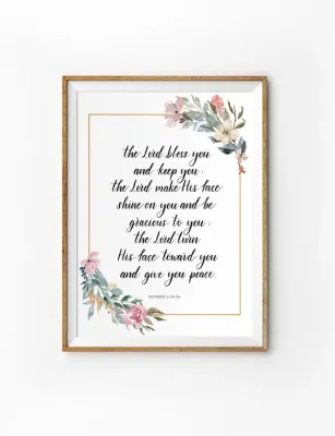
Prices are valid at publication and may change. Please refer to the product page for the latest price.
Color Palettes and Tonal Choices
The brand’s color strategy relies heavily on muted earth tones, warm neutrals, and classic monochromatic schemes. You will frequently find soft beiges, warm sands, sage greens, and terracotta tones serving as backdrops for their designs. High-contrast black-and-white photography and crisp charcoal typography are also central to their catalog. These color choices are highly intentional; they prevent the artwork from overwhelming a room, allowing the pieces to sit comfortably alongside various wood tones, fabrics, and wall colors.
Dominant Themes and Motifs
At the heart of the brand’s catalog is a strong emphasis on minimalist typography. Words, quotes, and literary fragments are treated as primary visual elements, using clean sans-serif fonts or elegant, flowing scripts. These typographic elements are frequently paired with delicate botanical illustrations—such as pressed ferns, eucalyptus leaves, or abstract floral outlines—and simple geometric shapes. Urban landscapes and soft-focus nature photography also make regular appearances, offering a sense of quiet escapism that appeals to urban dwellers.
Texture and Medium Preferences
The physical medium of a print significantly influences how light interacts with the artwork and how the colors are perceived. The brand typically utilizes high-quality, matte fine art paper and textured canvas surfaces. Matte paper eliminates harsh reflections, ensuring that fine typographic details remain legible from multiple angles under ambient room lighting. Textured canvas options add physical depth and a tactile quality to abstract and botanical prints, giving them a more organic, gallery-like presence on the wall.
Matching Commandment Co Aesthetics to Your Interior Style
Integrating new artwork into an established space is a matter of balancing visual weight, color harmony, and architectural style. The minimalist and literary nature of commandment co pieces makes them exceptionally suited for several prominent interior design movements, though their final impact depends heavily on your specific room conditions.

Minimalist and Scandinavian Spaces
Scandinavian and minimalist interiors prioritize light, simplicity, and functional beauty. The brand’s use of ample negative space—the empty areas surrounding a central design or text—complements these uncluttered environments perfectly. A single, understated typographic print or a pair of simple botanical sketches can enhance the airy feel of a room without disrupting the sense of calm. In these spaces, light-colored wooden frames, such as oak or ash, help maintain a soft, natural connection with the surrounding decor.
Modern and Contemporary Interiors
For homes featuring sleek lines, low-profile furniture, and a mix of industrial materials, larger abstract prints or bold black-and-white photography can serve as sophisticated focal points. Placing a large-scale, high-contrast print on a prominent accent wall helps anchor contemporary furniture arrangements, such as a low-slung leather sofa or a minimalist dining set. The clean geometry often found in the brand’s layouts mirrors the structured lines of modern architecture, creating a cohesive visual rhythm throughout the space.
Industrial and Eclectic Rooms
In industrial or eclectic settings, the challenge is often balancing raw, rugged textures with polished design elements. You can achieve this by pairing the brand’s clean, structured prints with rustic framing materials, such as reclaimed wood or dark, matte-black metal. Layering different art styles—such as placing a delicate botanical print next to an industrial metal light fixture or a vintage brick wall—creates a curated, lived-in aesthetic. The key is using the art to soften the harder edges of industrial materials like concrete and exposed steel.
Condition-Based Styling
While these design pairings offer a helpful starting point, the actual aesthetic success of your wall art depends on room-specific variables. Natural light exposure is a critical factor; a room with bright, direct sunlight will render colors differently than a space relying primarily on warm LED lighting. Wall paint colors also play a major role—a muted beige print may blend too seamlessly into a similarly toned wall, losing its visual impact, whereas placing it against a deep forest green or charcoal wall creates a striking, sophisticated contrast. Always consider the scale of your existing furniture to ensure the artwork neither gets lost nor completely dominates the wall.
Top Commandment Co Wall Art Picks by Room and Vibe
Selecting the right piece involves matching the visual energy of the artwork to the primary function of the room. Communal spaces often call for engaging, high-impact pieces, while private sanctuaries benefit from quieter, more restorative imagery.
Living Room and Entryway Statements
The living room and entryway are the primary public zones of the home, making them ideal locations for statement-making art. When selecting a piece for these areas, pay close attention to scale and visual weight. A common design guideline is to choose artwork that covers approximately two-thirds to three-quarters of the width of the furniture below it, whether that is a large living room sofa or a sleek entryway console table.
For these high-visibility spaces, framing choices are crucial. Opting for professional, clean-lined frames with wide mat boards can elevate a simple print, giving it a formal, gallery-worthy appearance. It is equally important to leave adequate breathing room around the frame; crowding a large piece with wall-mounted sconces, shelving, or tall indoor plants can create visual clutter and detract from the artwork’s impact.
Bedroom and Study Retreats
Bedrooms and home studies serve as personal retreats where the visual environment directly influences your mental state. In the bedroom, applying basic color psychology can help foster a restful atmosphere. Opt for softer, low-contrast palettes—such as muted blues, gentle sages, and warm greys—and nature-inspired motifs. Placing a calming botanical print or a soft abstract landscape above the headboard encourages relaxation. Avoid highly stimulating, chaotic, or high-contrast visuals in these areas, as they can inadvertently increase visual alertness.
In a study or home office, the goal is to foster focus and quiet inspiration. Typographic prints featuring thoughtful, encouraging quotes or clean geometric patterns work exceptionally well above a desk. However, be mindful of placement relative to your workspace lighting. Position the artwork to avoid direct glare from desk lamps or nearby windows, which can make glass-covered prints difficult to view and cause eye strain during long working hours.
Hallways and Transitional Spaces
Hallways, stairwells, and transitional zones are often overlooked, yet they present excellent opportunities for creative display. Because these spaces are typically narrow, they are perfect for smaller format prints arranged in a cohesive gallery wall. To maintain a sense of order rather than chaos, establish a unifying element, such as using identical frame colors, matching mat board widths, or adhering to a strict grid layout.
In narrow corridors, avoid oversized pieces that feel physically imposing as you walk past. Instead, align the center of your artwork arrangement with the average eye level—typically around 145 to 150 centimeters from the floor. This creates a comfortable viewing height and prevents the space from feeling cramped.
The following table outlines how to map different visual weights and color tones to ideal room types to help you plan your layout:
| Art Style & Visual Weight | Primary Color Tones | Ideal Room Placement | Styling Purpose |
|---|---|---|---|
| Bold Typographic (High Weight) | High-contrast Black & White | Entryway, Living Room | Creates an immediate focal point and sets a welcoming tone. |
| Delicate Botanical (Light Weight) | Sage Green, Soft Beige, White | Bedroom, Guest Room | Promotes relaxation, calm, and a connection to nature. |
| Abstract Geometric (Medium Weight) | Terracotta, Ochre, Charcoal | Home Office, Study | Stimulates focus and creative thinking without distraction. |
| Soft Landscape (Medium Weight) | Muted Blues, Warm Sands | Living Room, Dining Area | Adds depth and a sense of open space to communal areas. |
Installation and Care Checklist for Your Wall Art
Proper installation and ongoing maintenance are essential to preserving the structural integrity of your walls and the pristine condition of your commandment co prints. Because wall art is a long-term investment, taking the time to secure and protect each piece is highly recommended.
Wall Structural Integrity
Before driving any nails or screws into your wall, you must identify the structural material you are working with. In Singapore, residential walls are commonly constructed from solid concrete, brick, or hollow drywall partitions. Standard adhesive hooks or simple nails may suffice for very light, unframed prints, but heavier framed pieces require appropriate anchors. Concrete walls require masonry drill bits and plastic wall plugs, while drywall partitions necessitate specialized toggle bolts or threaded anchors to distribute weight safely.
Hanging Hardware and Safety
Always match the total weight of your framed artwork to the rated weight capacity of your chosen hanging hardware. Utilizing sturdy D-rings, heavy-duty wire, or dedicated picture rail systems ensures the piece remains securely mounted over time. If you are working at height, dealing with exceptionally heavy or oversized glass frames, or if you are uncertain about your wall’s structural composition, stop immediately and consult a qualified professional installer. Ensuring a secure mount prevents damage to both your home and the artwork.
Environmental and Lighting Factors
Environmental conditions play a massive role in the longevity of fine art. Prolonged exposure to direct, intense sunlight will cause UV fading, breaking down the pigments in the ink and yellowing the paper over time. Position your artwork on walls that do not receive direct sunbeams. Furthermore, Singapore’s high relative humidity can pose risks to paper and canvas. Avoid hanging non-protected prints or non-sealed canvases in high-humidity zones, such as unventilated bathrooms or semi-outdoor balcony areas, to prevent moisture damage, warping, and mold growth.
Glare and Illumination
The way your art is illuminated affects how its colors and details are perceived. If your print is framed behind standard glass or acrylic, position it away from windows or bright overhead light sources that cause distracting glare. For dedicated illumination, consider installing adjustable picture lights or track lighting with warm, low-wattage LED bulbs. Ensure any spotlights are positioned at a 30-degree angle to minimize glare while beautifully highlighting the textures of matte paper or canvas.
Frequently Asked Questions (FAQ)
Does Commandment Co offer custom framing or ready-to-hang options?
Commandment Co typically provides a variety of purchasing formats to suit different preferences. Buyers can often choose between unframed fine art prints—which are shipped rolled in protective tubes—and fully framed, ready-to-hang options. Framed pieces generally feature clean, minimalist wood or metal frames in classic finishes like black, white, or natural oak, complete with pre-installed hanging hardware for immediate installation upon delivery.
How do I safely clean and maintain canvas or fine art paper prints?
To clean your prints safely, gently dust the surface and the frame using a clean, dry, soft microfiber cloth or a feather duster. Never use liquid cleaners, glass sprays, chemical solvents, or damp cloths directly on exposed canvas or paper prints, as moisture can permanently dissolve inks and warp the fibers. Always refer to any specific care instructions provided by the manufacturer on the product packaging before attempting any deep cleaning.

Community discussion
Share your experience or ask a question. Comments are reviewed before publication.