
Choosing how to display your cherished memories or art pieces is a key step in personalizing your living space. The arrangement of your wall decor establishes the visual rhythm, dictates the room’s atmosphere, and influences how visitors interact with your home. When planning a gallery wall, the decision typically comes down to two primary design philosophies: the structured grid layout and the organic collage layout. Both styles offer distinct advantages, but they require very different approaches to photo selection, spatial planning, and physical installation.
The choice between a grid and a collage multi photo frame layout depends primarily on your photo size consistency, wall space geometry, and desired visual tone. Grid layouts offer structured symmetry and a modern aesthetic, requiring uniform frames and precise alignment. Collage layouts allow for eclectic, mixed-size arrangements that forgive minor alignment errors and suit irregular spaces. Evaluating your existing photo collection and physical wall constraints will determine which arrangement best serves your display goals.
To make an informed decision, you must look beyond the frames themselves and analyze the relationship between your images and the architectural features of your room. A mismatched layout can make a beautiful collection of photos look cluttered, while an overly rigid grid can make casual family snapshots feel cold and clinical. By understanding the structural demands and aesthetic outcomes of each style, you can create a balanced, visually engaging display that enhances your home’s interior design.
Products mentioned in this guide
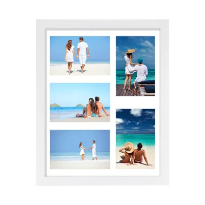
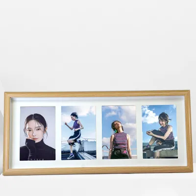

Prices are valid at publication and may change. Please refer to the product page for the latest price.
Understanding Grid and Collage Layout Structures
Grid layouts are defined by their mathematical precision, relying on uniform frame sizes, equal spacing, and strict horizontal and vertical alignment. This style mimics the clean, curated look of modern art galleries, where the structure of the display is just as important as the art itself. In a grid, every frame is identical in color, material, and dimension, and the gaps between them remain highly consistent. This creates a cohesive, singular visual unit that commands attention through repetition and order.
In contrast, collage layouts embrace variation, utilizing mixed frame sizes, varied orientations, and organic spacing to create a dynamic, highly personalized display. Instead of following a rigid mathematical formula, a collage relies on visual balance and intuitive placement. Frames can be placed at varying heights, and the gaps between them do not need to be uniform, allowing for a more relaxed, storytelling approach to wall decor. This style is highly adaptable, making it easy to mix different frame styles, textures, and colors within a single arrangement.
The way these two layouts distribute visual weight across your wall is fundamentally different. A grid layout distributes visual weight evenly across the entire arrangement, as no single frame or photo is designed to stand out more than the others. This creates a sense of calm and predictability, as the eye moves smoothly from one image to the next. A collage layout, however, often centers around a large anchor piece or a central focal point, with smaller frames radiating outward. This draws the viewer’s eye to a specific starting point before allowing them to explore the surrounding details.
These structural differences translate directly into the overall aesthetic impact of the room. Grid layouts project a minimalist, orderly, and sophisticated vibe that pairs exceptionally well with contemporary, industrial, or mid-century modern interiors. Collage layouts, on the other hand, offer a cozy, eclectic, and lived-in feel that complements bohemian, rustic, or traditional decor styles. A collage feels deeply personal, suggesting a collection that has been lovingly gathered and curated over many years.
Matching Your Photo Collection to the Layout
Before purchasing any frames, you must carefully assess the dimensions and aspect ratios of the photos you intend to display. If your collection consists of photos that are all the same size and orientation—such as a series of portrait-oriented family portraits or square travel landscapes—a grid layout is the natural choice. However, if you are working with a mix of portrait and landscape orientations, or photos of varying physical sizes, a collage layout is far more accommodating. Forcing mixed-size photos into a grid often requires extensive cropping, which can ruin the composition of your images.

The themes and color palettes of your photos also play a critical role in determining the best layout style. Grid layouts are highly sensitive to visual discord; they work best with cohesive themes, professional photography prints, or black-and-white image sets. When the subject matter and color tones are unified, the grid structure enhances their collective impact. Collage layouts are much more forgiving of diverse, candid, or highly colorful memories. The eclectic nature of a collage allows you to display a colorful vacation snapshot next to a vintage black-and-white family photo without the contrast feeling jarring.
Future expansion is another practical consideration that should influence your choice of layout. If you plan to add more photos to your display over time, a collage layout offers exceptional flexibility. You can easily introduce new frames of different sizes to the outer edges of the arrangement without disrupting the existing balance. Expanding a grid layout, however, is a much more rigid process. It requires sourcing identical frames and having enough continuous wall space to add an entire new row or column symmetrically, which can be difficult if the original frame style is discontinued.
If you have your heart set on a grid layout but own photos of varying sizes, matting and cropping can help bridge the gap. Using uniform mats with identical outer dimensions but different inner window sizes allows you to standardize differently sized photos for a grid. For example, you can place a small four-by-six-inch photo and a larger five-by-seven-inch photo into identical eleven-by-fourteen-inch frames by customizing the mat board openings. This technique preserves the clean, symmetrical lines of the grid while protecting your original photos from aggressive cropping.
Evaluating Wall Space and Installation Requirements
The physical characteristics of your wall space will often dictate which multi photo frame style is viable. Large, wide, and unbroken walls provide an ideal canvas for expansive grid layouts, where the symmetry of the frames can act as a major architectural feature. Conversely, awkward wall spaces, such as the angled walls along a staircase, narrow hallways, or tight corners, are highly suited to flexible collage arrangements. A collage can flow naturally around architectural obstacles, light switches, or furniture, turning a challenging layout into a creative design feature.
In terms of installation, the two styles demand very different levels of precision and patience. Grid layouts are notoriously challenging to install because they require exact measuring, leveling, and uniform spacing to look correct. Even a minor alignment error of a few millimeters can ruin the entire visual effect, making the grid look crooked and sloppy. Collage layouts are far more forgiving of minor alignment errors and allow for freehand placement. Because the spacing is organic rather than mathematical, a slight shift in a frame’s position is rarely noticeable to the casual observer.
Your budget and frame sourcing strategy should also align with your chosen layout. Sourcing frames for a grid layout typically requires purchasing multiple identical frames at the same time, which can represent a significant upfront cost, especially if you opt for high-quality wood or metal. If you are on a budget, a collage layout allows you to be much more resourceful. You can utilize mismatched, vintage, or repurposed frames collected over time from different sources, painting them a single color to unify them or embracing a completely eclectic look.
Finally, consider the long-term impact on your walls and the risk of repositioning. Because grid layouts rely on strict symmetry, moving even a single frame requires shifting the entire arrangement, which leaves behind a series of visible nail holes and wall damage. This makes careful initial planning essential. For heavy frames, plasterboard walls, or installations at height, such as high stairwells, ensure you use appropriate wall anchors rated for the frame weight, or consult a qualified professional installer to prevent falling hazards and avoid structural damage to your home.
Decision Framework: When to Choose Grid or Collage
To finalize your choice, it helps to evaluate your project against a clear decision framework. You should choose a grid layout if you possess a collection of photos with uniform sizes and cohesive color tones, prefer a clean, minimalist, or modern aesthetic, and have a large, flat wall that allows for precise, symmetrical alignment. This option is ideal for those who appreciate architectural order and have the patience to measure and level each frame with high precision during the installation process.
On the other hand, you should opt for a collage layout if your photos vary significantly in size, orientation, and subject matter, and you want to project a relaxed, cozy, or eclectic vibe. A collage is also a highly practical choice if you are decorating an irregular wall space, such as a stairwell, a narrow hallway, or the area around a doorway, where a rigid grid simply will not fit. This style allows your display to grow organically as you collect new memories over the years.
There are situations where neither layout may be the right fit for your space. If your wall is exceptionally small, crowding it with multiple frames can make the room feel cramped and cluttered. Similarly, if your photos lack any unifying element or are of low resolution, grouping them together may highlight these deficiencies. In such cases, you might want to consider a single large statement piece of wall art, or a high-quality digital frame that cycles through your photo collection without taking up physical wall space.
Before driving any nails into the wall, verify your living situation and local guidelines. If you are renting your home or are restricted from making multiple nail holes, both layouts will require alternative mounting solutions, such as adhesive hanging strips. However, keep in mind that grids are far less forgiving of the slight positioning errors that often occur when using adhesive strips. If you cannot make permanent holes, a smaller collage layout or a picture ledge shelf may offer a safer, more adjustable alternative to a complex grid.
Frequently Asked Questions (FAQ)
Can I mix grid and collage layouts on the same wall?
Yes, you can successfully combine both styles on a single wall by using a structured grid section as an anchor while allowing a collage arrangement to branch out organically from one side. For example, you might place a neat three-by-two grid of uniform family portraits in the center of the wall, and then surround it with smaller, mismatched frames containing candid snapshots, travel tickets, or small art prints. This hybrid approach provides the visual stability of a grid while retaining the playful, storytelling nature of a collage.
To prevent a mixed display from looking cluttered or chaotic, it is helpful to maintain consistent frame colors, materials, or matting. For instance, using only black wooden frames or matching white mats across both the grid and collage sections will unify the display. This shared design element ties the different shapes and sizes together, ensuring the overall arrangement looks intentional and cohesive rather than like an accidental jumble of frames.
How do I plan a multi photo frame layout before making nail holes?
To avoid unnecessary wall damage and frustration, you should always plan your layout before picking up a hammer. One of the most effective methods is to trace each of your frames onto sheets of kraft paper or cardboard, cut out the templates, and label them. You can then use painter’s tape to stick these paper templates to the wall, allowing you to experiment with different arrangements, spacing, and heights without making a single hole. This visual aid helps you see exactly how the layout interacts with your furniture and room lighting.
Another excellent preparation step is to arrange the physical frames on the floor directly in front of the target wall. This allows you to test the spacing, visual balance, and color distribution of your photos from a standing perspective. You can easily swap frames around, adjust the gaps, and step back to evaluate the composition. Once you are fully satisfied with the floor arrangement, you can measure the distances between the frames and transfer those exact measurements to your wall templates.

Community discussion
Share your experience or ask a question. Comments are reviewed before publication.