
Choosing the right wall art painting style requires matching the artwork’s visual weight, color palette, and structural lines with your room’s existing furniture, lighting, and architectural layout. By identifying your dominant decor profile—whether it is a sleek modern apartment or a cozy, nature-inspired space—you can select art that either harmonizes with your current setup or provides an intentional, eye-catching focal point. The right piece does not merely fill an empty wall; it unifies the room’s design elements and reflects your personal taste.
Assess Your Existing Interior Design and Room Vibe
Before browsing galleries or online marketplaces, take a step back to evaluate the structural and stylistic foundation of your room. Look closely at your dominant furniture pieces, noting their materials, shapes, and textures. A room filled with clean-lined, low-profile furniture suggests a contemporary or minimalist aesthetic, whereas plush fabrics, ornate wooden tables, and soft curves lean toward traditional or transitional styles.
Consider the architectural features of your living space. High-rise apartments, HDB flats, and modern condominiums often feature open-plan layouts where the living room, dining area, and kitchen flow into one another. In these spaces, the wall art painting you choose must work in harmony with the surrounding zones rather than competing with them.
Products mentioned in this guide

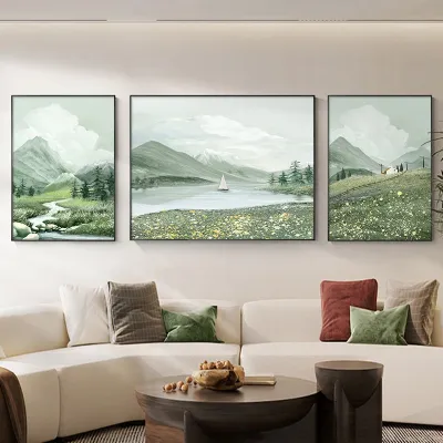


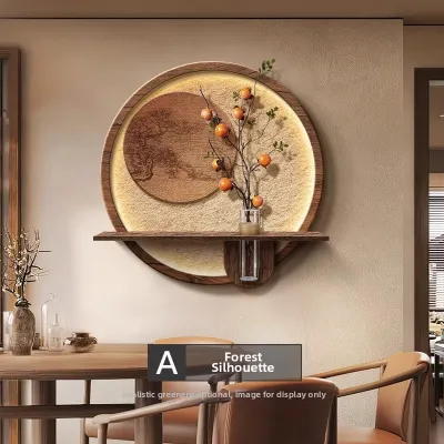



Prices are valid at publication and may change. Please refer to the product page for the latest price.
Evaluate the intended mood and daily function of the room. A bedroom is a sanctuary for rest, making calm, serene compositions highly appropriate. A lively dining room or entryway, on the other hand, can handle more energetic, conversation-starting pieces.
Recognize the balance between visual clutter and clean lines in your current setup. If your room already features patterned cushions, open shelving, and diverse textures, a busy painting can cause sensory overload. Conversely, a minimalist room with clean lines might require a textured canvas to inject warmth and depth.
Analyze Your Color Palette and Lighting Conditions
To ensure your wall art painting harmonizes with your home, map out the existing color hierarchy of the room. Identify the dominant color (usually on the walls), the secondary color (found in large furniture, rugs, or curtains), and the accent tones (present in cushions, vases, and small decor).

Decide whether you want the artwork to blend seamlessly or stand out as a deliberate focal point. A complementary approach uses shades from the same color family as your walls and furniture, creating a serene, cohesive atmosphere. A contrasting approach introduces a bold accent color from the opposite side of the color wheel to draw the eye immediately to the wall.
Observe how natural sunlight and artificial lighting affect color perception and glare throughout the day. Bright, direct tropical sunlight can wash out delicate watercolors and cause heavy glare on glass-fronted frames. If your wall receives intense daylight, consider a matte canvas print or non-reflective glass to preserve the artwork’s visibility.
Evaluate your artificial lighting setup. Warm track lights or spotlights can enhance the rich textures of an oil painting, while cool, diffused ceiling lights might make abstract pieces look crisp and modern. If you plan to install dedicated picture lights to highlight your wall art painting, verify the fixture’s voltage, base, wattage limits, and electrical certification. For any fixed wiring or work at height, always isolate the power and hire a qualified professional.
Match Wall Art Painting Styles to Your Decor Profile
A successful art selection acts as a bridge between your personal taste and the structural reality of your home. Rather than choosing a piece solely because it looks appealing in isolation, consider how its visual language speaks to your furniture. In open-concept layouts, wall art serves as an excellent tool for spatial zoning, visually separating a dining nook from a living area without the need for physical partitions.
Modern, Abstract, and Minimalist Styles
- Mid-century modern and industrial pairings: Bold geometric abstracts and high-contrast canvases pair exceptionally well with the clean lines of mid-century modern credenzas or the raw textures of industrial brick and concrete walls.
- Balancing busy spaces: If your room features intricate patterns or heavy textures, a minimalist line art piece or a sparse, monochromatic abstract painting provides a resting point for the eyes.
- Color alignment: When selecting high-contrast abstract art, verify that the dominant colors in the painting align with your room's existing accent palette to maintain visual harmony.
Botanical, Landscape, and Classic Styles
- Organic and cozy themes: Botanical prints, lush green landscapes, and soft watercolor paintings naturally complement rustic, bohemian, or Scandinavian-chic interiors that emphasize natural wood, rattan, and indoor plants.
- Adding depth to formal areas: Classic oil-style paintings or vintage landscape reproductions bring a sense of history, warmth, and sophistication to formal dining rooms or study spaces.
- Framing compatibility: Ensure that the frames chosen for classic art styles do not clash with modern architectural elements. An ornate gold frame can look stunning in a traditional setting but might feel out of place against ultra-modern, minimalist cabinetry unless used as a deliberate eclectic statement.
Finalize Size, Placement, and Framing Choices
Calculate the proportional wall space to ensure your wall art painting fits harmoniously. As a general guideline, artwork should cover roughly two-thirds to three-quarters of the available wall space that is not blocked by furniture or architectural trim.
When hanging art above a sofa, console, or bed, aim for the piece to be about two-thirds the width of the furniture below it. This prevents the art from looking awkwardly small or visually overwhelming.
Decide between a single statement piece and a curated gallery wall. A large, single canvas creates a clean, dramatic focal point, whereas a gallery wall allows you to mix smaller prints, sketches, and textures for a more personalized, eclectic feel.
Select frame materials and matting that reinforce both the artwork and the room’s aesthetic. Thin, black metal frames suit modern and minimalist styles, while warm oak or walnut frames complement botanical and classic pieces. Whether you are investing S$100 in a simple print or S$1,000 in an original canvas, proper framing protects your investment.
Take safety precautions during installation, especially when dealing with heavy frames or working at heights. For concrete walls common in high-rise apartments, use appropriate wall plugs and heavy-duty anchors. If you are hanging large, heavy frames or installing overhead pieces, consult a qualified professional to ensure secure mounting and prevent falling hazards.
Frequently Asked Questions (FAQ)
Can I mix different wall art painting styles in the same room?
Yes, mixing different wall art painting styles is highly effective if you establish a unifying element to tie them together. You can achieve cohesion by using a consistent color palette across different pieces, choosing identical frame styles, or focusing on a single subject matter depicted in different mediums. Balance the visual weight by spacing out bold, high-contrast abstract pieces so they do not crowd softer, representational landscapes. However, if your room’s baseline decor is already filled with diverse patterns, textures, and colorful accessories, sticking to a single, consistent art style is usually safer to avoid visual chaos.
How do I know if a wall art painting is too big or too small for my wall?
A wall art painting is likely too small if it is less than half the width of the furniture piece positioned directly below it, making it look lost on the wall. To ensure proper scaling, aim for the artwork to measure between 60% and 75% of the furniture’s total width. For vertical placement, the center of the painting should ideally hang at eye level, which is roughly 140 to 145 centimeters from the floor in standard living spaces. If you are creating a gallery wall, treat the entire grouping as a single visual unit and apply the same scaling rules, keeping the spacing between individual frames tight and consistent—typically around 5 to 8 centimeters apart.

Community discussion
Share your experience or ask a question. Comments are reviewed before publication.