
Selecting the right photo frames is more than a minor decor decision; it is the final touch that bridges your personal memories with your home’s architectural identity. A mismatched frame can disrupt the visual flow of an otherwise cohesive room, while a well-chosen profile enhances both the artwork and the surrounding space. To find the ideal match, you must evaluate your existing furniture, wall textures, and environmental conditions.
Matching photo frames to your interior design requires diagnosing your room’s dominant style—whether it is the clean simplicity of Scandinavian design, the raw texture of industrial spaces, or the ornate warmth of traditional decor. By aligning the frame’s material, profile width, and finish with these established design cues, you create a harmonious gallery that feels intentional and integrated.
Identify Your Decor Baseline Before Buying Photo Frames
Before browsing online marketplaces or local decor boutiques, take a step back to assess the room where your frames will hang. Look closely at the dominant materials already present in the space. If your living room features light oak coffee tables and linen sofas, your baseline leans toward natural, soft textures. Conversely, a room dominated by dark walnut cabinetry or polished marble floors establishes a completely different visual foundation.
Products mentioned in this guide
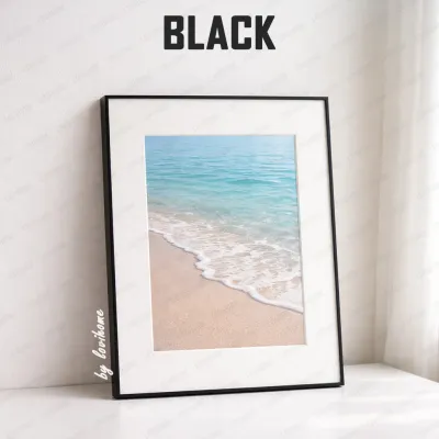
![[SG Stock] Wooden Picture Frame Wooden Photo Frame- Wall Art Poster Painting Hanging Stand Table Decor A3 A4 4R 5R](https://img.lazcdn.com/g/p/dbe873a1b973510e498244e54cebad2f.jpg_400x400q80.jpg_.webp)
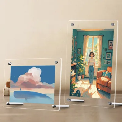
![[Local Stock] 10R 8R 5R 4R Bronze Designer Stainless Steel Photo frame](https://img.lazcdn.com/g/p/6aeb04f064a714fc7b4a8a28a7f07815.jpg_400x400q80.jpg_.webp)
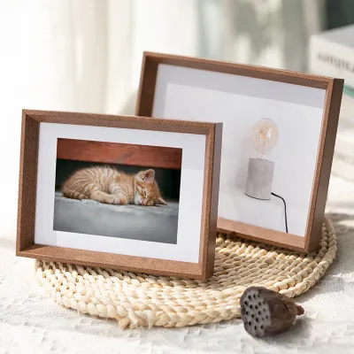
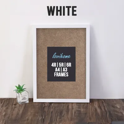

![[SG Supper Offer ] Hollow 3CM Wooden Photo Frame for Dry Flower Frame Specimen Shadow Box Valentines Day Gift Wooden Photo Frames Christmas Teachers day Gift Specimen Wedding Flower Art Collection /Frame Shadow Box /Valentines Day Gift](https://img.lazcdn.com/g/p/a717cd09dfce44d072105b1b06c8b844.jpg_400x400q80.jpg_.webp)
Prices are valid at publication and may change. Please refer to the product page for the latest price.
Next, observe the wall colors and the existing lighting in the room. A stark white wall behaves differently under warm LED lighting than a deep forest green accent wall. The frame you choose must either complement these tones or provide a deliberate, pleasing contrast. Note the primary mood of the space—is it a cozy, sunlit reading nook, a sleek and minimalist home office, or a vibrant, eclectic family room?
Finally, take stock of any existing wall fixtures, shelving units, or architectural features. If you already have black metal track lighting or brass wall sconces, incorporating those metal finishes into your frame selection helps maintain visual continuity. This initial audit ensures your new frames do not clash with the structural and decorative elements already in place.
Diagnose Your Core Interior Design Theme
Pinpointing your exact interior design theme allows you to make precise styling choices rather than relying on guesswork. If your home features open spaces, clean lines, a neutral color palette, and functional, light-wood furniture, you are likely working within a Scandinavian or minimalist aesthetic. These spaces prioritize simplicity, meaning any frame you introduce must respect the room’s uncluttered visual breathing room.

If your home showcases exposed brickwork, concrete screed floors, matte black steel fixtures, and raw, unpolished textures, your style is firmly industrial. This urban aesthetic thrives on structural honesty and utilitarian elements. Frames in these spaces should feel substantial, structural, and slightly weathered to match the rugged environment.
For homes with ornate crown moldings, rich wood finishes like mahogany or cherry, classic symmetry, and deep, warm color palettes, the theme is vintage or traditional. These spaces welcome decorative details, layers of texture, and classic styling. A simple plastic frame will feel out of place here, whereas a frame with depth and craftsmanship will elevate the entire wall.
If your space is a lively mix of global textiles, bold patterns, potted indoor plants, and a variety of art mediums, you inhabit a bohemian or modern eclectic home. This style is highly personal and expressive, allowing for creative risks. Here, the goal is not strict uniformity but a curated, collected-over-time feel that tells a story.
Match Photo Frame Styles to Your Identified Theme
Once you have diagnosed your interior theme, you can narrow down the vast array of photo frames available on the market. The key is to translate your room’s design principles directly into the frame’s material, profile width, and mounting style. Let us explore how to select the exact frame characteristics that align with each major design category.
Minimalist and Scandinavian Interiors
In minimalist and Scandinavian spaces, the frame should protect and present the artwork without competing for attention. Look for ultra-slim profiles made from light-toned woods like ash, birch, or pale oak. If wood tones do not suit your color scheme, simple matte black or matte white aluminum frames provide clean, crisp borders that define the artwork without adding visual weight.
Avoid heavy, ornate carvings, glossy finishes, or wide profiles that disrupt the serene, airy atmosphere of the room. If you want to emphasize a modern, weightless look, consider frameless clip frames or floating glass frames. Floating frames suspend the image between two panes of glass, allowing your wall color to show through around the edges, which maintains a sense of spaciousness.
Vintage and Traditional Interiors
Traditional and vintage spaces call for frames that possess character, weight, and historical charm. Opt for wider profiles featuring classic details such as bevels, steps, or delicate carvings. Metallic finishes like antique gold, brushed bronze, or silver leafing add a touch of warmth and sophistication that complements classic furniture and vintage lighting fixtures.
Rich wood stains, such as walnut, mahogany, or dark cherry, work beautifully to echo the tones of traditional cabinetry. When framing photographs or delicate prints in these environments, always utilize high-quality matting. A wide, acid-free paper mat in off-white or cream adds immediate depth, draws the eye inward, and prevents the artwork from pressing directly against the glass, protecting it from moisture damage over time.
Industrial and Urban Interiors
To complement an industrial or urban aesthetic, seek out frames that celebrate raw, structural, and weathered materials. Distressed wood frames with visible grain, knots, or reclaimed textures pair naturally with concrete and brick surfaces. Alternatively, raw metal frames made from brushed steel, iron, or aluminum with a matte finish reinforce the utilitarian feel of the space.
Do not shy away from frames that feature visible hardware, such as exposed corner brackets, rivets, or hanging chains. These elements highlight the construction of the frame, aligning perfectly with the industrial philosophy of showing how things are made. Keep the color palette muted, focusing on charcoal grays, matte blacks, rusted iron tones, and natural, weathered browns.
Evaluate Practical Constraints and Wall Placement
Selecting the right style is only half the battle; you must also ensure the frames are physically compatible with your walls and environmental conditions. Begin by measuring your available wall space carefully. Decide whether you want to make a statement with a single, large-format frame or create a dynamic gallery wall using a collection of smaller, coordinated frames.
Lighting is a critical factor that is often overlooked. If your frame will hang directly opposite a large window or under bright spotlights, standard glass covers can create intense glare, making the artwork difficult to see. In high-light areas, look for frames equipped with anti-reflective or matte-finish acrylic or glass to preserve visibility.
Environmental conditions, particularly humidity, play a massive role in frame durability. In tropical climates like Singapore, or in high-moisture areas like kitchens and bathrooms, solid wood frames can warp, and paper prints can buckle if not properly sealed. For these damp environments, high-quality aluminum or moisture-resistant composite frames are highly recommended, alongside sealed backing boards to protect the print.
Finally, identify your wall construction before purchasing hanging hardware. Many modern homes feature solid concrete or brick walls, which require a masonry drill bit, wall plugs, and screws to secure heavy frames. If you are dealing with drywall partitions, you must use specialized toggle bolts or locate the wall studs. For heavy, suspended loads or complex gallery installations at height, always prioritize safety by following the manufacturer’s weight limits or hiring a qualified professional installer.
Finalize Your Selection With a Pre-Purchase Checklist
Before finalizing your order on any online marketplace or at a local framing shop, run through this practical checklist to avoid common purchasing mistakes:
- Measure the Artwork and Matting: Ensure the frame's inner dimensions match your print. If you plan to use a mat, the frame size must accommodate the outer dimensions of the mat, while the mat's opening must fit the artwork.
- Verify the Material and Finish: Double-check that the frame's material (such as solid oak, anodized aluminum, or engineered composite) matches the diagnosed style of your room.
- Assess the Hanging Hardware: Confirm the frame comes with sturdy hanging brackets (like D-rings or wire) that can support its weight and match your wall hooks.
- Check the Cover Material: Decide between lightweight, shatterproof acrylic (ideal for high-traffic areas or children's rooms) and classic, scratch-resistant glass.
- Review Return and Exchange Policies: When purchasing home decor online, verify the seller's return policy in case the frame color or material looks different under your home's specific lighting conditions.
Frequently Asked Questions (FAQ)
Can I mix different photo frame styles in one room?
Yes, you can successfully mix different frame styles in a single room, provided you establish a unifying element to prevent visual chaos. One effective method is to maintain a consistent color palette, such as using different frame shapes and materials but keeping them all matte black or natural wood. Alternatively, you can use identical off-white matting across all frames to tie the collection together.
If you want to mix both materials and colors, arrange them in a structured grid layout. The clean, geometric order of a grid balances the eclectic nature of the frames. As a general rule, limit your mix to two or three complementary styles to keep the space looking curated rather than cluttered.
How do I choose the right frame color for my wall?
To choose the right frame color, decide whether you want the artwork to stand out as a focal point or blend seamlessly into the room. To create a striking focal point, select a frame color that contrasts sharply with your wall paint—for example, a matte black frame on a crisp white wall, or a light oak frame on a deep navy wall.
For a subtle, minimalist look, match the frame color closely to your wall paint. This creates a seamless, built-in appearance where the artwork seems to float on the wall. Another reliable technique is to identify a secondary accent color within the artwork itself and match the frame to that tone, which naturally ties the piece to the surrounding decor.

Community discussion
Share your experience or ask a question. Comments are reviewed before publication.