
Evaluating the quality of a paint by number canvas before you begin painting is the most effective way to ensure a rewarding, stress-free creative process. While many kits look identical in online product listings, the actual painting experience depends heavily on the physical properties of the canvas and the precision of its printed guide. A poor-quality canvas can warp under wet acrylics, bleed colors across blurry boundaries, or strain your eyes with illegible numbers. By focusing on key material specifications and print indicators, you can easily distinguish a durable, professional-grade surface from a frustrating, low-tier alternative.
In tropical or high-humidity environments like Singapore, canvas quality becomes even more critical. Excess moisture in the air can cause low-grade fabrics to sag on their frames, while poor-quality primers can lead to paint peeling or cracking over time. Understanding what to look for in fabric composition, weight, and print clarity allows you to select a kit that not only feels excellent to paint but also stands the test of time as a finished piece of wall decor.
Canvas Material Specs: What Fabric and Weight Mean for Your Painting
The foundation of any great paint by number kit is the fabric itself. When reviewing product specifications, you will primarily encounter pure cotton, pure linen, or cotton-linen blends. Pure cotton is highly popular because it is budget-friendly and offers a relatively smooth surface that is easy for beginners to work with. However, linen and linen-blends are highly favored by experienced hobbyists; linen fibers are naturally longer and stronger than cotton, providing excellent resistance to stretching and sagging over time, especially when exposed to ambient humidity.
Products mentioned in this guide
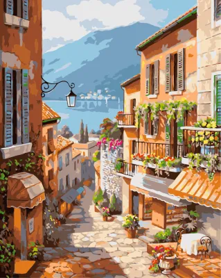

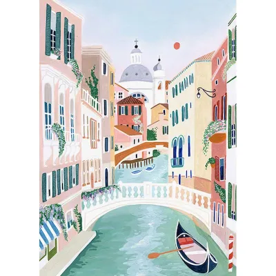
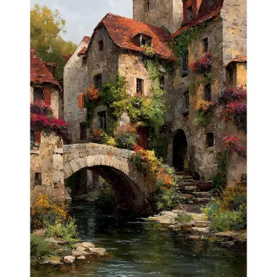


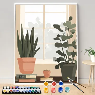
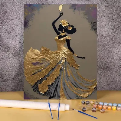
Prices are valid at publication and may change. Please refer to the product page for the latest price.
Canvas weight, measured in grams per square meter (GSM), is a direct indicator of durability and paint resistance. For acrylic painting, look for a canvas weight between 280 GSM and 350 GSM. A canvas within this range is thick enough to support multiple layers of heavy acrylic paint without warping, bending, or allowing the paint to seep through to the back. Canvases that fall below 250 GSM are often too thin, behaving more like heavy paper and curling at the edges when moisture is applied.
The surface texture, often referred to as the “tooth” of the canvas, must also be carefully balanced. A canvas with a moderate tooth has a visible, consistent weave that holds paint effectively, preventing the acrylic from sliding or pooling. If the texture is too rough, however, painting tiny, intricate numbered sections becomes incredibly difficult, as the brush bristles will struggle to deposit paint smoothly into the deep crevices. Visually inspect the canvas surface to ensure the weave is tight, uniform, and free of loose threads or knots.
Print Clarity and Line Precision: Decoding the Visual Guide
The printed guide on your canvas acts as your roadmap, and its clarity directly dictates how enjoyable your painting session will be. When evaluating a kit, pay close attention to the legibility of the numbers and the font size used in highly detailed areas. High-quality kits utilize a clear, sans-serif font that remains readable even in sections only a few millimeters wide. If the numbers are blurry, pixelated, or overlapping, you will likely find yourself guessing which color belongs where, leading to mistakes that are difficult to correct.

Line sharpness and boundary definition are equally critical for a clean final look. Premium canvases feature ultra-thin, crisp lines printed in a light gray or soft blue ink. These light colors are easily covered by a single coat of paint, even when using light pigments like white, yellow, or pastel pink. Conversely, low-quality kits often feature thick, dark black lines that tend to bleed through lighter acrylic paints, forcing you to apply multiple thick layers of paint that can ruin the texture of your finished artwork.
Some modern kits incorporate light color-coding or shaded backgrounds to assist the painter. This technique uses very faint pastel washes behind the numbers to help you distinguish between different sections at a glance. When choosing a color-coded canvas, ensure that the background shading is incredibly light; if the printed background colors are too saturated, they can alter the final appearance of your applied paint or prove difficult to cover entirely.
Structural and Framing Indicators: Beyond the Canvas Surface
If you prefer a canvas that arrives pre-stretched and framed, the structural components behind the fabric are just as important as the painting surface. Examine the specifications of the stretcher bars, which form the wooden frame. High-quality kits use solid, kiln-dried wood, such as pine, which resists warping when exposed to temperature and humidity fluctuations. Avoid cheap composite materials or thin MDF frames, as they are highly prone to bowing inward under the tension of the stretched canvas.
Flip the canvas over to inspect the staple placement and overall tension. The fabric should be wrapped neatly around the corners and secured tightly to the back of the frame with evenly spaced, rust-resistant staples. You can perform a simple “drum test” by gently tapping the front of the canvas with your fingers; it should feel taut and sound like a drum. Any visible wrinkles, loose corners, or sagging areas indicate poor stretching, which will make painting evenly a significant challenge.
Finally, verify that the canvas has been pre-primed with gesso. Gesso is a primer layer that seals the fabric fibers, preventing them from absorbing the moisture and pigment from your acrylic paints. Without a proper gesso coating, the canvas will suck the paint dry, leaving your colors looking dull, chalky, and uneven. Look for product descriptions that explicitly state the canvas is “pre-primed,” “triple-primed,” or “coated with acrylic gesso” to ensure vibrant, long-lasting colors.
Pre-Purchase and Unboxing Checklist: Verifying Quality in Practice
Evaluating quality starts before you make a purchase. When browsing online marketplaces, use the zoom feature on product photos to inspect the texture of the canvas and the sharpness of the printed lines. Read customer reviews carefully, specifically searching for feedback regarding “creases,” “faint numbers,” or “warped frames.” Additionally, verify the seller’s return policy to ensure you can easily request a replacement if the kit arrives damaged or defective.
Once your kit arrives, perform an immediate unboxing inspection before opening any paint pots. Lay the canvas flat on a clean surface and check for deep creases. Canvases that are shipped folded rather than rolled often develop stubborn creases that require careful ironing on the reverse side to flatten. Run your hands over the surface to check for uniform tension, and inspect the entire printed area to ensure there are no misaligned lines or completely blank sections.
Knowing when to stop and request a replacement can save you hours of frustration. If you discover severely blurred numbers that make sections unreadable, torn canvas edges, a loose or cracked wooden frame, or a surface that feels completely unprimed and rough, do not begin painting. Most manufacturers and sellers will not accept returns once you have applied paint to the canvas, so identifying these issues early is key to securing a hassle-free exchange.
Frequently Asked Questions (FAQ)
Does a higher canvas weight always mean better quality for paint by number?
No, a higher canvas weight does not automatically guarantee a better painting experience. While a heavy canvas (such as 380 GSM or higher) is highly durable and resists warping, it often features a very pronounced, rough texture. For detailed paint by number kits that contain tiny, intricate sections, a medium-weight canvas (around 300 GSM) with a finer, smoother weave is actually preferred, as it allows your brush to glide smoothly and deposit paint precisely.
What should I do if the printed numbers are too faint to see?
If you encounter faint numbers on your canvas, you can improve visibility by setting up a dedicated desk lamp to provide bright, directional lighting over your workspace. Keeping the paper reference guide included in your kit nearby is also an excellent way to double-check hard-to-read sections. If a few specific numbers are barely visible, you can lightly trace over them with a fine graphite pencil before you begin painting, but if the entire print is completely illegible or misaligned, you should contact the seller for a replacement.
Community discussion
Share your experience or ask a question. Comments are reviewed before publication.