
Integrating daily reminders into your living space is an excellent way to foster mindfulness, but the visual execution must align with your home’s design language. Choosing the right affirmation stickers involves more than selecting a phrase that resonates with your personal philosophy; it requires a thoughtful analysis of typography, color palette, and material finish to ensure the decal complements, rather than disrupts, your existing decor. When selected carefully, these design elements transform a simple wall graphic into an intentional architectural feature that enhances both the aesthetic and emotional atmosphere of your home.
In Singapore’s diverse housing landscape—ranging from sleek, compact HDB apartments to spacious, light-filled condominiums—maximizing visual harmony is key to maintaining an uncluttered environment. A mismatched sticker can quickly make a room feel chaotic or visually crowded. By evaluating your current interior style, surface textures, and lighting conditions, you can select a design that feels like a natural extension of your walls. Whether you are looking for affordable options starting under S$15 or premium custom metallic foils, matching the sticker to your aesthetic is the first step toward a cohesive space.
Identify Your Room's Core Design Elements
Before browsing through design catalogs, take a step back to analyze the baseline architectural and decorative signals of the room where you plan to install your wall decals. Begin by identifying the dominant color palette of the space. Are your walls painted in cool, crisp whites and greys, or do they lean toward warm, earthy neutrals like beige, cream, or terracotta? The color of your affirmation stickers should either harmonize with these tones or provide a deliberate, sophisticated contrast.
Products mentioned in this guide
![[KW] 50 pcs Affirmation Stickers – Uplifting Motivational Self Love Stickers for Laptops Journals | Scrapbook Sticker](https://img.lazcdn.com/g/p/e8b546be72d3aaa63ae40d451b12b0a3.jpg_400x400q80.jpg_.webp)
![[KW] Positive Affirmation Stickers – Motivational Quotes Self-Love & Mental Wellness Stickers for Journals and Laptops](https://img.lazcdn.com/g/p/13f53bdd4ef94f9a90df6d194d6b0345.jpg_400x400q80.jpg_.webp)
![[KW] 50 PCS Mental Health Stickers – Positive Affirmations Self-Love & Mindfulness Stickers for Journal Laptops & More](https://img.lazcdn.com/g/p/90f5bbb723ae3696072a9b1c107fb5a3.jpg_400x400q80.jpg_.webp)
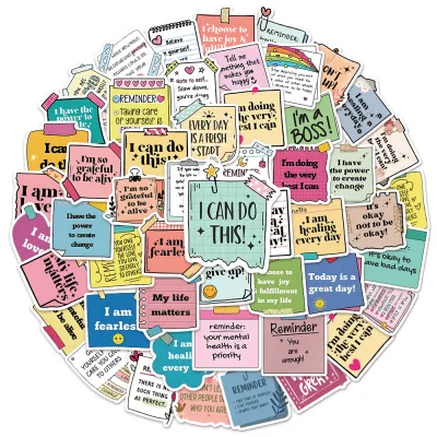
Prices are valid at publication and may change. Please refer to the product page for the latest price.
Next, examine the primary textures and materials that define the room. A space dominated by natural teak wood, rattan, and linen fabrics has a very different tactile energy than one characterized by polished marble, chrome hardware, and glass surfaces. Your wall decor should respect these textures. For instance, highly reflective metallic stickers might clash with raw, rustic wood finishes but look exceptionally polished alongside modern metal accents.
Additionally, observe the structural lines of your furniture and layout. Modern spaces often feature clean, geometric, and straight lines, whereas traditional or eclectic rooms may showcase ornate carvings, curved profiles, and layered textiles. Your choice of font style and graphic borders should mirror these shapes. Finally, use your existing wall art, area rugs, and decorative accent pieces as visual anchors. A well-placed sticker should bridge the gap between these elements, acting as a cohesive thread rather than an isolated, distracting afterthought. Categorizing your room into a distinct aesthetic bucket—such as minimalist, bohemian, traditional, or rustic—will simplify your selection process.
Match Sticker Styles to Your Existing Aesthetic
Once you have identified the primary design signals of your space, you can match them with a complementary sticker style. Each interior aesthetic has a corresponding visual language that dictates font choice, color, and layout.

Minimalist and Modern Spaces
Minimalist interiors rely on the philosophy of “less is more,” prioritizing functionality, clean lines, and an absence of clutter. To complement this aesthetic, look for affirmation stickers that feature clean, sans-serif typography, such as Helvetica, Futura, or elegant minimalist line art. The focus should remain on simplicity and readability, allowing the message to stand out without relying on decorative flourishes.
Color palettes in modern spaces are typically monochrome or highly muted. Opt for matte black, deep charcoal, or crisp white decals that blend seamlessly into the wall. Utilizing negative space is crucial; a small, precisely placed phrase with ample breathing room around it will maintain the clean, airy feel of a contemporary home. Avoid complex borders or multi-colored designs, which can easily disrupt the quiet sophistication of a minimalist room.
Bohemian and Eclectic Rooms
Bohemian and eclectic decors are celebrated for their warmth, layered textures, and global, nature-inspired influences. If your room features indoor plants, woven baskets, and rich textiles, choose boho-inspired affirmation stickers that incorporate earthy tones and organic shapes. Warm terracotta, mustard yellow, olive green, and soft ochre are excellent color choices that harmonize with this aesthetic.
Look for designs that feature hand-drawn illustrations, botanical elements, or free-flowing, abstract shapes. Slightly imperfect, organic lettering or casual script fonts work beautifully here, as they reflect the relaxed, lived-in character of the space. Rather than a rigid, perfectly centered layout, eclectic rooms welcome a more playful, asymmetrical placement that integrates naturally among hanging planters, macramé wall art, or gallery walls.
Traditional and Elegant Interiors
Traditional and classic spaces exude symmetry, refinement, and timeless elegance. If your home features crown molding, dark wood furniture, and structured layouts, your wall decor should reflect this formal sophistication. For these environments, elegant script, classic calligraphy, and refined serif fonts are the ideal choice.
To match the high-end hardware, brass light fixtures, and polished surfaces often found in elegant interiors, consider affirmation stickers with metallic accents. Gold, rose gold, or bronze foil finishes catch the light beautifully and add a subtle touch of luxury without overwhelming the room. Look for designs that include delicate, symmetrical borders or classic filigree details that echo the architectural moldings of your home, ensuring the decal feels integrated into the room’s formal design.
Cozy, Rustic, and Farmhouse Settings
Rustic, farmhouse, and cottage-style interiors focus on warmth, comfort, and a connection to the past. These spaces often showcase exposed wooden beams, distressed finishes, and soft, tactile fabrics. To maintain this cozy atmosphere, avoid harsh, high-contrast black vinyl stickers, which can feel too modern or industrial.
Instead, opt for watercolor designs, distressed or vintage-style fonts, and soft floral or botanical motifs. Muted pastel tones, soft greys, and warm taupes blend gently with natural wood grains and cream-colored walls. The visual texture of a watercolor wash or a slightly weathered font style mimics the organic imperfections found in rustic decor, creating a soft, welcoming visual effect that enhances the room’s cozy appeal.
Check Surface Compatibility and Practical Limits
Choosing the right style is only half the battle; ensuring the physical sticker adheres properly to your wall and can be removed without damage is essential for a successful installation. Different wall paint finishes interact uniquely with adhesive backings. Matte and flat paint finishes are highly porous, which provides excellent initial grip but can sometimes cause the paint to flake off during removal. Conversely, gloss, semi-gloss, and satin finishes are slicker, making them easier to clean and peel stickers from, though they may require a high-quality adhesive to prevent the edges from curling over time.
In Singapore’s tropical climate, high indoor humidity levels present a unique challenge for wall adhesives. Moisture in the air can seep behind the edges of standard vinyl decals, leading to premature peeling, especially in high-humidity zones like bathrooms, kitchens, or rooms without consistent air conditioning. When selecting your affirmation stickers, verify the manufacturer’s specifications to ensure the material is moisture-resistant and suitable for humid environments.
Additionally, if you are renting your home or enjoy updating your decor frequently, always check the product label for “removable” or “damage-free” properties. Avoid industrial-strength adhesives that are designed for permanent outdoor signage. If you have recently painted your walls, patience is critical. Even if the paint feels dry to the touch, it continues to release gasses and cure beneath the surface. Applying a sticker too soon can trap these gasses, leading to unsightly bubbling and potentially bonding the adhesive permanently to the uncured paint. Most paint manufacturers recommend waiting at least three to four weeks before applying any wall decals. Always consult both the paint manufacturer’s curing guidelines and the sticker manufacturer’s surface compatibility instructions before beginning the application process.
Choose the Right Placement for Daily Impact
To maximize the emotional and visual impact of your affirmation stickers, strategic placement is key. The ideal location should be a spot you naturally look at during transitional moments of your day. High-traffic areas and personal reflection zones are excellent candidates. For instance, placing a small, elegant script sticker on your bathroom mirror allows you to read a positive reminder while preparing for the day ahead. Alternatively, positioning a calming phrase above your bed headboard or directly facing your home office desk provides a steady source of focus and encouragement during work or rest.
Visual scale is equally important to maintain aesthetic balance. A common mistake is placing a tiny sticker in the middle of a massive, empty wall, which makes the decor look unfinished and makes the text difficult to read from a distance. Conversely, cramming a large, bold quote into a tight, cluttered corner can make the space feel claustrophobic. Measure your available wall space carefully before purchasing. As a general rule of thumb, the sticker should occupy roughly two-thirds of the open wall width above a piece of furniture, such as a desk or console table. You can use painter’s tape to temporarily outline the dimensions on your wall to visualize the scale and ensure the placement feels balanced before peeling off the backing.
Frequently Asked Questions (FAQ)
Can I apply affirmation stickers to textured walls?
Applying wall decals to heavily textured surfaces, such as orange peel, stucco, or rough plaster, presents significant adhesion challenges. Because the sticker cannot make full contact with the recessed areas of the texture, air pockets form beneath the vinyl, which often leads to peeling and lifting at the edges. Before purchasing, check the manufacturer’s guidelines to see if the product is rated for textured surfaces. It is highly recommended to test a small, inconspicuous area with a sample piece of vinyl first. If the texture is too aggressive, consider applying the sticker to a smooth, framed backing board or a piece of acrylic sheet, which can then be hung on the wall as a stylish alternative.
How do I remove wall decals without peeling the paint?
Removing wall decals safely requires patience and a gentle touch to avoid tearing the underlying paint or drywall paper. To start, apply mild heat to the surface using a hairdryer on a low or medium setting. Hold the dryer a few centimeters away from the sticker and move it continuously to warm and soften the adhesive backing. Once the vinyl feels warm and pliable, begin peeling it slowly from one corner, pulling it back flat against itself at a 45-degree angle rather than pulling straight outward. If you encounter high resistance or notice the paint starting to lift, stop immediately. In such cases, consult your paint manufacturer’s guidelines or seek advice from a professional painter to prevent further damage to your wall surface.
Community discussion
Share your experience or ask a question. Comments are reviewed before publication.