
Selecting the right frame goes beyond protecting your artwork; it acts as the crucial visual bridge between the piece and your overall room aesthetic. By evaluating material, profile, and color, you can ensure your wall decor enhances rather than clashes with your interior design theme. In Singapore homes, where spatial layout and natural light are carefully balanced, the frame you choose can either seamlessly integrate an artwork into your living space or make it stand out as a striking focal point. Understanding how different framing elements interact with your existing decor is the key to creating a cohesive, visually pleasing environment.
Identifying Your Core Interior Design Theme
Before selecting a frame, take a close look at the dominant design language of your room. Observe the existing furniture, wall colors, and architectural lines to identify the primary style. For instance, a space filled with low-profile furniture, light wood finishes, and abundant natural light typically aligns with a Scandinavian or modern minimalist aesthetic. Conversely, a room featuring exposed pipes, concrete screed walls, and dark metal accents points toward an industrial theme.
Next, identify the core materials and dominant color palettes present in the room. Note whether your space leans toward warm, organic textures like rattan and oak, or cool, sleek surfaces like polished concrete, glass, and steel. Understanding these material relationships helps you choose a frame that echoes the room’s existing textures rather than introducing a jarring element.
Products mentioned in this guide
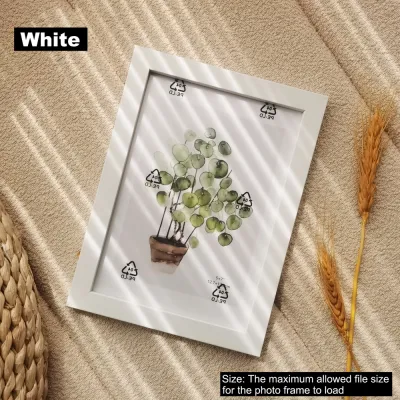
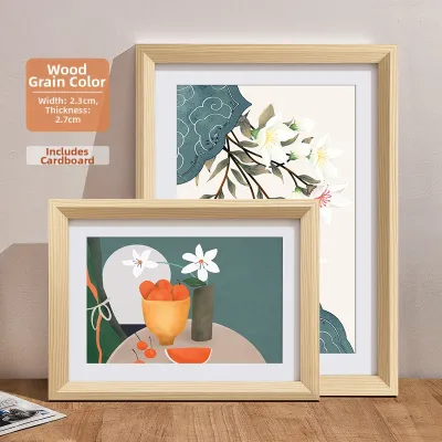
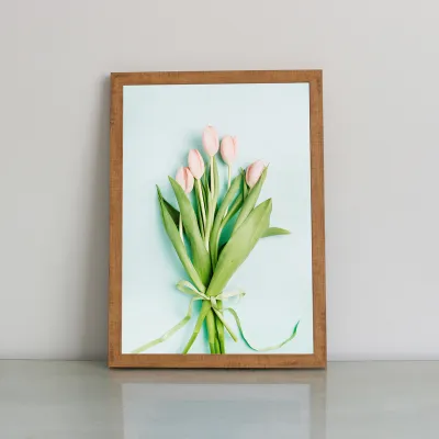


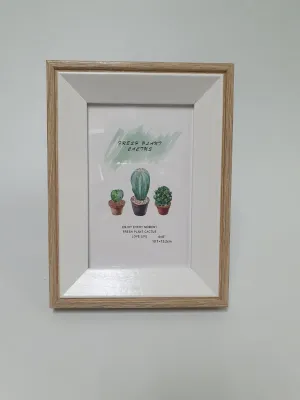
Prices are valid at publication and may change. Please refer to the product page for the latest price.
Finally, determine the intended role of the wall art. Decide whether you want the piece to serve as a bold focal point that immediately draws the eye, or as a subtle background element that quietly complements the surrounding decor. This decision will dictate how dramatic or understated your frame selection should be, helping you balance the visual weight of the room.
Matching Frame Profiles and Materials to Popular Themes
Different interior design themes call for specific frame contours, materials, and finishes to maintain visual harmony. Aligning these elements ensures your framed art feels like an intentional extension of the architecture.

For Scandinavian interiors, focus on light-toned woods such as oak, ash, or light pine. These materials reflect the Nordic appreciation for nature and light, bringing warmth to the space without feeling heavy. Choose slim, clean-lined profiles with natural textures, and avoid ornate carvings or glossy finishes. A simple, light wood frame preserves the airy, relaxed atmosphere characteristic of this style and pairs beautifully with botanical prints, line art, or soft abstract watercolor paintings.
Industrial spaces benefit from robust profiles and raw, tactile textures. Evaluate metal finishes such as matte black, brushed brass, or distressed steel, which complement industrial elements like exposed brick, concrete, and iron fixtures. A thicker, more substantial frame profile can hold its own against the heavy, structural elements of an industrial room, adding a sense of rugged sophistication to monochrome photography or architectural sketches.
Modern Minimalist decor requires a highly disciplined approach to framing. Consider ultra-thin profiles, such as slim aluminum frames, which provide structural support with minimal visual distraction. Stick to solid neutral colors like matte black, stark white, or anodised silver. Opt for flat edges without bevels or decorative details to keep the focus entirely on the artwork itself, maintaining the clean lines of the room.
Traditional or Eclectic themes offer the freedom to explore wider wooden or metallic frames with bevelled edges, intricate carvings, or decorative moulding. These frames add visual weight and classic elegance, making them ideal for historic or highly curated spaces. In an eclectic room, a vintage-style gilded frame can create a delightful contrast when paired with modern art, bridging different design eras.
Balancing Art, Frame, and Wall Context
Once you have aligned the frame style with your room’s theme, you must consider how the frame interacts with the artwork itself and the immediate wall environment. This step ensures the final presentation feels balanced and proportional.
Assess the visual impact of matting—the cardboard border that sits between the artwork and the frame. A wide mat board creates breathing room around a piece, elevating a small print and giving it a gallery-like importance. Conversely, framing an artwork without a mat offers a direct, contemporary look that works exceptionally well for large-scale photography or abstract prints where you want the image to fill the entire frame.
Next, decide on the level of frame-to-wall contrast you want to achieve. Choosing a frame color that closely matches your wall paint, such as a white frame on a white wall, creates a seamless, low-contrast look that makes the room feel more spacious. On the other hand, selecting a contrasting frame, such as a black frame on a light neutral wall, provides sharp definition, drawing immediate attention to the artwork.
If you are planning a gallery wall, you must balance consistency with variety to maintain visual cohesion. You can achieve this by keeping one variable constant—such as using the same frame material or color across all pieces—while varying the frame sizes and mating widths. This approach prevents the display from looking chaotic while still allowing for a dynamic, curated feel.
Practical Checks Before Purchasing or Customising
Before finalizing your frame order or visiting a local framer, performing a few physical and environmental checks will prevent costly mistakes and protect your investment.
First, verify the artwork’s exact dimensions and thickness against the frame’s internal rebate depth. This is especially important for canvas boards, thick paper, or multi-layered collages, as a frame with an insufficient rebate depth will not allow the backing board and retaining clips to secure properly.
Given Singapore’s high humidity, protecting your artwork from moisture is a critical consideration. Rapid temperature and humidity fluctuations from air conditioning can trap moisture inside a frame, leading to mold or paper warping. Check for moisture-resistant backing materials, such as acid-free foam boards, and ensure the back of the frame is properly sealed with framing tape. For valuable prints, consider using spacers to prevent the artwork from directly touching the glass.
Finally, evaluate the hanging location for weight limits and light exposure. Drywall partitions, common in newer apartments, require specialized wall plugs and have lower weight capacities than solid concrete walls. If your frame is heavy, or if you are hanging it at a significant height, ensure you use appropriate heavy-duty mounting hardware or consult a qualified professional installer to manage the suspended load safely. Additionally, if the artwork will be placed near windows with direct sunlight, consider opting for UV-filtering acrylic or glass to protect the colors from fading over time.
Frequently Asked Questions (FAQ)
Can I mix different frame styles on a gallery wall?
Yes, you can successfully mix different frame styles on a gallery wall by establishing a unifying element. To prevent visual clutter, try keeping the frame color consistent, such as all black or all natural wood, while varying the profiles, thicknesses, and textures. Alternatively, you can mix different frame materials and colors but keep the matting style and color identical across all pieces. Laying your frames out on the floor before mounting them on the wall helps you balance the visual weight and ensure a cohesive arrangement.
Are frameless prints suitable for minimalist interiors?
Frameless prints, such as gallery-wrapped canvases, acrylic face mounts, or sleek aluminum panels, are highly suitable for minimalist interiors. They offer a clean, borderless presentation that integrates seamlessly with flat wall surfaces. When opting for frameless options, ensure the edges are neatly finished—such as a mirrored or solid-colored wrap for canvases—to maintain a polished, high-end look that aligns with the clean aesthetic of minimalist design.

Community discussion
Share your experience or ask a question. Comments are reviewed before publication.