
Completing a paint-by-numbers kit is a deeply satisfying creative outlet, but the journey does not end when the final block of color dries. Transforming your finished canvas into a polished piece of home decor requires thoughtful framing and styling. When properly framed, a DIY painting transitions from a personal craft project into a sophisticated visual element that can elevate an entire room. The key to making this transition successful lies in selecting an art style and a frame that harmonize with your existing interior design theme.
Integrating hand-painted art into a living space involves balancing the artwork’s subject matter, color palette, and physical presentation with the room’s architectural features. A mismatched frame or an incompatible art style can make the piece feel like an afterthought, distracting from the room’s cohesive design. By understanding how different framing materials, canvas textures, and artistic motifs interact with popular decor styles, you can create a personalized gallery-worthy display that feels entirely intentional.
Understanding the Role of Framed Paint-by-Numbers in Home Decor
Framing serves as the visual transition between the raw texture of a painted canvas and the flat surface of a wall. For paint-by-numbers projects, which are typically executed on textured linen or cotton canvases using acrylic paints, the frame provides structural support and defines the boundaries of the artwork. An external frame adds weight and presence, helping a medium-sized canvas command attention on a larger wall.
Products mentioned in this guide

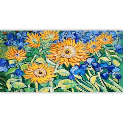
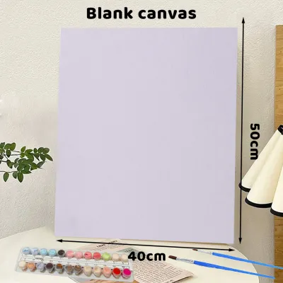



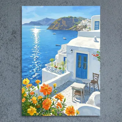

Prices are valid at publication and may change. Please refer to the product page for the latest price.
The material and color of the frame significantly influence how the painting is perceived. A dark, heavy frame tends to draw the eye inward, emphasizing the details of the painting, while a light or neutral frame allows the artwork to blend more seamlessly into the surrounding wall. Additionally, the thickness of the frame profile should match the scale of the room; thin, delicate frames suit compact spaces, whereas wider, more substantial profiles work well in spacious rooms with high ceilings.
Canvas texture and paint finish also play a role in the final look. Acrylic paints often dry with a satin or matte finish, which can catch light differently depending on how the paint was applied. Thick, textured brushstrokes add a tactile quality that is highly valued in hand-painted art. Leaving the canvas unframed or using a simple gallery wrap can sometimes expose unfinished edges, whereas a dedicated frame conceals these imperfections and gives the piece a clean, professional boundary.
Scale and proportion are critical when placing art in urban apartments, where wall space is often shared with built-in shelving, air conditioning units, and large windows. A frame that is too small can look lost on a expansive wall, while an oversized frame can overwhelm a cozy dining nook or study. Before choosing a canvas size or a frame, measure the wall space relative to nearby furniture, aiming for the artwork to span approximately two-thirds to three-quarters of the width of the furniture below it.
Style Pairings for Popular Interior Design Themes
Every interior design theme has its own visual vocabulary, defined by specific color palettes, textures, and structural lines. To make your framed paint-by-numbers look like a curated design choice rather than a random addition, the subject matter of the painting should align with these design principles.

Matching your artwork to your room involves analyzing the dominant colors in your space and selecting a painting that either complements or tastefully contrasts with those hues. The frame profile acts as the final unifying element, bridging the gap between the artistic style of the canvas and the physical materials used in your furniture and flooring.
Minimalist and Scandinavian Interiors
Minimalist and Scandinavian design themes prioritize simplicity, functionality, light-filled spaces, and a connection to nature. These interiors typically feature neutral color schemes, clean lines, and uncluttered surfaces. To complement this aesthetic, look for paint-by-numbers kits that feature abstract geometric shapes, simple line art, or minimalist landscapes with large, clean color blocks.
Avoid highly detailed, high-contrast, or chaotic compositions, as these can disrupt the visual tranquility of a minimalist room. Instead, opt for paintings with muted color palettes—such as soft beiges, warm taupes, sage greens, and pale blues. These gentle tones enhance the sense of openness and calm that defines Scandinavian spaces.
When it comes to framing, light-colored natural woods like oak, ash, or birch are excellent choices, as they echo the light timber furniture commonly found in Nordic-inspired homes. Alternatively, an ultra-slim matte black or matte white aluminum frame can provide a clean, graphic border without distracting from the simplicity of the artwork. A canvas floater frame, which leaves a small gap between the canvas and the frame edge, is particularly effective in modern, minimalist settings.
Tropical and Bohemian Spaces
Bohemian and tropical decors are characterized by their relaxed, eclectic, and nature-inspired atmospheres. These styles embrace rich textures, vibrant colors, and a layered mix of vintage and modern elements. For these spaces, paint-by-numbers kits featuring lush botanical prints, detailed floral arrangements, tropical palm leaves, or warm sunset landscapes are highly suitable.
These themes allow you to embrace bold, saturated colors like deep emerald, terracotta, mustard yellow, and rich plum. The visible texture of the acrylic paint on the canvas adds to the organic, handcrafted feel that is central to bohemian design. Do not worry about keeping the paint perfectly flat; visible brushstrokes and layered paint application enhance the rustic charm of the piece.
To frame these vibrant canvases, consider warm wood tones, natural rattan, or bamboo-style frames that complement indoor plants and woven textiles. If your space leans more toward an eclectic vintage bohemian style, an ornate, slightly distressed gold or dark wood frame can add character and a sense of history to your self-painted masterpiece.
Modern and Industrial Lofts
Industrial and modern urban interiors often feature raw, structural materials such as exposed brick, concrete walls, metal beams, and dark wood finishes. These spaces benefit from artwork that can hold its own against strong, textured backgrounds. Ideal paint-by-numbers subjects for this style include bold geometric abstracts, dramatic monochrome cityscapes, or high-contrast pop art.
Color palettes in industrial spaces can range from moody, dark tones to vibrant pops of primary colors that break up the neutrality of concrete and brick. A painting with sharp lines and high-contrast elements can create a striking focal point on a textured wall, drawing the eye and adding a layer of contemporary sophistication.
For framing, sleek metal frames in brushed steel, matte black, or dark bronze align perfectly with the industrial aesthetic. Floating frames in dark, distressed wood or black metal also work exceptionally well, giving the canvas a clean, floating appearance that highlights its structural form. If you are hanging the art on a highly textured surface like brick, a wider, solid frame can help separate the artwork from the busy background, ensuring the painting remains legible.
Practical Tips for Displaying and Integrating Your Art
Once your paint-by-numbers project is complete and framed, the final step is displaying it in a way that maximizes its visual impact. You can choose to hang a single, large canvas as a standalone statement piece, or group multiple smaller paintings together to create a cohesive gallery wall. If you opt for a gallery wall, try mixing your painted canvases with other mediums, such as photography or line drawings, to create a more dynamic and professional-looking collection.
Lighting is another crucial factor when displaying acrylic paintings. Because acrylic paint can have a slight sheen, direct overhead lighting can cause distracting glare on the canvas surface. Position your artwork away from direct, harsh sunlight, which can also cause colors to fade over time. If you want to highlight the texture of your painting, consider using adjustable track lighting or picture lights with warm-toned LED bulbs, ensuring any electrical installations are carried out safely and in accordance with local guidelines.
Finally, pay close attention to the physical installation of your framed art. Framed canvases, particularly those with solid wood frames or glass covers, can be heavy. In modern high-rise apartments, walls are often constructed from solid concrete or drywall, each requiring different mounting hardware. Always verify your wall type and use appropriate wall anchors, heavy-duty hooks, or mounting strips rated for the specific weight of your framed piece. For exceptionally heavy frames or installations that require working at height, seeking assistance or hiring a professional installer can prevent damage to your walls and ensure the artwork remains securely mounted.
Frequently Asked Questions (FAQ)
Can I mix different paint-by-numbers styles in one room?
Yes, you can mix different artistic styles within a single room, provided there is a unifying element to tie them together. To prevent the space from looking cluttered or disjointed, try using matching frame colors and materials across all the pieces. Alternatively, you can choose paintings with different subjects—such as an abstract piece and a landscape—that share a similar color palette. This creates a sense of visual harmony while allowing you to display a variety of styles.
How do I protect my finished paint-by-numbers from fading?
To preserve the vibrant colors of your acrylic painting, avoid hanging it in areas that receive direct, intense sunlight, as ultraviolet rays can degrade the pigments over time. It is also wise to avoid high-humidity environments, such as bathrooms, which can cause the wooden stretcher bars of the canvas to warp. For long-term protection, apply a clear, compatible acrylic varnish over the completely dry paint, following the manufacturer’s instructions. If you prefer to frame the piece behind glass, opt for UV-protective acrylic or glass to shield the canvas from light damage.

Community discussion
Share your experience or ask a question. Comments are reviewed before publication.