
Selecting the perfect framed wall art is more than just finding an image you like; it is about creating a visual conversation between the artwork, the frame, and the architecture of your room. When done correctly, wall decor anchors your furniture, defines your color palette, and expresses your personal style. In Singapore’s diverse housing landscape—ranging from sleek new HDB BTO flats and modern high-rise condos to historic heritage shophouses—the right art style can transform a plain white wall into a curated gallery.
To achieve this balance, you must evaluate your existing space, understand how different art movements interact with specific interior styles, and apply precise rules of scale and framing. By taking a systematic approach, you can ensure your next art purchase feels like an intentional, integrated part of your home rather than an afterthought.
Audit Your Room's Existing Design Elements
Before browsing online galleries or local art markets, you must establish a baseline of your room’s current design elements. Start by observing the dominant color palette of the space. Note the primary wall color, the secondary tones found in large furniture pieces, and the accent colors present in soft furnishings like cushions, rugs, and curtains. In many Singaporean homes, light neutrals such as warm off-whites, soft greys, and taupes are used to maximize the perception of space and light. Your chosen art should either harmonize with these dominant tones or provide a calculated, high-contrast pop.
Products mentioned in this guide
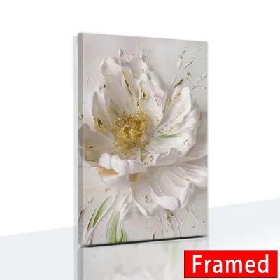
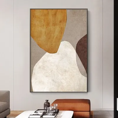
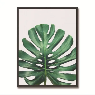
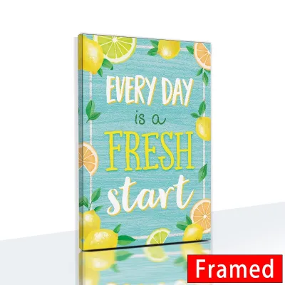




Prices are valid at publication and may change. Please refer to the product page for the latest price.
Next, identify the primary furniture materials and textures in the room. Take note of whether your space features light oak woods, dark walnut veneers, sleek powder-coated metals, polished marble, plush velvet, or raw linen. A room dominated by light, natural timbers has a very different visual weight and texture than one filled with industrial steel and concrete finishes. The textures in your furniture will directly influence the types of frames and art styles that will feel at home in the space.
Assess the overall mood and spatial flow of the room. An airy, uncluttered living room with minimal furniture requires a different curatorial approach than a cozy, layered study filled with books and personal mementos. Consider the volume of negative space on your walls; large, uninterrupted walls can handle bolder, more expansive compositions, while segmented walls near doorways or windows demand more restrained, focused pieces.
To simplify your art search, use this quick self-diagnosis framework to categorize your room into a broad design theme:
- Modern & Contemporary: Clean lines, neutral backdrops, polished surfaces, and minimal ornamentation.
- Scandinavian & Japandi: Light wood tones, functional furniture, organic textures, and a calm, muted color palette.
- Industrial: Exposed brick, concrete, dark metals, raw wood, and utilitarian fixtures.
- Bohemian & Biophilic: Abundant indoor plants, natural fibers like rattan and linen, layered textiles, and warm, earthy tones.
- Traditional & Heritage: Classic architectural details, dark wood furniture, rich fabrics, and symmetrical layouts.
Match Popular Framed Wall Art Styles to Your Decor
Art serves as an extension of your room’s narrative. The subject matter, color palette, and line weight of a print or painting interact dynamically with your furniture and architectural elements. Matching these styles correctly ensures that your walls elevate, rather than clash with, your carefully chosen decor.

Minimalist and Scandinavian Art
Minimalist and Scandinavian art styles are defined by continuous line drawings, simple geometric shapes, monochromatic or highly muted color palettes, and a generous use of negative space. These pieces do not compete for attention; instead, they offer a quiet, calming focal point that emphasizes form and simplicity.
This style is exceptionally well-suited for modern HDB BTO flats and Scandinavian-themed condominiums. In compact urban apartments where space is at a premium, highly detailed or chaotic artwork can quickly cause visual fatigue and make a room feel smaller. Minimalist framed wall art maintains a sense of openness and airiness, allowing the walls to breathe while still providing a polished, finished look.
Abstract and Contemporary Art
Abstract and contemporary art relies on bold color blocking, expressive brushstrokes, fluid shapes, and high-contrast compositions. Because abstract art does not depict recognizable objects, its impact comes entirely from its emotional energy, color relationships, and scale.
This dynamic style pairs beautifully with industrial lofts, eclectic spaces, and modern luxury homes. In a living room with neutral walls and minimalist furniture, a large abstract piece acts as a striking focal point that injects personality and energy. Furthermore, abstract art is an excellent tool for tying a room’s design together; you can select a piece that features subtle hints of your existing accent colors—such as a splash of terracotta or deep indigo—to unify your soft furnishings.
Botanical and Nature-Inspired Art
Botanical and nature-inspired art encompasses vintage plant illustrations, serene forest landscapes, macro photography of leaves, and soft, earthy color tones. This style celebrates the organic irregularities of the natural world, bringing a sense of life and tranquility indoors.
These prints are the perfect complement to bohemian, rustic, biophilic, or Japandi interiors. If your home already incorporates natural light, indoor houseplants, and raw materials like rattan, bamboo, or linen, botanical art reinforces this organic connection. Hanging nature-themed art is also a highly effective design trick for softening the hard architectural lines and sharp angles common in modern concrete apartments, creating a more relaxed, sanctuary-like atmosphere.
Vintage, Retro, and Mid-Century Modern Art
This category includes muted retro color palettes, classic typography, mid-century architectural sketches, travel posters, and reimagined classical portraits. These pieces carry a sense of nostalgia, history, and curated character.
Vintage and retro art styles find their natural home in heritage shophouses, mid-century modern living rooms, or spaces featuring rich walnut furniture and brass accents. The key to styling vintage art in a modern home is balance. Pairing a vintage print or a historic map of Singapore with a sleek, contemporary frame prevents the space from looking dated or dusty, resulting in a sophisticated, highly curated aesthetic.
Determine the Right Scale and Layout for Your Walls
One of the most common design mistakes is hanging artwork that is disproportionate to the wall or the surrounding furniture. A piece of art that is too small will look lost and insignificant, while a piece that is too large can overwhelm the room and make it feel cramped.
When placing framed wall art above a piece of furniture—such as a sofa, a sideboard, or a bed headboard—aim for the artwork or the collective gallery grouping to span roughly two-thirds to three-quarters of the furniture’s total width. For example, if your sofa is 200 cm wide, your framed art arrangement should ideally measure between 130 cm and 150 cm in width. Additionally, hang the artwork so that the center of the image sits at eye level, which is standardly calculated as approximately 145 cm to 150 cm from the floor.
You must also consider the visual weight of the frame and the artwork combined. A dark, thick wooden frame holding a high-contrast painting has a heavy visual weight and requires a spacious wall to avoid looking oppressive. Conversely, a light, thin metal frame holding a minimalist sketch has a light visual weight and can easily get lost on a large, expansive wall unless grouped with other pieces.
Depending on your space and style, choose one of these core layout strategies:
- Single Oversized Statement Piece: Ideal for modern and minimalist spaces. A single large frame creates a clean, high-impact focal point and simplifies the room's visual landscape.
- Symmetrical Grid: Best for structured, formal, or traditional rooms. Placing a series of identical frames (such as a 2×2 or 3×2 grid) with matching mats and subject matter creates a sense of order and architectural symmetry.
- Organic Gallery Wall: Perfect for relaxed, bohemian, or eclectic spaces. This layout allows you to mix different frame sizes, styles, and art mediums. To keep an organic gallery wall from looking chaotic, maintain consistent spacing of 5 cm to 8 cm between all frames and ensure there is a common thread, such as a shared color palette or similar frame materials.
Choose Frame Materials and Finishes to Bridge the Style
The frame is the physical and visual bridge between your artwork and your interior design. The right frame material, profile thickness, and finish can elevate a simple print into a gallery-worthy display while seamlessly integrating it into your room’s aesthetic.
Consider how different frame materials align with your interior style:
- Natural Wood Frames: Light oak, ash, and maple frames add warmth and a soft, organic texture, making them ideal for Scandinavian, Japandi, and biophilic spaces. Darker woods like walnut or mahogany complement mid-century modern, traditional, and heritage homes.
- Sleek Metal Frames: Thin metal frames in matte black, brushed brass, or aluminum offer clean, precise lines. Matte black frames are a staple of industrial and modern design, while brushed brass adds a touch of warmth and luxury to contemporary spaces.
- Frameless or Acrylic Float Mounts: These modern alternatives eliminate the visible border entirely, making them perfect for ultra-minimalist or highly contemporary settings where the focus must remain solely on the artwork.
Frame thickness, or profile depth, also plays a critical role. A chunky, deep-set frame adds physical presence and dramatic shadow lines, drawing attention to the art as a distinct object. A ultra-thin, low-profile frame keeps the presentation lightweight and modern, allowing the art to blend softly into the wall.
Do not overlook the role of the passe-partout, or mat board. A wide, white or off-white mat board instantly elevates an inexpensive print, giving it breathing room and a professional, gallery-style appearance. Functionally, the mat board also prevents the artwork from touching the glass, which is vital in Singapore’s humid climate to prevent moisture from trapping and damaging the print over time.
When choosing frame colors, you can either match your room’s existing hardware and furniture—such as matching a matte black frame to your black metal light fixtures—or choose a contrasting color to make the artwork stand out. If your walls are a deep, moody color, a light wood or white frame will pop dramatically. On pale walls, a dark frame will ground the artwork and draw the eye inward.
Final Pre-Purchase and Hanging Checklist
Before finalizing your purchase and drilling holes into your walls, run through this practical checklist to ensure a seamless installation:
- Check Manufacturer Instructions: Always check the artwork and frame manufacturer's guidelines regarding weight limits, mounting hardware, and care instructions.
- Use the Paper Template Method: Cut out sheets of kraft paper or newspaper to the exact dimensions of your framed art. Tape these templates to your wall using painter's tape. This allows you to step back and evaluate the scale, height, and overall layout in real-time before making any permanent marks.
- Assess the Lighting: Avoid hanging glass-covered frames directly opposite large windows or bright spotlights. Harsh reflections and glare can obscure the artwork entirely. If a high-glare spot is unavoidable, consider investing in non-reflective or museum-grade acrylic glazing.
- Verify Wall Types and Hardware: In Singapore, structural walls and HDB bomb shelters are made of reinforced concrete, requiring a hammer drill, masonry drill bits, and plastic wall plugs. Partition walls, commonly found in newer condo bedrooms, are made of drywall and require specialized toggle bolts.
- Safety First: For heavy suspended loads, work at height, or if you are unsure of hidden electrical conduits and water pipes behind the wall, always isolate the power in that zone and consult a qualified professional handyman to handle the installation safely.
Frequently Asked Questions (FAQ)
How high should I hang framed wall art above furniture?
You should hang framed wall art so that the bottom edge of the frame sits approximately 15 cm to 20 cm (6 to 8 inches) above the top of your sofa, console table, or headboard. This spacing ensures that the furniture and the artwork function together as a cohesive visual unit. Hanging the art too high creates an awkward gap of empty wall space, making the frame look like it is floating disconnectedly.
Can I mix different art styles in the same room?
Yes, mixing different art styles is highly effective and adds a rich, layered character to your home. To make a mixed collection look intentional rather than messy, establish at least one unifying element. This could be using the exact same frame color and material across all pieces, maintaining uniform white matting, or sticking to a tightly curated color palette (such as warm earth tones or black-and-white photography) across different artistic mediums.
Should the frame color match the wall or the furniture?
Both approaches work, but they yield different visual results. Matching the frame color to your wall (for example, a white frame on a white wall) creates a seamless, floating effect that keeps the focus entirely on the artwork itself. Matching the frame to your furniture or hardware (such as matching a walnut frame to a walnut dining table) grounds the piece, integrating the artwork into the room’s broader architectural lines and color scheme.
Community discussion
Share your experience or ask a question. Comments are reviewed before publication.