
Selecting the right painting frame is the crucial final step in bringing any piece of art to life. A frame does not merely hold a picture against the wall; it acts as a visual bridge, transitioning the eye from the unique world of the artwork to the broader design of your room. The ideal frame style respects the medium, era, and emotional tone of the art while establishing a harmonious relationship with your interior decor.
By understanding how different materials, profiles, and proportions interact with various art genres, you can transform a simple print or a valuable canvas into a striking focal point. Making an informed choice ensures your art is both visually enhanced and physically protected over time.
Core Principles of Matching Frames to Art
To achieve a balanced presentation, you must first navigate the relationship between contrast and harmony. A frame can either echo the dominant tones of the artwork to create a seamless, unified look, or it can introduce a deliberate contrast to make the piece stand out. For instance, pairing a dark, moody oil painting with a deep charcoal or black frame creates a harmonious, self-contained window. Conversely, placing a light, airy watercolor inside a dark walnut frame draws immediate attention to the boundary, emphasizing the artwork’s delicate qualities.
Products mentioned in this guide
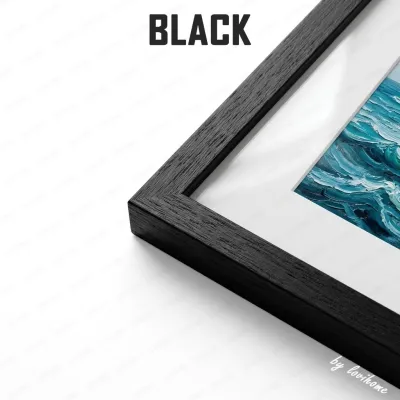
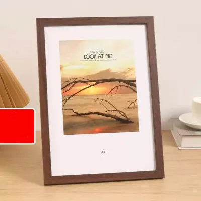
![SG Stock [Bulk Price ] A4 Wooden Photo frame Picture Frame Certificate Holder Graduation Photos Frame Christmas Gift Home Office Decoration](https://img.lazcdn.com/g/p/2f603894c3a2fada3d93a87b8b4b038f.jpg_400x400q80.jpg_.webp)
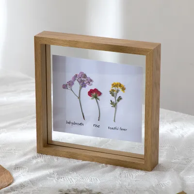
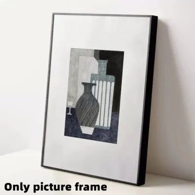
![[SG Seller]Kids Art Frames Flip Frame Wooden Decorative Picture Frame Changeable Children Drawing Portfolio Storage Box](https://img.lazcdn.com/g/p/5f4092ae039530ad01f6cdce32dff75f.jpg_400x400q80.jpg_.webp)
Prices are valid at publication and may change. Please refer to the product page for the latest price.
Visual weight is another critical factor that dictates how a frame interacts with art. The thickness, depth, and ornamentation of the frame should complement, rather than compete with, the complexity of the artwork. A highly detailed, busy painting often requires a simpler, wider frame to give the eye a place to rest, whereas a minimalist sketch can handle a more textured or substantial frame to elevate its presence on the wall.
Matting plays a vital role in this balancing act by providing essential breathing room. A mat board physically separates the artwork from the glass and the frame, preventing the composition from feeling cramped. For delicate works on paper, drawings, and photographs, a generous mat board of neutral tone ensures the art remains the undisputed center of attention while protecting the medium from touching the glazing.
Recommended Frame Styles for Specific Artwork Genres
Different art genres carry distinct historical, stylistic, and material characteristics. Matching your frame to the specific genre of your artwork ensures that the final presentation respects the artist’s original intent while enhancing its visual appeal.

Modern and Contemporary Art
Modern and contemporary art pieces, characterized by clean lines, bold graphics, or minimalist compositions, thrive in frames that mirror their sleek aesthetic. Thin, unornamented profiles made of aluminum or simple, straight-cut wood are excellent choices. These frames provide a clean boundary without adding unnecessary visual noise, allowing the artwork’s form and color to speak for themselves.
Color selection for contemporary frames typically leans toward a neutral palette. Matte black, crisp white, or natural light woods like maple and ash are highly effective. A black frame adds sharp definition, white offers a seamless transition on light walls, and natural wood introduces a subtle organic warmth that complements modern interiors.
For canvases or works on paper with unique deckled edges, floating frames—also known as canvas floater frames—are highly recommended. These frames secure the artwork from behind, leaving a small gap between the edge of the canvas and the inner profile of the frame. This creates the illusion that the artwork is suspended in mid-air, preserving the visible edges and depth of the piece.
Traditional and Classical Paintings
Traditional and classical paintings, such as oil portraits, landscapes, and still lifes, carry a sense of history and depth that benefits from more substantial, classic framing. Ornate and textured frames featuring gold leaf, antiqued bronze, or deeply carved dark wood profiles pay homage to historical gallery traditions. These elaborate designs draw the viewer inward, framing the scene like a window into another era.
Proportionality is key when dealing with classical works. The grandeur of an ornate frame must match the visual density of the painting. A small, highly detailed oil painting can easily support a wide, dramatic frame, which elevates its status and gives it a commanding presence on the wall.
Preservation is equally important for older or valuable traditional pieces. When framing these works, ensure that all mounting boards, mats, and adhesives are strictly acid-free. Archival-grade materials prevent yellowing and chemical degradation over time, preserving the integrity of the canvas or paper for decades to come.
Abstract and Expressionist Pieces
Abstract and expressionist art relies heavily on color, texture, and raw emotion. Framing these pieces requires a careful touch to avoid confining their energetic compositions. One effective strategy is to echo a secondary or accent color from the painting within the frame itself, which subtly pulls the composition outward and integrates it with the frame.
Alternatively, using minimalist boundaries can help contain chaotic or highly textured abstract works. A simple, deep shadow box or a thin wood frame in a neutral tone provides structure to a wild, expressive painting without competing with the brushwork. The frame acts as a quiet border that tells the viewer where the art ends and the wall begins.
In some cases, skipping the frame entirely is the most appropriate choice. Gallery-wrapped canvases, where the painting continues around the sides of the wooden stretcher bars, are designed to be hung unframed. This approach emphasizes the physical, sculptural presence of the canvas on the wall and suits modern, open-plan living spaces perfectly.
Photography and Digital Prints
Photographic works and digital prints require framing solutions that maintain absolute clarity and protect the delicate paper surface. Clean, sharp lines are essential here; thin metal frames or smooth, painted wood profiles keep the focus entirely on the photographic image.
Because photographs are highly susceptible to reflections, glare reduction is a primary consideration. Opting for anti-reflective or matte acrylic or glass glazing protects the print from ultraviolet light while ensuring that room reflections do not obscure the details of the image. This is especially important in bright spaces with abundant natural light.
Matting is particularly crucial for photography and digital prints. A wide, high-quality mat board—often two to three inches wide—elevates a standard print, giving it a professional, gallery-quality appearance. The mat also prevents the photographic emulsion from sticking to the glass, which can cause permanent damage over time.
Integrating the Framed Art with Your Room's Decor
While the frame must suit the artwork, it must also coexist harmoniously with your room’s overall interior design. You must decide whether you want the frame to blend seamlessly with your existing furniture and wall colors or act as a standout accent. For a cohesive look, match the wood tones of your frames to the dominant wood finishes in your room, such as your coffee table, shelving, or flooring. If your space features modern black metal accents, black metal frames will tie the room together beautifully.
When creating gallery walls or grouping multiple pieces of art, maintaining visual consistency is key to preventing a cluttered appearance. You do not need to use identical frames for every piece, but there should be a unifying element. This could be a consistent mat board color, a shared frame material, or a uniform color palette across different frame profiles. Mixing a few ornate vintage frames with sleek modern ones can work, provided they share a common tonal thread.
Lighting interactions should also influence your framing choices. Consider how the frame’s finish—whether high-gloss, satin, or matte—reacts to both natural sunlight and artificial light fixtures in the room. A high-gloss black frame might catch distracting reflections from a nearby window, whereas a matte or brushed finish will diffuse the light gently, maintaining a clean look throughout the day.
Practical Checks Before Purchasing or Installing
Before purchasing a frame or initiating an installation, precise dimension verification is essential. Measure the exact height, width, and thickness of your artwork. If you are using a mat board, account for the overlap required to secure the art behind the mat window, and ensure the frame’s rabbet depth—the inner groove where the glass, mat, art, and backing sit—is deep enough to accommodate all layers securely.
Because framed art constitutes a suspended load, weight and hardware safety must be prioritized. Weigh the fully assembled frame before hanging. For heavy wood or glass-fronted frames, standard adhesive strips are insufficient and present a falling hazard. Identify your wall type; concrete or brick walls, common in many solid apartment constructions, require masonry wall plugs and screws, whereas drywall requires specialized hollow-wall anchors. Investing in reliable hanging hardware, which typically costs between S$5 and S$20, is a small price to pay for protecting your valuable art.
For heavy frames suspended at height or mounted on challenging concrete walls, always follow the manufacturer’s installation instructions. If you are unsure about drilling or securing heavy suspended loads, consult a qualified professional installer to ensure the frame is safely anchored.
Environmental factors also play a significant role in the longevity of your framed art. In tropical climates with high humidity, wood frames can warp, and moisture can become trapped behind the glass, leading to mold growth on paper art. Avoid hanging sensitive artworks in high-humidity zones like bathrooms or directly opposite air conditioning vents. Additionally, keep valuable pieces out of direct sunlight to prevent fading, or invest in UV-protective glazing to shield the artwork from solar damage.
Frequently Asked Questions (FAQ)
Can I use the same frame style for an entire gallery wall?
Yes, using a uniform frame style across an entire gallery wall creates a clean, structured, and highly cohesive look. This approach works exceptionally well for a series of related prints, black-and-white photography, or minimalist artworks. If you prefer to mix different frame styles, you can still maintain harmony by using identical mat boards or keeping the frame colors within a tight, consistent palette.
Should the frame match the wall color or the artwork?
The primary rule is that the frame should match and complement the artwork first, as its main purpose is to showcase the art. However, considering the wall color is highly beneficial. Matching the frame closely to the wall color can create a seamless, floating effect that highlights the art’s internal colors, while choosing a frame that contrasts with the wall creates a bold, defined boundary that draws the eye directly to the piece.

Community discussion
Share your experience or ask a question. Comments are reviewed before publication.