
Choosing a photoframe that complements your home interior requires balancing the room’s architectural lines, dominant materials, and color palette with the visual weight of the artwork itself. Rather than treating a frame as an isolated accessory, view it as a design element that bridges your art and your wall. The right frame style enhances the visual narrative of your space, while an mismatched one can create distracting visual friction.
By analyzing your existing decor, selecting compatible materials, and planning your wall layouts intentionally, you can transform simple prints and personal photographs into integrated design features. Whether you live in a sleek modern condominium or a cozy, character-filled apartment, a systematic approach to frame selection ensures your walls feel curated rather than cluttered.
Assess Your Existing Room Aesthetic
Before purchasing any photoframe, observe the dominant design style of the room where it will hang. Take note of the clean lines in your furniture, the textures of your soft furnishings, and the overall architectural character of the space. A room filled with low-profile, handleless cabinets and neutral tones leans minimalist, whereas a space featuring exposed brick, concrete screed, and black steel elements fits an industrial aesthetic.
Products mentioned in this guide

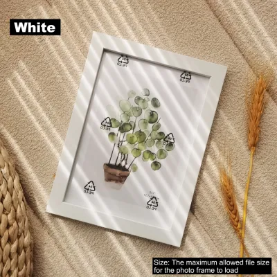
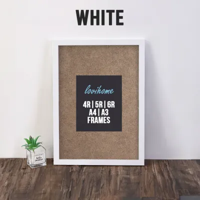
![[SG Stock]4R/5R/6R/A4 Wooden Photo Frame Picture Frame Wood White Black Simple Picture Frame Birthday Gift present Christmas gift](https://img.lazcdn.com/g/p/90c8cf15b9d834f250e5f719c443c585.jpg_400x400q80.jpg_.webp)


Prices are valid at publication and may change. Please refer to the product page for the latest price.
Identify the existing hardware finishes and architectural details that define the room’s character. If your space features brushed brass light fixtures, warm timber window frames, or traditional wall mouldings, your frame choices should acknowledge these elements. Matching the metal or wood tones of your frames to these pre-existing details creates an immediate sense of structural continuity.
Evaluate the visual weight and formality of the room to determine how prominent your framing should be. A formal dining area or a structured study often benefits from symmetrical, substantial frames that command attention and establish order. Conversely, a relaxed living room or a cozy reading nook is better suited to lighter, more varied frame styles that encourage a casual, lived-in atmosphere.
Match Photoframe Materials and Finishes to Your Decor
Frame materials play a pivotal role in establishing the tactile and visual language of your walls. Natural wood frames with visible grains, such as oak, walnut, or teak, bring organic warmth and texture to Scandinavian, rustic, or traditional interiors. These warm timber tones soften hard surfaces and connect your indoor decor to natural outdoor elements.

For modern, industrial, or highly contemporary spaces, sleek metal, polished acrylic, or frameless glass designs offer a cleaner look. Anodized aluminum or matte black metal frames provide sharp, thin borders that frame artwork without adding unnecessary bulk. These materials perform exceptionally well in high-traffic areas or minimalist settings where visual clutter must be kept to an absolute minimum.
Pay close attention to how frame finishes interact with the ambient light and textures in your room. Matte finishes absorb light and offer a understated, contemporary look that keeps the focus entirely on the artwork. Glossy or lacquered finishes add a touch of luxury and reflection, which can brighten dark corners but may cause distracting glare in sunlit rooms. Distressed or painted wood finishes introduce vintage charm, making them ideal for eclectic or farmhouse-inspired spaces.
If you want to add a contemporary edge to a traditional room, consider using material contrast intentionally. Framing a classic sketch or a vintage botanical print in a ultra-thin, matte black metal frame creates a sophisticated juxtaposition. The key to successful contrast is moderation; ensure the contrasting frame shares at least one visual element, such as color or proportion, with other objects in the room.
Determine the Right Frame Profile and Width
The profile and width of a photoframe dictate how much physical presence it has on your wall. Slim, flat profiles with a width of one centimeter or less are excellent for minimalist aesthetics, small prints, or dense gallery walls. These narrow borders protect the artwork while allowing multiple frames to sit close together without overwhelming the wall space.
Wider, ornate, or stepped profiles are better suited for traditional decor, large standalone pieces, or when the frame itself is intended to act as a focal point. A wide, carved wooden frame or a classic gold-leafed profile adds historical weight and drama to an entryway or above a fireplace. These substantial frames signal to the viewer that the enclosed artwork is of significant importance.
Using a mat board, also known as a passe-partout, is a highly effective way to adjust proportions and elevate the perceived quality of your display. A wide white or off-white mat board provides visual breathing room, separating the artwork from the frame and preventing busy images from feeling cramped. Matting also allows you to fit smaller photographs into larger, more substantial frames, creating a balanced and professional gallery appearance.
Coordinate Colors Without Clashing
Your frame color strategy should enhance the artwork while maintaining a balanced relationship with your wall color and the broader room palette. For a seamless, built-in look, choose frames that closely match your wall color, such as white frames on a crisp white wall. This technique makes the frames virtually disappear, allowing the artwork to appear as if it is floating on the wall.
To make your artwork pop dramatically against the background, opt for high-contrast frame colors. A dark charcoal or matte black frame on a light pastel or white wall creates a sharp, graphic border that immediately draws the eye. Conversely, light wood or white frames can soften the appearance of art hung on dark, moody accent walls.
To tie the room together cohesively, pull subtle accent colors directly from the artwork itself or from nearby soft furnishings like cushions, rugs, or curtains. If your painting features subtle hints of terracotta, selecting a warm cherry wood or a copper-toned metal frame can highlight those tones beautifully. Avoid overly bright or highly saturated frame colors that compete with the artwork, as the frame should always serve to support the art rather than distract from it.
Plan Your Wall Layout and Grouping Strategy
How you group and arrange your frames on the wall is just as important as the individual frame styles you choose. If you prefer a structured, clean, and architectural look, select uniform frames of the exact same size, material, and color, and arrange them in a precise grid. This symmetrical approach works beautifully for series of black-and-white photographs or botanical prints.
For an eclectic, collected-over-time aesthetic, you can mix different frame styles, sizes, and materials on a single wall. To keep a mixed gallery wall from looking chaotic, establish a unifying element, such as using identical white mat boards for all pieces, or sticking to a restricted color palette of black, white, and natural wood. This consistency ensures the arrangement feels intentional rather than accidental.
Before finalizing your layout, assess your wall space, ambient lighting conditions, and viewing distances. In rooms with abundant natural light, consider using glare-resistant acrylic or non-reflective glass to protect your prints and ensure they remain visible from all angles. In tropical climates like Singapore, where humidity levels can be high, ensure your frames are well-sealed at the back to prevent moisture from warping the artwork over time.
Always plan the spacing and alignment of your frames before making any holes in the wall. You can cut out paper templates matching the sizes of your frames and tape them to the wall using painter’s tape to visualize the arrangement. This step allows you to adjust the gaps between frames, ensuring the entire composition feels balanced and proportional to your furniture and ceiling height.
Frequently Asked Questions (FAQ)
Should all photoframes in a room match exactly?
No, photoframes in a single room do not need to match exactly, and mixing styles often adds depth and character to a space. To mix frames successfully while maintaining visual harmony, establish a common thread among them. You can achieve this by keeping the mat board colors identical, sticking to a single material family like various tones of natural wood, or limiting your color palette to two cohesive finishes, such as matte black and warm brass.
How do I hang heavy or oversized photoframes safely?
Hanging heavy or oversized photoframes requires careful attention to wall construction and hardware capacity to prevent damage or injury. In homes with concrete or masonry walls, which are common in Singapore, you must use a hammer drill to insert appropriate plastic wall plugs and heavy-duty screws. For drywall partitions, locate the timber studs behind the wall or use specialized hollow-wall anchors rated specifically for the weight of your frame.
Always inspect the built-in hanging mechanisms on the back of the frame, such as D-rings or heavy-duty hanging wire, to ensure they are structurally sound and securely attached to the frame corners. Avoid using temporary adhesive strips for heavy glass or solid wood frames, as temperature and humidity fluctuations can weaken the adhesive over time. For exceptionally heavy, valuable, or high-risk installations, consult a qualified professional installer to ensure the piece is mounted securely.
Community discussion
Share your experience or ask a question. Comments are reviewed before publication.