
The right frame does more than simply hold a piece of paper against a wall; it acts as an essential visual translator between the artwork and your living space. Matching your poster frame style to your art print’s specific aesthetic requires evaluating the print’s colors, lines, and historical context, then balancing those elements against your home’s interior design. A well-chosen frame elevates a simple paper print into a polished, intentional focal point, while a mismatch can distract from the artwork or make the display feel disjointed. By understanding how different frame profiles, materials, and matting options interact with various art styles, you can create a harmonious presentation that protects your art and enhances your room’s decor.
Assess Your Art Print's Visual Characteristics
Before browsing frame profiles or purchasing materials, you must objectively analyze the visual properties of your art print. This diagnostic step ensures your frame selection supports, rather than competes with, the artwork’s inherent design.
Color Palette and Contrast Examine the dominant hues, saturation levels, and overall color temperature of your print. High-contrast artworks with bold, saturated colors often require simple, solid-colored frames that ground the intensity. Conversely, prints featuring soft pastels, muted earth tones, or monochromatic schemes can easily be overwhelmed by stark, heavy frames. Identify whether the print has warm undertones (such as creams, yellows, and rich browns) or cool undertones (such as crisp whites, blues, and greys), as this dictates whether you should lean toward warm natural woods or cool-toned metals.
Products mentioned in this guide
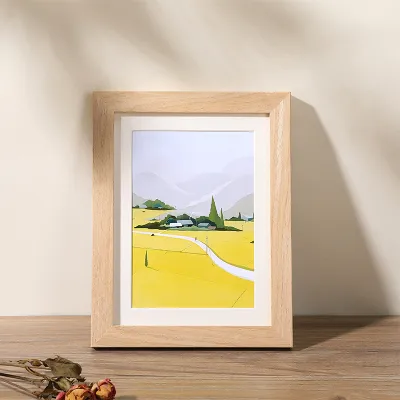
![[SG Stock] Wooden Picture Frame Wooden Photo Frame- Wall Art Poster Painting Hanging Stand Table Decor A3 A4 4R 5R](https://img.lazcdn.com/g/p/7e82d3ea8ef383b11bfd2b9f17d6a169.jpg_400x400q80.jpg_.webp)
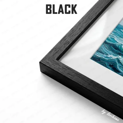
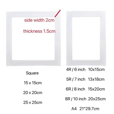
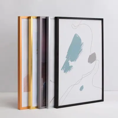
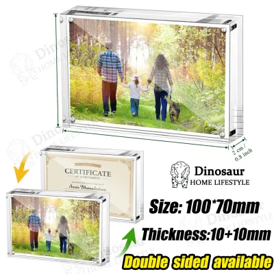
![[SG FREE ] Transparent Acrylic Photo Frame Magnetic Poster Display Stand](https://img.lazcdn.com/g/p/13f7a1d4fb08962d10c162e211f039fc.jpg_400x400q80.jpg_.webp)
Prices are valid at publication and may change. Please refer to the product page for the latest price.
Composition and Line Work Analyze the structural layout of the artwork. Minimalist typography, geometric abstracts, and modern architectural photography rely on clean lines and open space. These compositions demand frames with thin, precise profiles that mimic their structural clarity. On the other hand, highly detailed illustrations, busy botanical prints, or classical oil reproductions feature complex textures and organic shapes. These busy compositions can handle wider, more textured frame profiles because the visual weight of the art matches the weight of the frame.
Thematic Era and Mood Every print carries a specific stylistic origin or mood. A mid-century modern graphic, a classical Japanese woodblock reproduction, a vintage travel poster, and a contemporary line drawing each belong to distinct design traditions. Identifying this thematic era prevents jarring stylistic clashes. For instance, framing a historical map in an ultra-modern, neon acrylic frame can disrupt the historical narrative of the piece, whereas pairing it with a classic, dark wood or distressed frame preserves its antique character.
Physical Margins and Borders Inspect the physical edges of your print. Some posters are printed “full bleed,” meaning the image extends to the very edge of the paper. Others feature a built-in white border. If your print has a built-in border, you may not need an additional mat board (passe-partout) to give the image breathing room. If the print is full bleed, placing it directly under a frame without a mat can sometimes make the composition feel cramped, particularly if key details sit close to the edge.
Match Frame Styles to Specific Art Aesthetics
Once you have diagnosed the visual characteristics of your print, you can match it to one of three primary framing styles. Each style uses specific materials, finishes, and profiles to create a distinct visual relationship with the artwork.

Minimalist and Modern Frames
Minimalist frames feature thin, understated profiles designed to disappear into the background, leaving the focus entirely on the artwork. These frames avoid decorative carvings, bevels, or intricate textures, relying instead on clean angles and smooth finishes.
- Best Applications: Contemporary abstract paintings, minimalist typography, modern architectural photography, line art, and high-contrast graphic designs.
- Frame Characteristics: Thin profiles (typically 1 to 1.5 centimeters wide) made from matte black or crisp white painted wood, or bare metals such as anodized aluminum and brushed steel.
- Visual Effect: This style provides a clean, architectural boundary that defines the artwork without adding historical weight or competing textures. It is highly effective for modern spaces where the goal is a sleek, uncluttered presentation.
Vintage and Ornate Frames
Ornate frames draw inspiration from historical design movements, featuring wider profiles, detailed moldings, and textured finishes that command attention. These frames do not merely house the art; they actively participate in the overall presentation, acting as decorative objects in their own right.
- Best Applications: Classical art reproductions, vintage movie posters, baroque illustrations, historical maps, and dramatic, moody portraits.
- Frame Characteristics: Wide profiles with carved scrollwork, beaded details, or stepped moldings. Finishes include antique gold leaf, tarnished silver, distressed bronze, or dark, polished mahogany.
- Visual Effect: An ornate frame adds immediate weight, elegance, and a sense of historical importance to a print. It elevates inexpensive paper reproductions by giving them the physical presence of a gallery-worthy piece, making the display feel permanent and valuable.
Natural Wood and Textured Frames
Natural wood and textured frames emphasize organic materials, showcasing visible grain patterns, natural color variations, and tactile surfaces. This style bridges the gap between modern simplicity and traditional warmth.
- Best Applications: Botanical illustrations, landscape photography, earthy abstract pieces, watercolor paintings, and warm-toned vintage advertisements.
- Frame Characteristics: Unfinished or lightly sealed timbers such as oak, ash, walnut, or pine, as well as textured materials like bamboo, rattan, or linen-wrapped profiles.
- Visual Effect: These frames introduce an organic, grounding element to your wall. The natural grain softens the transition between the artwork and the wall, creating a relaxed, warm, and inviting aesthetic that connects the art to natural themes.
Avoid Common Style Mismatches and Framing Mistakes
Framing mistakes can diminish the visual impact of high-quality prints and, in some cases, cause physical damage to the artwork itself. Avoiding these common pitfalls ensures your display remains visually balanced and structurally sound.
The Overpowering Frame A common mistake is pairing a delicate, minimalist print—such as a simple black-and-white line drawing—with a heavy, highly detailed ornate frame. The visual complexity of the frame completely swallows the artwork, drawing the viewer’s eye outward to the border rather than inward to the art. If you wish to use an ornate frame for a delicate print, always insert a wide, neutral mat board to create a visual buffer between the fine lines of the art and the busy details of the frame.
Color Clashing and Temperature Mismatches Choosing a frame color that fights with the dominant tones of the print can ruin the entire display. For example, framing a cool-toned, blue-and-grey landscape in a warm, reddish cherry wood frame can create an uncomfortable visual tension. Instead, match the frame’s color temperature to the print’s undertones. Cool-toned prints pair naturally with silver, black, or cool grey frames, while warm-toned prints are complemented by gold, bronze, or warm oak and walnut finishes.
Ignoring the Mat Board Omitting a mat board (passe-partout) is a missed opportunity to rescue a difficult framing scenario. A mat board is not merely decorative; it provides essential visual breathing room, separating the artwork from the frame and preventing the glass from touching the print directly. In humid climates, direct contact between the print and the glass can trap moisture, leading to mold growth or causing the ink to fuse to the glass. Always verify the manufacturer’s care instructions for your print; if the print is highly sensitive or printed on delicate archival paper, use acid-free mat boards and mounting materials to prevent yellowing or chemical degradation over time. If instructions conflict or are unavailable, consult a professional framer.
Scale and Proportion Issues Using a frame that is too thin or flimsy for a massive poster can make the entire display look cheap and structurally unstable. Large posters (such as A1 or larger) require wider, sturdier frame profiles to physically support the weight of the glazing and backing board without bowing. Conversely, a tiny print in a massive, thick frame can look ridiculous unless it is intentionally matted with an oversized border to create a dramatic, gallery-style effect.
Adapt the Frame to Your Room's Decor and Lighting
A frame must not only match the art print but also harmonize with the physical environment where it will hang. In Singapore apartments, where space and natural light vary significantly, environmental factors play a major role in how your framed art is perceived.
Harmonizing with Interior Styles Consider the existing furniture, flooring, and architectural finishes in your room. If your home features a clean Japandi or Scandinavian aesthetic with light oak furniture, choosing natural ash or oak frames will create a cohesive, flowing look. For industrial spaces with exposed concrete or dark metal fixtures, matte black aluminum frames fit perfectly. If your home leans toward a classic, colonial, or eclectic style, rich walnut or antique gold frames can tie the room together by echoing existing decor elements.
Lighting and Glazing Considerations The amount and direction of light in your room should dictate your choice of glazing (the protective glass or acrylic front). Singapore’s bright tropical sunlight can cause severe glare on standard glossy glass, making it difficult to see the artwork from certain angles.
- Standard Glass or Acrylic: Best for areas with controlled, indirect lighting. Acrylic is lightweight and shatterproof, making it ideal for larger frames or high-traffic areas.
- Anti-Reflective or Matte Glazing: Recommended for walls opposite large windows or directly under bright overhead spotlights. This specialty glazing minimizes reflections, preserving the clarity and colors of the print.
- UV-Protective Glazing: Essential if your print is exposed to direct sunlight, as UV rays will rapidly fade colors and degrade paper fibers over time.
Installation and Safety Boundaries When hanging framed art, safety must be your primary concern, especially for heavy timber or metal frames and large glass-fronted displays.
- Wall Substrate: Verify whether you are mounting onto concrete, brick, or drywall. Concrete walls common in Singapore apartments require appropriate masonry anchors and drilling, while drywall requires toggle bolts or stud mounting.
- Height and Suspended Loads: For work at height or hanging heavy, suspended frames over seating areas or beds, ensure you use heavy-duty d-rings, picture wire, and wall anchors rated for the specific weight of the frame. If you are unsure of the wall's load-bearing capacity or lack the proper tools, stop and consult a qualified professional installer to prevent falling hazards.
Frequently Asked Questions (FAQ)
Can I mix different frame styles on a gallery wall?
Yes, you can mix different frame styles on a gallery wall, provided you establish a unifying element to prevent the display from looking chaotic. One effective strategy is to use different frame profiles and materials (such as mixing natural wood, black metal, and gold) but keep the matting consistent by using the exact same border width and off-white color for every piece. Alternatively, you can use different frame styles but keep them all in a single color family, such as varying shades of black and dark grey, which allows the diverse shapes and textures to feel cohesive.
Should the frame match the art or the room's furniture?
As a general rule, prioritize matching the frame to the artwork first, as the frame’s primary job is to complement and protect the print. If a frame clashes with the art, the display will look incorrect regardless of how well it matches your sofa or flooring. Once you have identified a few frame styles that suit the artwork, select the option that best harmonizes with your room’s color palette and furniture finishes. For standalone statement pieces, focus entirely on what best elevates the art; for a series of smaller prints integrated into a specific room, let the room’s decor guide your choice of frame material.
Community discussion
Share your experience or ask a question. Comments are reviewed before publication.