
A beautifully styled sofa can instantly elevate an entire living room, serving as the design anchor for your home. However, achieving that effortlessly curated look using a variety of cushion covers is harder than it seems. Without a clear strategy, mixing different patterns, colors, and textures can quickly devolve into a chaotic, messy pile of fabrics that makes your seating area look cluttered rather than comfortable.
The secret to styling a sofa like a professional interior designer lies in balancing contrast with cohesion. By establishing a clear design framework, you can combine seemingly mismatched cushion case covers into a harmonious, intentional arrangement. Whether you are working with a compact fabric sofa in a modern apartment or a spacious sectional, a few fundamental styling rules will help you mix and match covers with absolute confidence.
Foundational Rules for Cohesive Cushion Styling
Before purchasing any new covers, it is essential to understand the structural rules that govern successful soft furnishing arrangements. The most important of these is the “rule of odd numbers.” In interior design, groupings of odd numbers—such as three or five cushions—are naturally more pleasing and dynamic to the human eye than even numbers. Even numbers tend to look stiff, formal, and clinical, whereas odd numbers create a relaxed, balanced asymmetry that feels inviting and lived-in.
Products mentioned in this guide
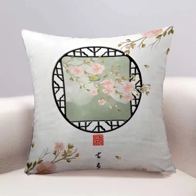
![[V.Home] Throw Pillows/Cushion Case/4 sizes available/Indoor Decoration Cushion Pillow](https://img.lazcdn.com/g/p/7b0bca45b51dd8b3fca4a548ca000357.jpg_400x400q80.jpg_.webp)
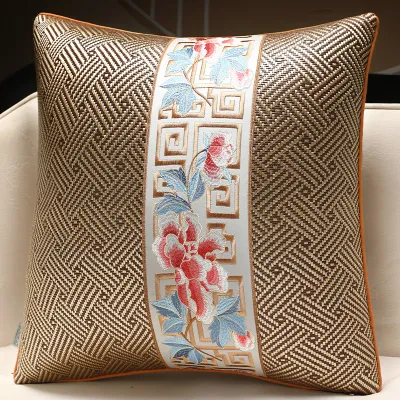
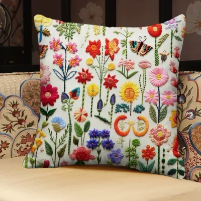
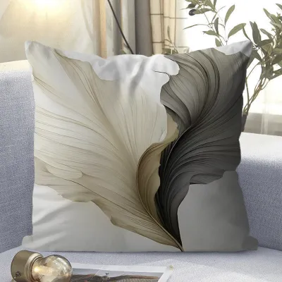
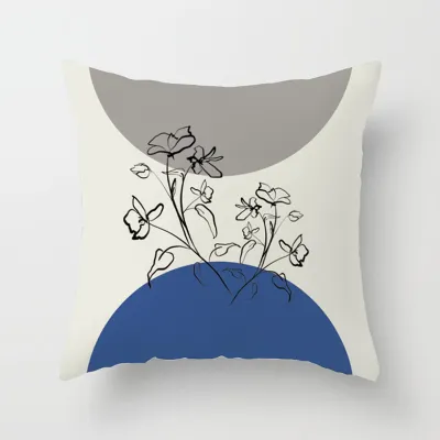
Prices are valid at publication and may change. Please refer to the product page for the latest price.
To prevent your odd-numbered arrangement from looking like a random assortment, you must establish a unifying element. This common thread acts as the visual glue holding the entire collection together. Your unifying element could be a shared color family (such as warm earth tones or cool coastal blues), a specific design era (like mid-century modern or Scandinavian minimalist), or a consistent mood (such as casual bohemian or refined luxury). Without this shared DNA, individual cushion covers will compete for attention rather than complement one another.
Finally, always use your sofa’s existing upholstery as the foundational canvas. The material, color, and texture of your sofa dictate which cushion styles will work best. For instance, a dark leather sofa has a smooth, heavy presence that benefits from high-contrast, light-colored textiles with plenty of physical grip, such as raw linen or chunky woven cotton. Conversely, a light grey or beige fabric sofa offers a highly forgiving, neutral backdrop that can easily support bold jewel tones, delicate pastels, or intricate geometric patterns.
Strategies for Pairing Colors and Patterns
Combining different colors and prints is often where homeowners feel the most hesitation. The fear of clashing can lead to playing it too safe with matching sets, which often look flat and uninspired. By breaking down the process into structured steps, you can safely introduce vibrant patterns and hues without overwhelming your living space.

Building a Unified Color Palette
To create a balanced color scheme, professional stylists rely on a modified version of the classic 60-30-10 design rule. When applied to a sofa arrangement, 60% of your visual weight should come from a dominant base color, which is typically the color of your sofa or a dominant neutral cushion. Next, 30% of the palette should consist of a secondary supporting color, which appears on two or three of your mid-sized cushions. The remaining 10% is reserved for a bold accent color, restricted to a single focal-point cushion to draw the eye without dominating the room.
When selecting these colors, incorporate plenty of neutral tones to act as visual buffers. Shades of cream, beige, oatmeal, soft grey, or charcoal are essential for separating bold, highly saturated cushion case covers. If you place two vibrant, patterned cushions directly next to each other, they will fight for dominance. Inserting a solid, neutral cushion between them immediately restores order, giving the eyes a place to rest and allowing the individual beauty of each decorative cover to stand out.
Mixing Pattern Scales and Types
If you want to mix multiple patterned covers, the golden rule is to vary the scale of the prints. A classic, foolproof combination involves pairing one large-scale pattern, one medium-scale pattern, and one small-scale or micro-pattern. For example, you might choose a large-scale botanical or abstract floral print as your main statement piece. You would then pair this with a medium-scale geometric grid or stripe, and round out the look with a small-scale, highly detailed herringbone or speckled print. This variation prevents the patterns from blending into a blurry, confusing mass from a distance.
In addition to varying the scale, you should also mix the types of patterns you use. Combining structured, geometric lines with organic, flowing motifs creates a beautiful design tension. Try pairing a sharp, linear windowpane check with a soft, hand-painted watercolor floral or a leafy tropical print. To keep this mix from looking chaotic, always ensure that at least one color from your large-scale statement pattern is repeated in the smaller prints, and ground the entire look with solid-colored covers that tie back to your base palette.
Layering Textures to Add Depth
When working with a subtle color palette or a monochromatic scheme, texture becomes your most powerful tool for creating visual depth. Without contrasting textures, a neutral sofa can easily look flat and uninviting. Layering different fabrics introduces physical and visual weight, making the seating area feel cozy, luxurious, and multi-dimensional.
To achieve this, focus on contrasting matte and shiny finishes. Pair a flat-weave cotton or a rustic, slubby linen cover with a plush, light-catching velvet or a smooth faux silk. The way light interacts with these different surfaces adds instant sophistication to the arrangement. You can also introduce highly tactile, three-dimensional weaves such as bouclé, chunky cable knits, tufted cotton, or detailed embroidery. These raised surfaces invite touch and give the arrangement a high-end, crafted feel.
Texture also functions beautifully as a “visual neutral.” If you have two colors or patterns that feel slightly mismatched, placing a highly textured, neutral-toned cushion (such as a cream bouclé or a beige waffle-weave) between them can bridge the gap. The physical depth of the texture distracts the eye from minor color discrepancies, seamlessly tying the disparate elements together.
In Singapore’s warm, tropical climate, practical material considerations are just as important as aesthetics. Heavy wools, dense synthetics, and thick polyesters can trap heat and moisture, making your sofa feel uncomfortably warm for daily use. Instead, prioritize breathable, moisture-wicking natural fibers like pure linen, cotton-linen blends, and lightweight ramie for the primary cushions you lean against. You can still incorporate luxurious accent textures like velvet or bouclé, but use them sparingly on smaller accent pieces or lumbar cushions that can be easily moved aside.
Step-by-Step Cushion Arrangement and Placement
Once you have selected your cushion case covers, the final step is physical styling. How you position the cushions on your sofa determines whether the final look feels professional and polished or messy and thrown together.
To build a balanced arrangement, always work from the back to the front, starting at the outer corners of the sofa and moving inward:
- The Anchor Layer (Back Corners): Place your largest, most structured cushions in the far corners of the sofa. These are typically 50cm x 50cm or 55cm x 55cm square cushions. For a cohesive look, these anchor cushions should be solid colors or very subtle textures that complement the sofa fabric, establishing a clean frame for the rest of the arrangement.
- The Mid-Layer (Inward): Layer slightly smaller cushions (typically 45cm x 45cm) directly in front of the anchor cushions, overlapping them by about half their width. This is where you should introduce your medium-scale patterns, contrasting textures, and secondary colors.
- The Accent Layer (Center or Front): Finish the look with a smaller accent cushion or a rectangular lumbar cushion (typically 30cm x 50cm) placed in the center of the sofa or nestled in front of one of the side clusters. This front cushion is the perfect spot for your boldest accent color, most intricate embroidery, or a unique round shape.
When arranging your cushions, consider the overall vibe of your home. A symmetrical layout—where the left side of the sofa perfectly mirrors the right side—creates a formal, traditional, and highly tailored look. This works exceptionally well in classic or minimalist interiors. If you prefer a more casual, contemporary, or lived-in aesthetic, opt for an asymmetrical layout. For example, on a three-seater sofa, you might place a cluster of three cushions on one side (a large solid, a medium pattern, and a small texture) and balance it with a single, highly detailed medium cushion on the opposite side. This keeps the sofa looking balanced without feeling overly rigid.
Styling Mistakes That Make Your Sofa Look Messy
Even with beautiful cushion covers, a few common styling pitfalls can quickly ruin the overall effect. Recognizing these mistakes will help you refine your arrangement and maintain a clean, stylish living room.
One of the most frequent errors is overcrowding the sofa. While a mountain of plush cushions looks cozy in photographs, a sofa must remain functional. If your family or guests have to physically remove cushions and pile them onto the floor just to sit down, you have too many. As a general rule, at least 50% of the sofa’s seating surface should remain completely clear and usable. For a standard three-seater sofa, five cushions are usually the absolute maximum required for a styled yet functional look.
Another common mistake is mixing too many high-contrast, saturated colors without a grounding neutral base. If your sofa features bright orange, electric blue, lime green, and hot pink cushions all fighting for attention, the result is visual noise that causes eye fatigue. Always ensure your bold choices are balanced by quiet, solid neutrals that allow the vibrant colors to pop in a controlled, sophisticated way.
Furthermore, never underestimate the importance of your cushion inserts. A high-quality cushion case cover will still look messy and cheap if it is stuffed with a flat, lumpy, or undersized insert. To achieve that plump, luxurious look seen in design showrooms, always purchase cushion inserts that are slightly larger than the covers themselves. For example, if your cushion cover measures 45cm x 45cm, use a 50cm x 50cm insert. This extra volume fills out the corners perfectly, prevents fabric sagging, and gives the cushion a premium, high-end loft. For a soft, chop-able finish, feather or high-quality down-alternative inserts are highly recommended over stiff polyester fiberfill.
Finally, remember to step back and view your sofa in the context of the entire room. Your cushion covers do not exist in a vacuum; they must communicate with the rest of your decor. Ensure the colors and patterns you select complement nearby elements such as your area rug, curtains, wall art, and even your indoor plants. By connecting the design language of your cushions to the wider room, your sofa will look like a seamless, intentional extension of your home’s unique style.
Community discussion
Share your experience or ask a question. Comments are reviewed before publication.