
Selecting the perfect poster collection for your home in Singapore is more than just picking beautiful images; it is about creating a visual dialogue between your walls and your living space. Whether you are decorating a compact HDB flat or a spacious condominium, the art you display serves as the ultimate finishing touch that binds your interior design elements together. A thoughtful poster collection can instantly elevate a room, making it feel curated, intentional, and deeply personal. However, without a clear strategy, mismatched prints can easily clash with your furniture, disrupt the flow of your home, or get lost in the room’s existing color scheme.
To achieve a harmonious look, you must consider how different poster styles—ranging from clean minimalist line art to bold vintage travel prints—interact with your home’s architectural features, lighting, and furniture. This guide provides a comprehensive decision-making framework to help you identify your core interior aesthetic, select the ideal poster genres, evaluate print and frame quality, and plan a secure, visually balanced layout that withstands Singapore’s unique tropical climate.
Identifying Your Core Interior Aesthetic
Before browsing online marketplaces or local art boutiques, you must take a step back and objectively evaluate your existing space. The dominant design theme of your home is established by the lines of your furniture, the textures of your materials, and your primary color palette. For instance, if your living room features clean-lined oak furniture, light grey upholstery, and woven rattan accents, your baseline leans toward a Scandinavian or minimalist aesthetic. Conversely, if your space is characterized by dark walnut wood, tapered furniture legs, and warm brass fixtures, you are working with a mid-century modern foundation. Identifying these dominant elements prevents you from purchasing prints that fight against your room’s established character.
Products mentioned in this guide


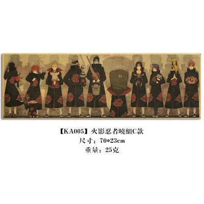
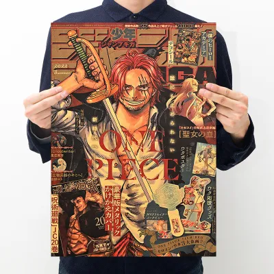


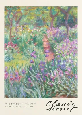
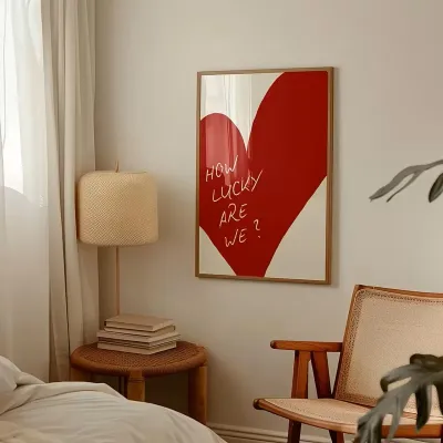
Prices are valid at publication and may change. Please refer to the product page for the latest price.
Lighting conditions and spatial mood also play a critical role in how art is perceived. Singaporean homes often experience a stark contrast in natural light; a living room with floor-to-ceiling windows receives intense, bright tropical sunlight, while deep interior hallways or study rooms might rely entirely on warm artificial lighting. Bright, airy spaces can easily accommodate soft, pastel-toned prints or highly detailed botanical illustrations without losing their impact. In contrast, darker or moodier rooms benefit from high-contrast graphic designs or bold black-and-white photography that cuts through the shadows and commands attention.
Finally, consider the primary function of the room to guide the emotional tone and visual energy of your poster collection. A home office or study requires art that fosters focus and calm, making minimalist abstract shapes or serene landscape photography ideal choices. For a high-traffic living room where you entertain guests, a dynamic gallery wall featuring vibrant colors or retro typography can spark conversation and inject energy into the space. By aligning the emotional resonance of the artwork with the room’s daily utility, you ensure that your poster collection enhances, rather than disrupts, the domestic experience.
Matching Poster Styles to Popular Home Aesthetics
Aligning a poster collection with your interior design theme requires a keen eye for visual weight, typography, and subject matter. Every piece of art carries a specific visual weight determined by its color saturation, line thickness, and complexity. When placed on a wall, these elements interact directly with the surrounding decor, such as the height of your sofa, the pattern of your curtains, and the texture of your walls. For example, a delicate, thin-line sketch can easily get visually swallowed if placed next to a heavy, dark-stained bookshelf, whereas a bold, saturated graphic print might overwhelm a delicate glass console table.

Typography and subject matter also carry strong stylistic associations that can either reinforce or confuse your design narrative. Modern sans-serif typography and abstract geometric shapes naturally align with contemporary, forward-looking spaces, while serif fonts, distressed textures, and historical illustrations evoke a sense of nostalgia and warmth. Understanding these relationships allows you to transition from a random assortment of prints to a cohesive, professional-looking collection. Let us explore how to match specific poster styles with four of the most popular home aesthetics in Singapore.
Minimalist and Scandinavian Interiors
Minimalist and Scandinavian interiors are celebrated for their simplicity, functionality, and deep connection to natural elements. To complement this aesthetic, your poster collection should focus on abstract line art, minimalist typography, and muted color blocks that avoid visual clutter. Look for prints that utilize single-line drawings, soft organic shapes, or subtle architectural details. The color palette should remain restrained, drawing from neutral tones such as beige, taupe, soft terracotta, sage green, and charcoal grey to mirror the calming, earthy vibe of Scandi decor.
A critical design principle for these spaces is the preservation of negative space—both within the artwork itself and on the wall surrounding it. Posters with ample white or off-white backgrounds allow the eye to rest, maintaining the airy, breathable atmosphere that defines minimalist living. Crowding a wall with dense, highly detailed imagery will instantly disrupt the clean lines of your furniture and make a compact room feel smaller.
When it comes to framing, simplicity is paramount. Opt for thin, sleek aluminum frames in matte black or brushed brass, or choose light natural wood frames such as oak, ash, or birch. These materials harmonize beautifully with light-colored wooden furniture and maintain the organic, understated elegance of the space. Avoid wide, ornate, or highly glossy frames, as they introduce unnecessary visual noise that conflicts with the minimalist philosophy.
Vintage, Retro, and Mid-Century Spaces
If your home embraces the warmth, nostalgia, and rich textures of vintage, retro, or mid-century modern design, your poster collection should reflect this historical depth. Excellent candidates for these spaces include detailed botanical illustrations, retro travel posters featuring bold vintage typography, and mid-century geometric patterns inspired by Bauhaus or atomic-era designs. These styles inject personality and a sense of history into your home, making your walls feel like a curated archive of classic design.
The color palette for a vintage-inspired collection should lean heavily into warm, earthy tones and muted primary colors. Think mustard yellow, olive green, burnt orange, rust, and deep teal, often softened by sepia filters or aged paper backgrounds. These warm tones complement the rich wood grains of teak, walnut, and rosewood furniture commonly found in mid-century homes, creating a seamless visual transition from your furniture to your walls.
To anchor this historical aesthetic and add appropriate visual weight, select frames with character. Dark wood frames, such as walnut or mahogany, work exceptionally well to reinforce the mid-century vibe. Alternatively, slightly distressed metallic frames or vintage-style gold-leaf frames can add a touch of antique charm to botanical or retro travel prints. The goal is to make the frame feel like an extension of the art itself, grounding the collection in a specific era.
Industrial and Modern Urban Lofts
Industrial and modern urban loft aesthetics thrive on raw, unfinished architectural elements like exposed brick, concrete screed, steel beams, and copper piping. To balance these rugged, textured surfaces, your poster collection should lean toward contemporary, high-contrast art. Black-and-white photography—particularly urban landscapes, architectural details, or gritty street scenes—works exceptionally well in these environments. Additionally, bold graphic designs, patent blueprints, and minimalist industrial typography can enhance the raw, functional feel of the space.
The key to decorating industrial walls is contrast. Because concrete and brick walls have highly textured, matte surfaces, your artwork needs sharp lines and high-contrast values to stand out. A soft, pastel watercolor print will likely look washed out and out of place against a dark concrete screed wall. Instead, opt for deep blacks, stark whites, and occasional pops of industrial colors like safety orange, cobalt blue, or crimson red to create a striking visual focal point.
For framing, matte black metal frames are the gold standard for industrial spaces, mirroring the black steel fixtures and window frames often found in loft designs. If you prefer a more modern, clean look, frameless canvas mounts or acrylic block frames can showcase the artwork without any border, allowing the raw texture of the wall to frame the piece naturally. Ensure the mounting hardware is robust and visible, as exposed screws or industrial-style hanging clips can actually enhance the overall aesthetic.
Bohemian and Eclectic Rooms
Bohemian and eclectic interiors are defined by their relaxed, layered, and deeply personal nature. These spaces reject rigid design rules in favor of a curated, collected-over-time look that showcases your travels, interests, and artistic passions. For a boho or eclectic home, your poster collection should be a vibrant mix of genres. Do not hesitate to combine abstract modern art, lush botanical prints, colorful exhibition posters, and global motifs within the same display.
The display strategy in a bohemian room should feel informal and lived-in. Instead of a perfectly symmetrical grid, experiment with relaxed layering techniques. You can lean larger framed posters against the wall on top of a low sideboard, overlap smaller frames on floating shelves, or create an organic, salon-style gallery wall that climbs toward the ceiling. This casual arrangement contributes to the cozy, unpretentious atmosphere that makes bohemian spaces so inviting.
While eclecticism encourages variety, you must still balance the bright colors of your posters with the room’s existing textiles, such as Moroccan rugs, macrame wall hangings, and patterned cushions. To prevent the space from feeling chaotic, look for subtle color threads that tie the collection together—perhaps a recurring shade of terracotta or a shared warm undertone across different prints. Mix and match frame materials, combining light wood, bamboo, and vintage brass to enhance the layered, worldly aesthetic.
Key Selection Criteria for Poster Collections
Once you have decided on a style, evaluating the physical quality of the posters and frames is crucial before finalizing your purchase. In Singapore’s tropical climate, high humidity levels can severely impact paper products. Cheap, thin poster paper is highly susceptible to absorbing moisture from the air, leading to unsightly warping, rippling, or mold growth inside the frame. To prevent this, always check the product specifications for paper weight and quality. Look for heavy-weight paper, ideally 200 gsm (grams per square meter) or higher, with an acid-free, archival-grade rating. Matte or satin finishes are generally preferred over high-gloss finishes, as they minimize reflections and provide a more sophisticated, gallery-like appearance.
Sizing and aspect ratios must be carefully calculated relative to your wall space and furniture scale. A common design mistake is hanging a poster collection that is too small for the wall, which makes the room look unfinished and the art look like an afterthought. As a general rule of thumb, a poster or a cluster of posters should occupy approximately two-thirds to three-quarters of the width of the furniture it hangs above, such as a sofa, console table, or bed. Measure your wall space carefully and use a measuring tape to visualize the dimensions before ordering.
Framing compatibility is another essential checkpoint, particularly regarding protection and glare. If your poster collection will be hung in a room that receives direct sunlight, standard glass frames can create intense glare, making the art difficult to see from certain angles. Consider opting for frames equipped with anti-glare acrylic or UV-protective glass. Acrylic is also much lighter and shatterproof, making it a safer choice for heavy frames hung in high-traffic areas or above beds.
Finally, verify the print resolution and color accuracy of the online retailer. High-quality prints should have a minimum resolution of 300 DPI (dots per inch) to ensure sharp lines and vibrant, non-pixelated colors. Read customer reviews to check if the physical colors match the digital mockups on the website. Additionally, review the retailer’s return and exchange policies; because colors can look different under your home’s specific lighting, having a flexible return policy provides peace of mind in case the prints do not harmonize with your space as expected.
Planning Your Layout and Display Strategy
The way you arrange and hang your poster collection is just as important as the art itself. There are several layout strategies to choose from, depending on the mood you want to create. A symmetrical gallery wall grid, where identical frame sizes are aligned perfectly, creates a formal, clean, and orderly look that suits minimalist or modern spaces. A salon-style cluster, which mixes different frame sizes and orientations in an organic arrangement, offers a dynamic, creative feel perfect for eclectic or vintage homes. For a minimalist or industrial space, a single, oversized statement piece can create a powerful, uncluttered focal point.
To achieve a professional finish, precise measuring and spacing are essential. Maintain a consistent margin between your frames—typically between 5 to 10 cm. If the spacing is too wide, the collection will look disconnected; if it is too narrow, it can feel cramped. Use a spirit level and a pencil to mark your alignment lines lightly on the wall.
Before drilling any holes or applying adhesives, it is highly recommended to test your layout using paper templates. Trace each of your frames onto kraft paper or newspaper, cut them out, and tape them to the wall using painter’s tape. This allows you to step back, evaluate the balance of the arrangement, and adjust the spacing and height without damaging your walls. The center of your collection or statement piece should ideally hang at eye level, which is approximately 145 to 150 cm from the floor to the center of the artwork.
Lastly, always verify your wall material and weight limits before selecting hanging hardware. In Singapore, most HDB flat walls are made of solid concrete, which requires a masonry drill bit, wall plugs (anchors), and screws to hang heavy frames securely. Drywall partitions, common in newer condominiums or partitioned study rooms, require specialized toggle bolts or drywall anchors. Never attempt to hang heavy glass-framed posters on standard nails or weak adhesives, as they can fall and cause injury or damage.
Frequently Asked Questions (FAQ)
How do I mix different poster styles without clashing?
Mixing diverse poster styles successfully relies on establishing a unifying visual thread. You can achieve this by using a consistent frame color and material across all pieces, such as matching matte black frames, which instantly binds different art styles together. Another effective technique is maintaining an identical matting style (the cardboard border around the print) to create uniform negative space. Additionally, look for a recurring color accent—such as a specific shade of blue or terracotta—that appears in each print, ensuring the collection feels cohesive despite varying subject matters. Balance the visual weight by distributing large, bold graphic prints and smaller, highly detailed sketches evenly across your layout so no single side feels too heavy.
What is the best way to hang a poster collection on a rented wall?
For rental properties where drilling into concrete or drywall is restricted, damage-free adhesive strips are the most reliable solution. Choose high-quality adhesive strips that are rated specifically for the combined weight of your frame and poster, and always err on the side of caution by using strips rated for a higher weight capacity than needed. Before application, clean the wall surface with rubbing alcohol to remove any dust or oils, and follow the manufacturer’s instructions precisely, including the recommended press-and-hold times. When it is time to move out, pull the adhesive tabs slowly and straight down parallel to the wall to prevent peeling the paint. For heavier frames that exceed adhesive weight limits, consider leaning your posters on top of existing furniture, such as sideboards, consoles, or bookshelves, which completely avoids wall contact while maintaining a stylish, modern look.

Community discussion
Share your experience or ask a question. Comments are reviewed before publication.