
Selecting the right wall art for a minimalist Singapore apartment requires balancing visual simplicity with personal expression. In compact Housing & Development Board (HDB) flats and modern condominiums, walls are valuable real estate where every design choice directly impacts the perception of space. The most effective art styles for these homes are those that embrace negative space, low-saturation color palettes, and clean geometric or organic lines. By focusing on visual restraint, you can elevate your living space without introducing clutter, ensuring your home remains a serene sanctuary away from the bustling city.
Understanding the Minimalist Context in Singapore Homes
Singapore apartments present unique architectural characteristics that influence how art interacts with the interior. Standard HDB flats and condominiums typically feature ceiling heights ranging from 2.6 to 2.8 meters, with compact floor plans that demand careful spatial planning. Natural light is often abundant due to large windows designed to maximize ventilation, but this also introduces significant glare on certain walls. To maintain a minimalist aesthetic, wall art must work in harmony with these physical dimensions rather than overwhelming them.
Minimalism in a local context is not merely about empty walls; it is about creating visual breathing room, or negative space. When a room feels open, the mind relaxes, which is essential in high-density urban environments. Before selecting any artwork, observe the existing color palette of your walls, flooring, and major furniture pieces. Most minimalist Singapore homes utilize neutral backdrops—such as off-white, warm grey, or light beige—paired with natural textures like light oak, indoor plants, or concrete screed. Your chosen art should complement these existing tones, acting as a quiet extension of the room’s design rather than a loud, competing focal point.
Products mentioned in this guide
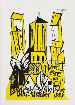
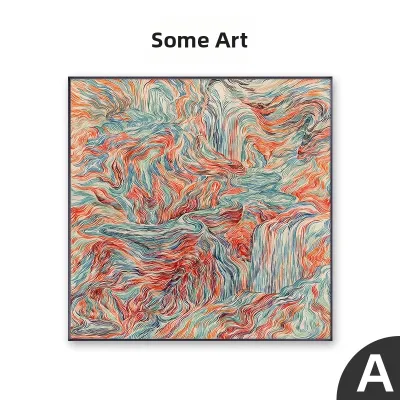
Prices are valid at publication and may change. Please refer to the product page for the latest price.
Evaluating Art Styles and Visual Characteristics
Instead of searching for rigid art genres, evaluate potential pieces using a framework of visual weight. Visual weight refers to how much attention an object commands based on its color saturation, line complexity, and subject abstraction. In a minimalist setting, the goal is to distribute this weight evenly so that no single piece makes the room feel lopsided or cramped.

Color Palette and Contrast Management
Color selection is the most immediate way to control the visual weight of your wall art. Monochromatic pieces, particularly those utilizing shades of grey, beige, taupe, or soft charcoal, blend seamlessly into minimalist walls, offering a sophisticated and calming effect. If you prefer color, opt for muted, desaturated tones—such as dusty olive, terracotta, or pale ochre—which introduce warmth without disrupting the room’s quiet atmosphere.
High-contrast black-and-white art, such as bold ink washes or minimalist photography, can also work beautifully if managed carefully. To prevent high-contrast pieces from disrupting the visual flow, ensure they are balanced by surrounding neutral elements. For instance, a stark black-and-white print can be softened by a light wood frame or placed on a wall that receives soft, indirect light, preventing the contrast from feeling too harsh or jarring.
Line Complexity and Negative Space
The internal composition of an artwork dictates how long the eye lingers on it and how busy it feels. Minimalist art relies heavily on a high ratio of negative space to positive subject matter, meaning the background of the print is just as important as the subject itself. When browsing art, look for compositions where the background occupies at least sixty to seventy percent of the canvas or paper.
Continuous line drawings, single-stroke brushwork, and simple geometric abstractions are excellent choices because they convey form with minimal visual noise. In contrast, highly detailed landscapes, intricate patterns, or busy street photography can make a compact HDB living room feel cluttered. By choosing clean, sweeping lines and generous empty space within the frame, you allow the viewer’s eyes to rest, reinforcing the overall sense of spaciousness.
Subject Matter and Texture Integration
Minimalist subject matter does not have to be boring or entirely abstract. Non-exhaustive examples of suitable themes include soft botanical silhouettes, architectural details focusing on shadow and form, and subtle, spaced-out typography. These subjects provide a gentle point of interest without demanding intense cognitive processing from the observer.
If you want to add depth to a neutral room without introducing color, look to physical texture. Textured art—such as embossed paper prints, heavy-weave canvas, or plaster-based relief art—interacts dynamically with the changing natural light in your apartment throughout the day. The subtle shadows cast by a textured surface provide visual interest and warmth, satisfying the desire for detail while keeping the color palette entirely clean and unified.
Sizing and Placement Strategies for Compact Layouts
Proper scaling is crucial when hanging art in compact Singapore layouts. A common guideline for maintaining balanced negative space is the 4:7 rule, where the artwork occupies roughly fifty-seven percent of the available wall width. In a typical HDB living room or condo bedroom, leaving ample empty wall space around the frame prevents the room from feeling boxed in.
Hanging height should be determined relative to both the floor and your furniture. The center of the artwork should ideally sit at eye level, which is approximately 140 to 145 centimeters from the floor. When hanging art above a sofa or console table, ensure the bottom of the frame sits about 15 to 20 centimeters above the furniture piece, and the width of the art spans roughly two-thirds to three-quarters of the furniture’s width. This anchors the art to the furniture, creating a cohesive visual unit rather than a floating element.
For minimalist spaces, a single, large-scale statement piece is generally more effective than a complex gallery wall. A single large frame creates a clean, singular focal point that simplifies the room’s visual landscape. If you prefer a multi-piece arrangement, limit it to a curated diptych or triptych—two or three matching frames hung side-by-side with precise, equal spacing of about 5 to 10 centimeters. This structured layout maintains the clean lines characteristic of minimalist design.
When hanging heavy frames or working at height near ceiling fans, always follow the manufacturer’s installation instructions and use appropriate wall anchors. For complex installations or heavy suspended loads, consult a qualified professional to ensure the artwork is mounted securely and safely.
Framing and Material Considerations for Local Climates
The frame you choose is the bridge between the artwork and your apartment’s architecture. For a minimalist aesthetic, select thin, low-profile frame borders made of natural materials like light oak, ash, or matte-finished aluminum in black or white. Avoid wide, ornate, or glossy frames, as they add unnecessary visual weight and can detract from the simplicity of the artwork.
Singapore’s abundant natural light requires careful consideration of glazing materials to prevent distracting reflections. Standard glass can act like a mirror, obscuring the artwork and creating harsh glare during the brightest parts of the day. Consider opting for anti-reflective glass or high-quality acrylic glazing with a matte or non-glare finish, which preserves the visibility of the art from various angles in the room.
Furthermore, Singapore’s tropical climate and high humidity levels present challenges for preserving paper prints and canvas. Moisture can lead to warping, mold growth, or foxing over time. To protect your investment, check manufacturer specifications for humidity-resistant backing materials, such as acid-free foam board, and ensure the frame is properly sealed at the back. For high-humidity areas like dining spaces near open kitchens, canvas prints treated with protective, moisture-resistant coatings or framed prints with spacer inserts that prevent the paper from touching the glass are highly recommended.
Common Curation Mistakes to Avoid
One of the most frequent mistakes in minimalist curation is overcrowding the walls by trying to fill every empty surface. Empty walls are not design flaws; they are active components of a minimalist layout that allow the room to breathe. Resist the urge to hang art on every vertical surface, and instead designate one or two primary walls for display.
Another common pitfall is choosing frames that are too heavy or dark for the space, which can make a small room feel visually weighed down. Similarly, improper scaling—such as hanging a tiny print on a massive wall—creates visual awkwardness and disrupts the harmony of the room. Always measure your wall and furniture dimensions before purchasing, and use painter’s tape to map out the frame size on the wall to verify the scale before making a final decision.
Frequently Asked Questions (FAQ)
How often should I rotate or update minimalist wall art?
Rotating your wall art every six to twelve months is an excellent way to refresh your living space without undergoing a complete redesign. You might choose to swap prints to reflect seasonal shifts in light, opting for warmer, earthier tones during cooler, rainier months and lighter, cooler tones during the brighter seasons. When storing prints that are out of rotation, keep them flat in a cool, dry place, ideally wrapped in acid-free tissue paper and stored inside a protective portfolio box to prevent moisture damage and yellowing.
Can I mix different art styles in a single minimalist room?
You can successfully mix different art styles, such as pairing a geometric abstract print with a delicate botanical line drawing, provided you maintain a unifying element. To keep the arrangement cohesive and prevent visual clutter, use identical frames and matting for all pieces, or restrict the entire collection to a strict, shared color palette. Keeping the spacing between the frames perfectly consistent also helps tie disparate styles together, ensuring the overall composition feels intentional and orderly rather than chaotic.
Community discussion
Share your experience or ask a question. Comments are reviewed before publication.