
Selecting the right wall art is more than just finding an image you like; it is about creating a dialogue between the artwork, its border, and the room it inhabits. In Singapore’s diverse residential landscape—from compact, light-filled HDB flats to spacious, high-ceilinged condominiums—the way you pair pictures, frames, and art with your existing interior design dictates the entire mood of your home. Whether you are leaning into the clean serenity of Scandinavian design, the raw textures of an industrial loft, or the grounding calm of Japandi style, matching your wall decor to your interior aesthetic ensures a cohesive and visually balanced space.
To achieve a polished look, you must consider how the physical elements of your art—such as the medium, the frame profile, and the mounting style—interact with your home’s architecture. This guide explores how to match different art styles and framing options to Singapore’s most popular interior design themes, while addressing the practical challenges of displaying art in a tropical climate.
Core Principles for Matching Pictures and Frames to Your Space
Before purchasing any artwork, you must analyze your room’s existing design elements to determine the right artistic direction. Start by identifying the dominant furniture styles, textures, and color palettes in the space. A room filled with warm teak mid-century modern furniture demands a different artistic approach than a sleek, modern space dominated by polished marble and chrome. Look at the secondary and accent colors in your soft furnishings, such as cushions, rugs, and curtains, as these will guide the color scheme of your selected art.
Products mentioned in this guide
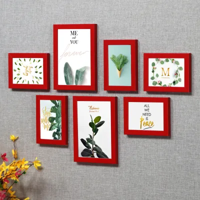
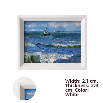
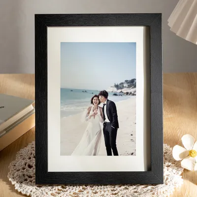
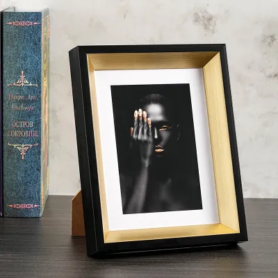
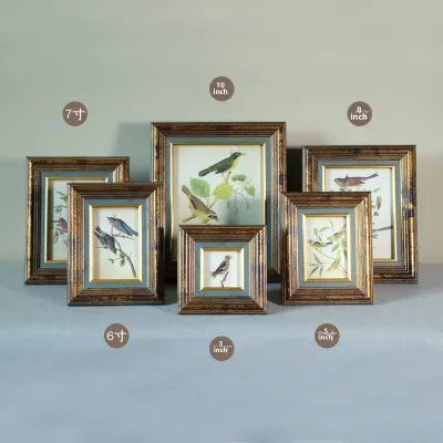
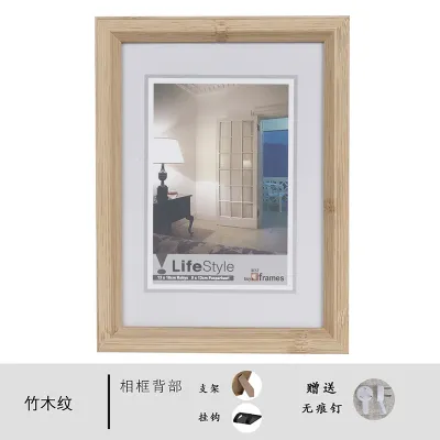
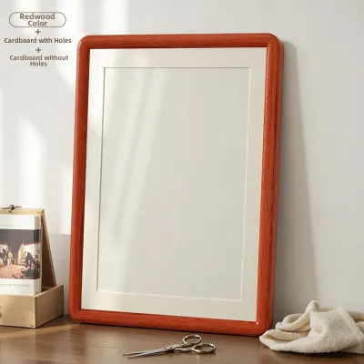
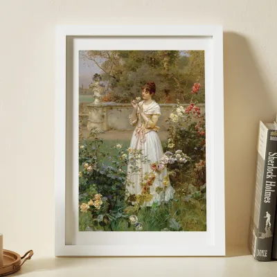
Prices are valid at publication and may change. Please refer to the product page for the latest price.
Achieving color harmony requires a deliberate balance between complementary and analogous colors. Analogous color schemes, which use colors next to each other on the color wheel (such as blues, greens, and grays), create a serene, harmonious environment ideal for bedrooms and study areas. Conversely, complementary color schemes use opposing colors (such as a splash of terracotta orange against a deep blue wall) to create vibrant contrast. Utilizing complementary colors in your artwork is an excellent way to establish a bold focal point in high-traffic areas like the living room or dining space.
Visual weight and scale are equally critical when selecting pictures, frames, and art. The physical size of the artwork and the thickness of its frame must relate proportionally to the surrounding furniture and the room’s wall dimensions. A small, delicate print will look lost on a large living room wall, while an oversized, heavy-framed canvas can overwhelm a narrow hallway. In typical Singaporean homes with standard ceiling heights of 2.6 to 2.8 meters, keeping the scale of your art balanced with your furniture prevents the room from feeling vertically cramped.
To ensure a piece of art will complement your home before making a purchase, use this quick evaluation checklist:
- Aesthetic Alignment: Does the art style match the era and vibe of your dominant furniture?
- Color Integration: Does the artwork contain at least two colors that match your room's secondary or accent decor?
- Frame Compatibility: Do the frame materials and colors coordinate with other wood, metal, or painted finishes in the room?
- Scale Proportion: Is the artwork's width between two-thirds and three-quarters of the width of the furniture piece below it?
- Environmental Suitability: Is the art medium and framing style durable enough for the room's humidity and light exposure?
Minimalist and Scandinavian Spaces: Botanical Prints and Clean Frames
Minimalist and Scandinavian interiors prioritize simplicity, functionality, and a deep connection to nature. These spaces are characterized by light color palettes, natural wood tones, and uncluttered layouts that maximize natural light. To maintain this breezy, open atmosphere, your wall art choices should feel light, airy, and unburdened by heavy visual details.

Best Art Styles: Botanical and Line Drawings
Subtle botanical prints and single-line drawings are highly effective in Scandinavian-themed homes. Botanical art featuring delicate fronds, eucalyptus leaves, or soft floral silhouettes introduces organic shapes without cluttering the visual field. Single-line drawings—which depict faces, figures, or abstract shapes using a single continuous line—provide a sophisticated, modern touch that respects the minimalist ethos.
When choosing abstract art for a minimalist space, prioritize pieces with ample negative space. Art that features a simple brushstroke or a soft watercolor wash against a clean white or cream background allows the eye to rest. This abundance of white space within the image itself prevents the walls from feeling closed in, helping to preserve the light, spacious feel typical of Nordic-inspired interiors.
Frame Choices: Slim Profiles and Wide Matboards
Framing for minimalist art should protect the piece without drawing attention away from the artwork itself. Slim, flat-profile frames with a width of 1 to 1.5 centimeters are ideal. Opt for light wood finishes like oak, ash, or maple to complement the light timber furniture commonly found in Scandinavian designs. Alternatively, thin matte black or clean white frames can provide a sharp, graphic border that grounds the artwork against pale walls.
To elevate simple prints and line drawings, utilize wide white or off-white matboards (passe-partout). A generous matboard margin of 5 to 10 centimeters around the print creates visual breathing room, drawing the viewer’s eye inward toward the artwork. This framing technique gives inexpensive prints a premium, gallery-like appearance while emphasizing the clean, structured lines of the minimalist aesthetic.
Layout and Placement Strategies
In Scandinavian design, layout strategies favor order, symmetry, and restraint. A highly effective placement strategy is to center a single, medium-to-large framed print directly above a low-profile sofa, sideboard, or bed. This creates a clear, calming focal point without competing with other design elements in the room.
If you prefer grouping multiple pieces, stick to a small, symmetrical grid, such as a pair of matching botanical prints hung side-by-side. Avoid the temptation to cover every empty wall; leaving generous sections of blank wall space is essential to achieving the “less is more” philosophy. This intentional emptiness allows the selected pictures, frames, and art to stand out as thoughtful, curated design choices.
Industrial and Urban Lofts: Bold Abstracts and Metal Frames
Industrial and urban loft styles celebrate raw, exposed architectural elements such as concrete screed walls, red brick veneers, copper piping, and black metal framing. These spaces have a rugged, utilitarian aesthetic that requires bold, high-contrast artwork to stand out against visually heavy, textured backgrounds.
Best Art Styles: Large-Scale Abstracts and Monochrome Photography
To make an impact against a textured concrete or brick wall, choose large-scale abstract paintings or high-contrast monochrome photography. Abstract art featuring bold, sweeping brushstrokes, geometric patterns, or heavy impasto textures holds its own against raw architectural elements. Look for pieces that incorporate industrial accent colors, such as rust orange, deep charcoal, mustard yellow, or metallic copper.
Monochrome photography is another excellent fit for urban industrial spaces. High-contrast black-and-white images of architectural structures, gritty cityscapes, or vintage industrial machinery complement the raw materials of the room. The lack of color highlights the textures, shadows, and lines of the photograph, echoing the structural honesty of industrial design.
Frame Choices: Frameless Canvas and Matte Black Metal
For a raw, unfinished look that aligns with the industrial theme, consider frameless gallery-wrapped canvases. A canvas with its edges painted black or left with raw paint drips feels authentic and unpretentious, making it a perfect fit for concrete-heavy rooms. This frameless approach allows the texture of the canvas and the paint layers to take center stage.
If you prefer framed pictures, opt for matte black metal frames with a clean, industrial profile. Aluminum or steel frames with a brushed or anodized finish provide a sleek, hardware-like border that complements black metal light fixtures and steel-framed glass partitions. Alternatively, frames made from reclaimed wood with visible grain, knots, and distressed finishes can add warmth and historic character to a cold, modern loft space.
Layout and Placement Strategies
Industrial spaces allow for more relaxed, unconventional art displays. Instead of hanging every piece, try leaning a large, heavy-framed abstract painting directly on the floor against a concrete wall, or resting a medium-sized framed photograph on a low metal console table. This casual, studio-like arrangement feels effortless and artistic.
Beyond visual aesthetics, wall art plays a practical role in industrial-themed homes. Concrete floors, exposed brick, and high ceilings can create harsh acoustic environments with excessive echo. Hanging large canvas paintings or framed art with soft backing boards helps to absorb sound waves, softening the room’s acoustics and making the industrial space feel much more comfortable and lived-in.
Modern Asian and Japandi Rooms: Organic Textures and Wood Frames
Japandi style blends the cozy warmth of Scandinavian hygge with the rustic minimalism of traditional Japanese aesthetics, while Modern Asian design incorporates rich cultural motifs and natural materials. Both styles emphasize tranquility, organic textures, and a connection to nature, requiring art that evokes a sense of peace and grounding.
Best Art Styles: Ink Wash and Textured Plaster Art
Subtle ink wash paintings (Sumi-e style) and textured plaster art are perfect for these serene environments. Ink wash art, featuring misty mountain landscapes, delicate bamboo stalks, or abstract circular brushstrokes (Enso), utilizes varying shades of black and gray ink to create depth and movement. These pieces celebrate simplicity and impermanence, aligning with the Wabi-Sabi philosophy of finding beauty in imperfection.
Textured plaster art, which features three-dimensional ridges, waves, or geometric patterns sculpted directly onto canvas, is another excellent option. These tactile pieces rely on light and shadow rather than color to create visual interest. When selecting art for Japandi or Modern Asian rooms, prioritize warm, earthy tones such as beige, terracotta, olive green, sand, and soft charcoal to foster a grounding, zen-like atmosphere.
Frame Choices: Natural Wood Tones and Floating Frames
To maintain the organic warmth of these design styles, frame your art in natural wood. Select high-quality timber frames in tones like oak, walnut, ash, or teak, ensuring they coordinate with the wooden furniture in the room. Avoid highly polished or lacquered finishes; instead, opt for matte, oil-rubbed, or raw wood finishes that showcase the natural grain of the timber.
Floating frames, also known as canvas floater frames, are highly recommended for textured plaster art or canvas paintings. These frames leave a small gap (typically 5 to 10 millimeters) between the edge of the canvas and the inner border of the frame, making the artwork appear to float within its enclosure. This technique adds subtle depth, shadow, and a modern architectural touch without detracting from the organic quality of the art.
Layout and Placement Strategies
Layouts in Japandi and Modern Asian spaces should prioritize asymmetrical balance and the concept of “Ma”—the Japanese aesthetic design principle of intentional negative space. Instead of centering your art perfectly, try placing a single, highly textured piece slightly off-center on a prominent wall, allowing the empty space around it to create a sense of calm and anticipation.
When grouping art, arrange pieces in odd numbers, such as a triptych of three vertical ink wash panels hung with consistent spacing between them. Ensure that each piece has enough room to breathe, avoiding dense clusters. This sparse, deliberate arrangement encourages quiet contemplation and prevents the visual clutter that disrupts a zen-like home environment.
Eclectic and Transitional Homes: Gallery Walls and Mixed Frames
Eclectic and transitional homes are highly personalized spaces that blend elements from different design eras, cultures, and styles. These interiors are vibrant and character-rich, offering the perfect canvas for creative gallery walls and a diverse mix of art mediums.
Curating a Cohesive Gallery Wall
A successful gallery wall combines vintage oil paintings, modern graphic prints, personal photographs, and sketches without descending into visual chaos. The key to curating a cohesive display is finding a unifying thread. This thread could be a shared color palette (for example, ensuring every piece contains a touch of warm gold or deep navy) or a consistent theme, such as travel photography, botanical studies, or abstract portraits.
Before driving any nails into the wall, plan your layout on the floor. Lay out all your framed pictures, frames, and art on a large sheet of paper or directly on the floor, arranging them until you find a balanced composition. Start with a large, visually heavy “anchor” piece placed slightly off-center, and build outward by adding smaller frames. Take a photo of the final floor arrangement from above to use as a reference during installation.
Unifying Mixed Frames and Media
Mixing frame styles adds depth and historical layers to an eclectic home, but it requires structural boundaries to look intentional rather than accidental. To unify diverse frame styles, use consistent matboard colors across all pieces. For instance, framing a vintage sketch in an ornate gold frame and a modern print in a sleek black frame will look cohesive if both utilize the exact same off-white matboard.
Another strategy is to alternate between two complementary frame finishes throughout the gallery, such as mixing warm brass frames with matte black wood frames. To add texture and dimension, incorporate non-traditional, three-dimensional items into your gallery wall. Consider hanging woven seagrass baskets, small ceramic wall sculptures, or antique brass plates alongside your framed pictures to create a rich, tactile display.
Layout and Placement Strategies
For a structured eclectic look, align your frames along a central horizontal or vertical axis. This method allows you to mix frames of various shapes and sizes while maintaining a clear, organizing line that guides the viewer’s eye. Alternatively, you can use a strict grid layout (such as nine identical square frames) but fill them with highly diverse, colorful art styles to create a playful contrast between order and creativity.
When hanging a gallery wall, maintaining consistent spacing between frames is crucial. Aim for a gap of 5 to 7.5 centimeters (approximately 2 to 3 inches) between each frame. If the frames are hung too close together, the arrangement will look cramped and cluttered; if they are too far apart, the visual connection between the pieces will be lost, and the gallery will look disjointed.
Sizing, Framing, and Hanging Guide for Singapore Homes
To ensure your wall art looks professional and remains secure, you must account for local environmental factors, spatial constraints, and the structural realities of Singaporean properties.
Proportions and Sizing Rules
When hanging art above a piece of furniture, such as a sofa, console table, or bed, follow the two-thirds rule. The total width of your single artwork or gallery wall arrangement should span approximately 60% to 75% of the width of the furniture below it. Art that is too narrow will make the furniture look bulky, while art that is wider than the furniture will create a top-heavy, unstable appearance.
In standard HDB flats and condominiums, wall space can be limited by built-in carpentry, air conditioning units, and structural columns. To avoid overwhelming smaller rooms, scale your art down slightly. Instead of a single massive canvas, opt for a vertical diptych (two panels) or triptych (three panels) to fill the wall space. Vertical art arrangements are particularly effective in Singaporean homes, as they draw the eye upward, creating the illusion of higher ceilings.
Protecting Art from Tropical Humidity and Sunlight
Singapore’s tropical climate, characterized by high relative humidity (often exceeding 80%) and intense sunlight, poses significant risks to wall art. Standard paper prints framed with cheap cardboard backings are highly susceptible to moisture absorption, which leads to paper warping, rippling, and the growth of mold or brown spots (known as foxing). To protect your investment, follow these preservation steps:
- Moisture-Resistant Backing: Avoid standard cardboard or cheap MDF backing. Request acid-free foam board or PVC backing from your framer, as these materials do not absorb moisture.
- Dust Cover Sealing: Ensure the back of the frame is completely sealed with professional framing tape to prevent humid air, dust, and insects from entering.
- Spacers: Ensure the artwork does not touch the glass directly. Use a matboard or plastic spacers to create an air gap, preventing condensation from sticking the paper to the glass.
- UV-Protective Glazing: For rooms with large windows or direct sunlight, choose UV-filtering acrylic or museum glass. Standard glass allows UV rays to pass through, which will fade colors and degrade paper fibers over time. Acrylic is also highly recommended over glass because it is lightweight, shatterproof, and less prone to condensation in air-conditioned environments.
Wall Types and Safe Hanging Hardware
Before drilling into your walls, you must identify the construction material. Older HDB flats and structural columns in newer developments are made of solid, reinforced concrete. Drywall partitions, commonly used in newer condominium layouts or added during renovations to separate rooms, consist of plasterboard over metal studs.
For solid concrete walls, you must use a rotary hammer drill with a masonry drill bit. Insert a plastic wall plug (such as a rawlplug) into the drilled hole before inserting a screw. This ensures the screw has a tight, secure grip capable of holding heavy framed pictures. For drywall partitions, standard nails or screws will slip out under weight; you must use specialized toggle bolts or heavy-duty hollow-wall anchors that expand behind the plasterboard to distribute the load safely.
Always use hardware rated for the specific weight of your framed art. For heavy, oversized pieces, or when drilling into structural walls with complex internal wiring, consult building management guidelines or hire a qualified professional handyman. If you are living in a rental property where drilling is restricted, high-quality, damage-free adhesive hanging strips are a viable alternative. However, you must strictly adhere to the manufacturer’s weight limits, clean the wall surface thoroughly with rubbing alcohol before application, and avoid using them on textured or moisture-prone walls.
Frequently Asked Questions (FAQ)
How high should I hang pictures and frames on the wall?
The standard gallery rule is to hang pictures so that the center of the artwork is at eye level, which is approximately 145 to 152 centimeters from the floor. This rule applies to open walls in hallways, entryways, or dining areas where viewers are standing. When hanging art above furniture like a sofa or sideboard, adjust this height so that the bottom of the frame sits 15 to 20 centimeters above the top of the furniture piece. This creates a cohesive visual grouping rather than leaving a disjointed gap of empty wall.
Can I mix different frame styles in the same room?
Yes, mixing frame styles is highly encouraged and can prevent a room from looking too sterile or showroom-like. To maintain visual harmony, ensure there is at least one unifying element across your frames. You can mix black metal, natural oak, and gold frames in the same room if they all feature the same clean, slim profile, or if they all utilize matching white matboards. Keeping the spacing between the frames consistent also helps to unify different frame styles within a single space.
What is the best lighting for displaying wall art?
The best lighting for wall art highlights the details of the piece without causing harsh glare or heat damage. Adjustable track lighting with warm white LED bulbs (2700K to 3000K) allows you to direct light precisely at the artwork from an angle, minimizing reflections on the glass. Dedicated picture lights mounted directly above the frame provide a classic, gallery-like feel. For hardwired picture lights, ensure the power is isolated at the main distribution board before installation, and consult a licensed electrician. Battery-operated or plug-in picture lights offer a convenient, DIY-friendly alternative that requires no electrical wiring.
Community discussion
Share your experience or ask a question. Comments are reviewed before publication.