
Creating a cohesive gallery wall relies on establishing a clear visual relationship among your wall frames. Rather than buying random frames and hoping they match, a successful display uses a deliberate design anchor—such as a shared color palette, consistent frame materials, or uniform matting—to tie diverse pieces of art together. By planning these elements before making a purchase, you can transform a chaotic collection of prints, photos, and sketches into a structured, intentional focal point that enhances your living space.
In modern apartments, where wall space is often a premium design asset, a well-planned gallery wall can make a room feel larger and more personalized. Whether you are working with a compact entryway or a spacious living room wall, the frames you choose act as the structural bridge between your home’s architecture and your personal art collection. Selecting the right frames requires balancing aesthetic preferences with practical considerations like wall material, weight limits, and room lighting.
This guide walks you through the essential principles of frame coordination, style matching, and technical checks. By understanding how to balance visual weight, align frame profiles with your interior decor, and verify installation safety, you can confidently curate a gallery wall that looks professional and stands the test of time.
Products mentioned in this guide
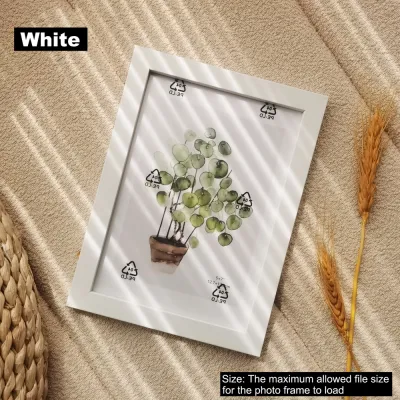


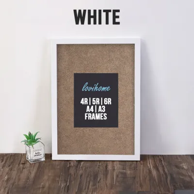
![[SG Seller Super Offer] High Quality Wooden Photo Frame Table Wall Display Graduation Photos Valentines Day Gift Christmas Gift Specimen Pictures Art Display Home Office Gift](https://img.lazcdn.com/g/p/851788c94bcd41f985d460c2ddf8bdc5.jpg_400x400q80.jpg_.webp)



Prices are valid at publication and may change. Please refer to the product page for the latest price.
Core Principles for a Unified Gallery Wall
A cohesive gallery wall does not require every frame to be identical, but it does require a unifying element that signals intention. This anchor can be a shared frame color, a single material like natural oak, or a consistent mat board width and color. When the eye detects a repeating pattern or a common thread across the display, it registers the arrangement as a single, harmonious installation rather than a cluttered collection of individual items. For instance, using all black frames with wide white mats can instantly unify highly diverse artwork, from colorful abstract paintings to black-and-white family photographs.
Balancing visual weight is another critical principle when arranging your wall frames. Visual weight refers to how much attention an object attracts based on its size, color, and texture. A large, dark frame has more visual weight than a small, light-colored one. To prevent your gallery wall from feeling lopsided, distribute these heavier elements evenly across the layout. Placing a single massive frame on one side without a counterweight on the other can make the entire arrangement feel unstable and visually jarring. Instead, position larger “anchor” frames near the center or balance them diagonally across the composition.
While uniformity offers a clean, modern look, you can also break these rules to achieve a curated, eclectic aesthetic. The key to breaking uniformity successfully is to limit your variations. If you choose to mix different frame styles and materials, keep the artwork theme or the color palette highly consistent. Alternatively, if your artwork is incredibly diverse in style and color, keep the frames completely uniform to ground the display. This balance of order and variety ensures that your gallery wall looks thoughtfully collected over time rather than randomly assembled.
Matching Frame Styles to Your Interior Design
Before selecting specific wall frames, assess the dominant design language of your room to ensure the display complements your existing decor. The frames should either blend seamlessly into the background to highlight the artwork or act as contrasting accents that draw the eye. For example, in a room dominated by warm wood tones and soft textiles, choosing frames with matching timber finishes creates a calm, integrated look. Conversely, introducing sleek black metal frames into a soft, neutral room can add a crisp, modern edge that defines the space.

Minimalist and Modern Profiles
Minimalist and modern frame profiles are characterized by their thin, flat faces and clean lines. Typically made from aluminum or slim, painted wood, these frames are designed to step back and let the artwork take center stage. They are highly effective in contemporary, Scandinavian, or industrial spaces where simplicity and functional design are prioritized.
These sleek profiles are particularly suited for displaying photography, minimalist line art, architectural prints, and modern typography. The thin borders provide a crisp edge without distracting from the subtle details of the art. When paired with generous white or off-white matting, minimalist frames create a gallery-like atmosphere that feels airy and sophisticated.
However, minimalist frames have distinct limitations when it comes to heavy, highly textured, or oversized artwork. A very thin frame may lack the structural integrity to support heavy glass or thick canvas boards without warping over time. Additionally, large-scale oil paintings or deeply textured mixed-media pieces can visually overwhelm a delicate, ultra-thin frame, making the overall presentation look unbalanced. For these substantial pieces, a wider, more robust profile is generally required to provide both physical support and visual proportion.
Classic and Ornate Profiles
Classic and ornate frames feature detailed moldings, bevels, and traditional finishes such as gold leaf, dark mahogany, or distressed plaster. These profiles carry a sense of history and craftsmanship, making them ideal for traditional, transitional, or bohemian interiors. The width of the molding in these frames is typically much wider, drawing significant attention to the frame itself as a decorative object.
You can use ornate frames to create an intentional, high-contrast look by pairing them with modern or minimalist art. Placing a simple, abstract line drawing inside a heavily carved, gilded frame creates a striking juxtaposition that feels both curated and sophisticated. This technique works best when the ornate frame is treated as a statement piece within a mixed-material gallery wall, preventing the overall display from feeling overly formal or dated.
When working with classic wood or composite frames, physical weight and mounting requirements become primary considerations. These frames are substantially heavier than their minimalist aluminum counterparts. Before purchasing, verify that your hanging hardware and wall type can safely support the weight of thick timber or plaster moldings. Heavy frames often require heavy-duty wall anchors or direct mounting into wall studs to prevent damage to your walls and ensure the display remains secure.
Eclectic and Mixed-Material Approaches
An eclectic gallery wall combines different frame styles, colors, and materials to create a rich, layered look that feels personal and lived-in. To execute this approach successfully without creating visual chaos, you must establish a clear framework for your mix. One effective strategy is to use consistent matting across all frames, regardless of their individual styles. A uniform mat board color and width act as a visual buffer, tying a rustic wooden frame, a sleek black metal frame, and a vintage gold frame into a single cohesive unit.
Another crucial step is the even distribution of different colors and textures across your layout. Avoid grouping all the wooden frames in one corner and all the metal frames in another. Instead, scatter the different materials throughout the arrangement to guide the viewer’s eye smoothly across the entire wall. This balanced distribution ensures that no single section of the gallery wall feels isolated or out of place.
Be mindful of the threshold where an eclectic mix turns into a cluttered mess. If you mix frame materials, frame colors, matting styles, and artwork genres all at once without any common thread, the display can quickly become overwhelming. If your frames are highly diverse, try to limit your artwork to a specific theme, such as black-and-white photography or botanical prints. Having at least one constant variable keeps the arrangement grounded and visually pleasing.
Coordinating Sizes, Colors, and Matting
Achieving a balanced gallery wall requires careful coordination of frame sizes, color palettes, and matting choices. When planning your layout, start by selecting one or two large “anchor” frames that will serve as the focal points of the display. These larger pieces should be placed near the center or slightly off-center to anchor the arrangement. You can then surround them with medium and smaller accent frames, maintaining consistent spacing—typically between 5 to 10 centimeters—between all frames to ensure a clean, organized appearance.
Mat boards are incredibly powerful tools for unifying differently sized frames and artwork dimensions. If you have a collection of small prints that you want to display alongside larger pieces, placing the small prints in larger frames with wide, custom-cut mat boards can elevate their visual presence. This technique not only protects the artwork by keeping it from touching the glass but also creates a sense of breathing room around each piece, making the entire gallery wall feel more cohesive and professional.
Your color palette strategy will largely dictate the mood of the gallery wall. A monochrome palette, featuring all black, white, or natural wood frames, offers a clean, timeless look that works well in almost any interior. An analogous palette uses frames in closely related tones, such as a mix of light oak, walnut, and warm beech, creating a soft, organic feel. For a bolder statement, a high-contrast arrangement—such as mixing matte black frames with bright white frames—creates a dynamic, graphic effect that draws immediate attention. Whichever palette you choose, ensure it complements the dominant colors in your artwork and the surrounding room.
Practical Checks Before Purchasing
Before finalizing your frame purchases, it is essential to perform several practical checks to ensure safety, compatibility, and functionality. First, verify your wall type and understand its weight limits. In many modern apartments, internal walls are constructed of drywall (gypsum board), which has lower weight-bearing capacities than solid brick or concrete walls. Check the manufacturer’s specifications for both the frames and the hanging hardware to ensure they are compatible with your specific wall type.
Choosing between glass and acrylic glazing is another critical decision that impacts safety, weight, and visual clarity. Glass is highly scratch-resistant and provides a classic, premium feel, but it is heavy and fragile. For high-traffic areas, children’s bedrooms, or earthquake-prone regions, lightweight and shatter-resistant acrylic is often the safer choice. However, acrylic can scratch easily and may require specialized anti-static cleaners. Additionally, if your gallery wall is positioned opposite a large window, consider investing in non-glare or UV-protective glazing to minimize reflections and protect your art from sun damage.
Finally, check the frame depth and the mounting mechanism before purchasing. Standard frames are designed for thin paper prints, but if you plan to frame thick canvas boards, textured watercolor paper, or layered collage art, you will need a frame with sufficient depth (often referred to as the rabbet depth). Ensure the frame’s backing clips or bendable tabs can securely hold the artwork, mat board, and backing board in place without bowing or damaging the frame structure.
Building Your Gallery Wall Shortlist
To finalize your frame selection without getting overwhelmed by endless options, follow a structured filtering process. Start by defining your primary unifying constraint. Decide whether your gallery wall will be anchored by a single frame color (such as matte black), a specific material (such as solid oak), or a uniform matting style. This single decision will instantly eliminate a vast majority of options, allowing you to focus only on frames that fit your core design rule.
Next, filter your remaining candidates by available sizes, orientation options, and packaging. If your layout requires a mix of landscape and portrait orientations, ensure the frames you select feature dual-direction hanging hardware on the back. For a more cost-effective approach, look for multi-pack frame bundles. Many manufacturers offer curated sets of five, seven, or ten frames in pre-coordinated sizes, which can simplify the layout process and offer better value than purchasing individual frames.
Lastly, evaluate the shipping risks and return policies of your chosen retailer, especially when purchasing frames with fragile glass glazing. Check customer feedback regarding packaging quality to ensure the frames arrive intact. It is also wise to verify the return policy for damaged items, ensuring you can easily secure replacements if any glass or frame corners are damaged during transit. By systematically filtering your options based on these practical criteria, you can build a reliable shortlist and proceed to purchase with confidence.
Frequently Asked Questions (FAQ)
Should all frames in a gallery wall be the exact same size?
No, frames do not need to be the exact same size unless you are aiming for a highly formal, symmetrical grid layout. Grid layouts work exceptionally well for a series of related prints, such as botanical illustrations or architectural photography, creating a clean and orderly look. However, for a more relaxed, organic, or salon-style gallery wall, mixing different frame sizes is highly encouraged. The key is to balance the varying sizes by distributing the visual weight evenly and maintaining consistent spacing between each frame to keep the arrangement looking intentional.
How do I hang heavy frames safely on drywall?
Hanging heavy frames on drywall requires careful preparation and the correct hardware. Whenever possible, locate the wooden or metal studs behind the drywall using a stud finder and mount your hanging hooks directly into them. If a stud is not available where you want to hang a frame, you must use appropriate drywall anchors, such as toggle bolts or self-drilling threaded anchors, which expand behind the wall to distribute the weight. Always check the manufacturer’s weight rating on both the frame and the hanging hardware, and consult a professional installer for exceptionally heavy, oversized, or valuable pieces.
Is it better to use glass or acrylic for gallery wall frames?
The choice between glass and acrylic depends on your household environment and where the frames will be hung. Glass is highly scratch-resistant, easy to clean with standard glass cleaner, and does not warp, making it ideal for smaller frames in low-traffic areas. Acrylic is much lighter and virtually shatterproof, making it the superior choice for large frames, high-traffic hallways, or homes with young children and pets. If you choose acrylic, be sure to use a soft microfiber cloth and an ammonia-free cleaner to avoid scratching the surface, and consider non-glare options if the wall faces direct sunlight.

Community discussion
Share your experience or ask a question. Comments are reviewed before publication.